In Praise of the Diagonal Reference Line

Annotations are what set visual communication and journalism apart from just visualization. They often consist of text, but some of the most useful annotations are graphical elements, and many of them are very simple. One type I have a particular fondness for is the diagonal reference line, which has been used to provide powerful context in past news pieces, and is making a comeback in the COVID-19 charts.

One of my favorite charts ever is a piece called Why Is Her Paycheck Smaller? by Hannah Fairfield and Graham Roberts. It’s a beautiful piece, but since it’s from 2010 it’s no longer working as an interactive chart (because Flash). The key elements can be seen on a simple screenshot, though.

The chart shows men’s weekly earnings plotted on the horizontal axis against women’s earnings on the vertical. That’s just a simple scatterplot, but what makes this so effective is the heavy diagonal line showing equal wages. Notice where most of the dots are? But what makes this really special are the additional lighter reference lines showing 10%, 20%, and 30% less for women’s earnings compared to men doing the same job. Without those, it would be incredibly hard to appreciate that difference or to understand it with anywhere near that precision.

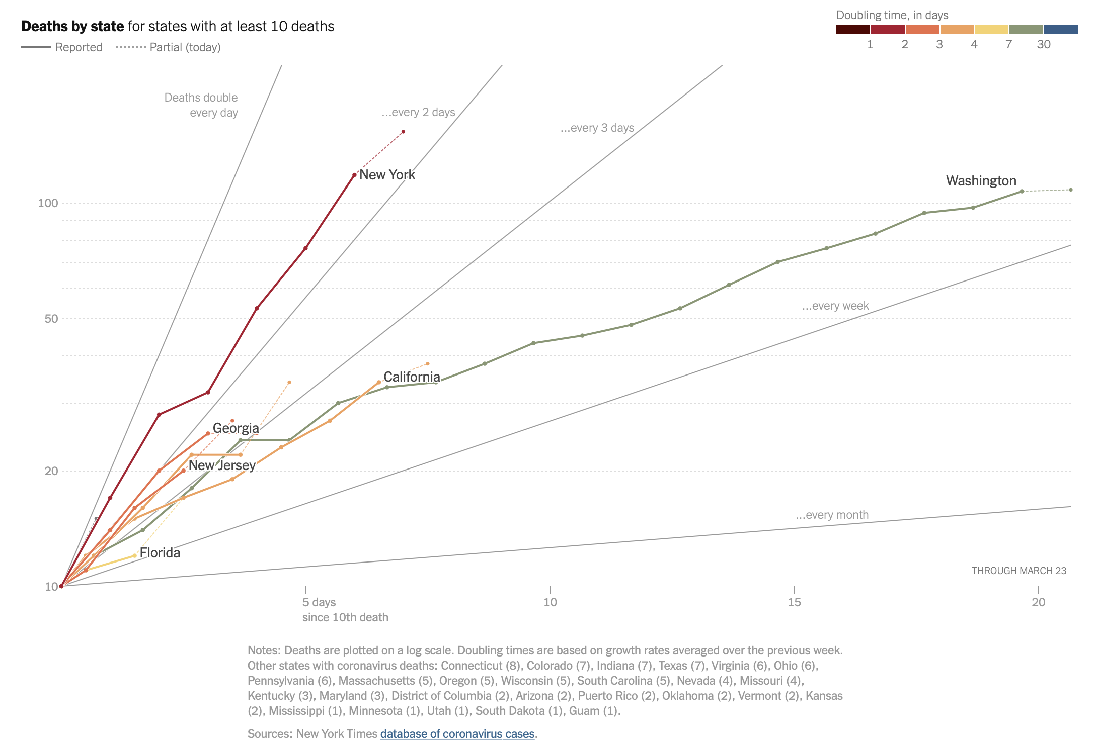
John Burn-Murdoch has been doing incredible work tracking COVID-19 cases over the last few weeks. His coronavirus pandemic charts at the Financial Times give a very clear perspective of how different countries compare. This particular chart shows the number of deaths from the coronavirus on a vertical log-axis, with the horizontal axis being indexed to start at whenever each country first crossed 10 deaths.
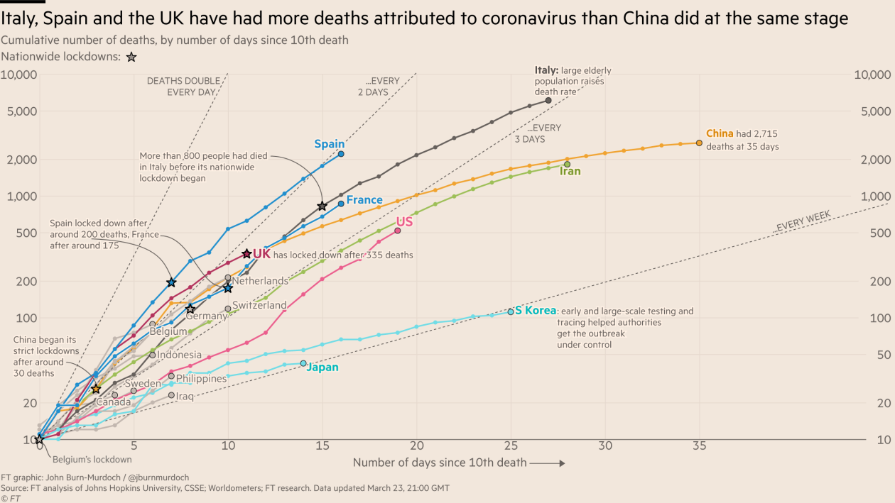
Notice the reference lines? They’re showing different rates of growth, here expressed as the days each country takes to double its deaths at the current rate: every day, every other day, every three days, or every week. The FT page breaks the data down by country, a number of regions, as well as major cities. There’s a lot of information on that page, it’s well worth a visit (and freely accessible right now, too).

John credits Lisa Charlotte Rost and her post on the DataWrapper blog with the idea. Josh Katz and Margot Sanger-Katz at the NY Times are using the same technique on their coronavirus tracker as well, breaking the data down by country and a number of U.S. states. As I’m writing this, the outlook for New York is not looking good.

It’s amazing what a simple graphical element can do for context in a visualization. It turns a mere display of data into an informative piece of journalism.

6 responses to “In Praise of the Diagonal Reference Line”

  1. Monika M. Wahi, MPH, CPH Avatar

    Thank you for pointing this out. When you say it, it seems obvious – so why is adding reference lines to charts such a “new” idea? In my field of public health, you will rarely see these lines in scientific literature. My opinion is that this has had a lot to do with our software.

    SAS has historically had what I would call an unfortunate approach to graphing. The software takes in your dataset, does a lot of work, and then produces a graph. If you want to edit the graph, you really have to know what you are doing, by either tweaking your data, tweaking your graphing call, or tweaking your code to death.

    By contrast, in both base R and using package ggplot, adding a reference line is literally one line of code. This is why I greatly advocate using R for plotting. SAS does some amazing things with big data, but if you really want to communicate with your plot, SAS is really not the software for this.

  2. Lisa Charlotte Rost Avatar

    Hi Robert, thanks for this nice post and for mentioning the Datawrapper blogpost. Since deciding to use these lines two weeks ago, I got a lot of emails & comments telling me that people interpret the lines as borders of “corridors”; assuming that, as long as a line stays between two lines (e.g. 2 days and 3 days), it has a doubling time between 2 and 3 days.

    That’s not the case. China is between the lines for “every 5 days” and “every week”, but has a doubling time of far more than a month.

    I added a bold note at the beginning of the charts (e.g. on the two ones here: https://blog.datawrapper.de/coronaviruscharts) yesterday and now hope that it becomes clearer. That said, I can see how this chart is misleading. There’s even a German news outlet that copied my chart (before I added the note), misunderstood it and added a wrong interpretation guide.

    Josh Katz has found the best solution to this problem, in my opinion – as soon as you hover over e.g. the US, it shows a line extrapolating the doubling time of the last 5 or so days: https://www.nytimes.com/interactive/2020/03/21/upshot/coronavirus-deaths-by-country.html

    1. Robert Kosara Avatar

      Yes, I realized that too after looking at the The NY Times piece a few times. The additional line for each country is crucial and it’s a different situation than the wage gap chart. I still think the lines by themselves help if you know what to look for, but it’s easier to misread them.

  3. Michael Friendly Avatar

    Tukey’s advice (originally for QQ plots):
    Comparisons are often best made against a horizontal reference line.

    Here, this corresponds to choosing one doubling rate as a reference and rotating so that one is horizontal.
    This would make the various cities/countries more distinguishable.

    1. Robert Kosara Avatar

      Others have proposed this too, but I’m not convinced it would help. I believe the strength of the diagonal reference line is that it doesn’t require you to transform the data. That makes it much easier to read for casual observers. I’m not arguing against rotation when you’re dealing with the same data often, but for a broad audience, I think it would make things harder to understand and easier to misread.

  4. Jacob Avatar
    Jacob

    You wouldn’t happen to know how to make the lines in Tableau, would you?