
Proteins are among the most complex structures we know. They consist of thousands of atoms, and fold into complex shapes to perform a variety of functions. Understanding how they work is not possible from looking at single atoms, but rather at the overall, three-dimensional structure. The visual language for doing this was developed by Jane Richardson.
I find it fascinating to learn that concepts and ideas that I take for granted were only invented relatively recently. When we look at visualizations of proteins today, we expect clean, relatively simple shapes: ribbons, helices, and the rope-like structures that connect them. But this is a very abstracted view that was not at all obvious thirty years ago.
Scientists only figured out how to determine the three-dimensional structure of proteins in the 1970s. When Jane Richardson was writing a review article about the proteins whose structure was known in 1980, she needed a consistent way of showing them. It was clearly not very practical (or useful for understanding) to draw thousands of atoms that were part of a complex, three-dimensional structure.
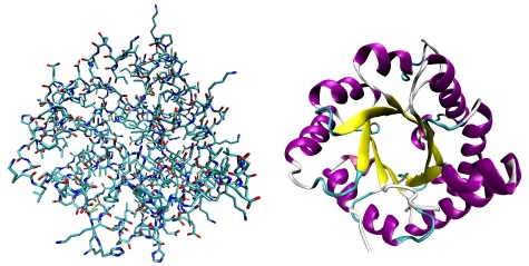
There are three distinct structures in a protein: alpha-helices (spiral shapes), beta sheets (ribbons), and turns (the "ropes" in-between). Seeing those in the atom structure (above) is almost impossible, but crucial for understanding how a protein works.
Jane Richardson's contribution was finding a visual way of representing these components of proteins. Her ribbon diagrams simplify the structure of the protein, and at the same time focus on the important parts. These diagrams were hand-drawn at first; today, any program that shows proteins includes this style of showing them, they are used in textbooks, etc.
I interviewed Richardson for the Sightings column in American Scientist a while ago. She is a professor at Duke University and still uses visual means (virtual reality, among them) for teaching and research to further our understanding of complex molecules.
This is my entry for Ada Lovelace Day 2010.
Teaser image: left part by Jane S. Richardson, right part by Wikipedia user Debstar. Atoms-to-abstraction image by Wikipedia user Opabinia regalis
Comments (3)
Posting new comments was disabled in 2020.