Would you make a bar chart where the length of the bar doesn't actually scale with the number being shown? Would you draw a line chart with the lines all over the place, not where the values actually are? Of course not. Yet somehow, every single election map works like that.
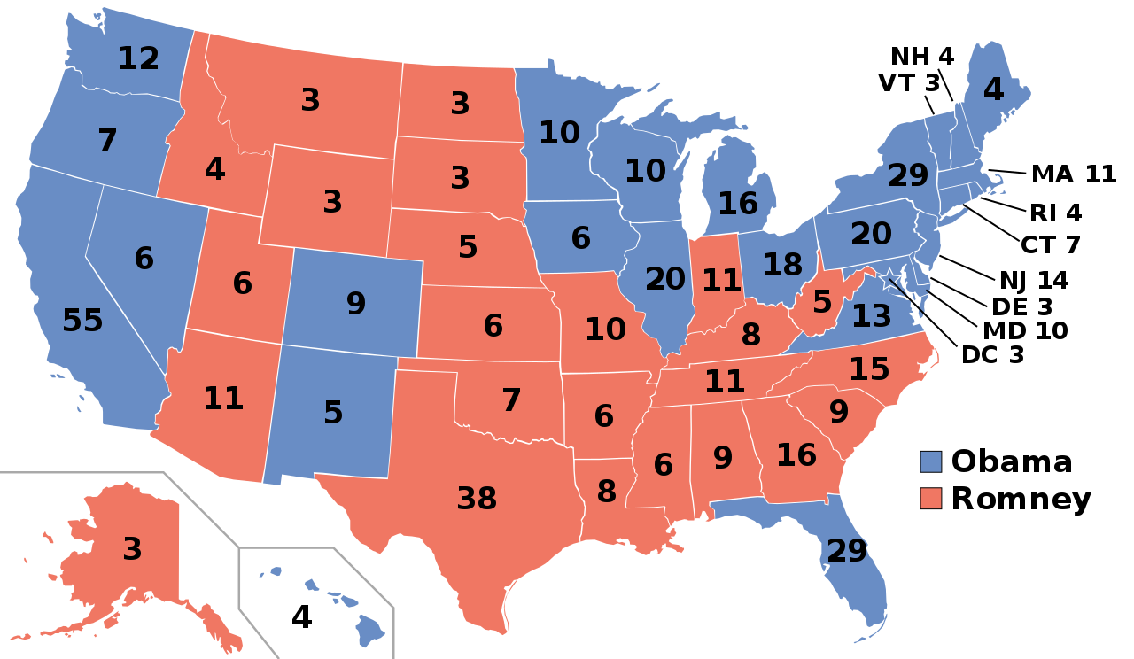
Look at this map from Wikipedia that shows electoral votes on the labels and who won each state. Tell me which candidate won the 2012 election. Don't go with what you know, use the map that is supposed to show you the data and tell me: who won?

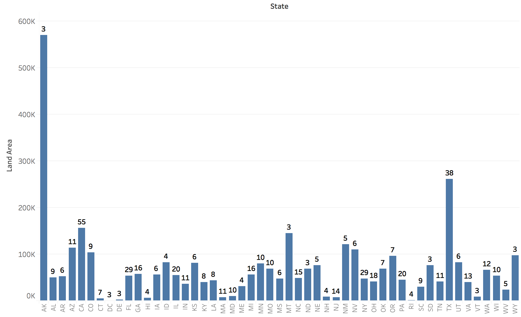
Let's try something different. Here's a bar chart of the number of electoral votes for each state. Like with the map, the label shows electoral votes, the bar's length is the state's area. Can you tell me which state has the most electoral votes? How many more does Texas have than Montana?

Not helpful? Of course, they were sorted alphabetically. Silly me! Let's sort by area instead. Now, which one has the most votes?

That is exactly what happens with a map. The map shows you area: rocks, farmlands, pastures, prairie, etc. It does not show you people. It does not show you the immense difference in population density even between states – and it's much more severe between smaller areas, like ZIP codes or counties. You can put all the labels on it that you want, a choropleth map will always show you area.
So what if the map doesn't exactly show me votes, you say, how much of a difference could it possible make? How many square miles are there per electoral vote in the different states? Does that number differ in a meaningful way?
Why yes, it does. Alaska has a staggering 190,214 square miles per electoral vote, four times that of the next state, Montana! And it doesn't stop there. California, which has the most electoral votes (55) has 2,832 square miles per vote – less than one in 67 compared to Alaska with its three votes (or 1 in 17 compared to Montana, same number of votes)!
All the way down the list, we find the District of Columbia, with 20 square miles per electoral vote. The factor between Alaska and D.C. is almost 10,000! Four orders of magnitude! And they both have the same number of electoral votes, too. Yet one is ten thousand times the size on a map, and it often gets distorted way beyond that due to the popular Mercator projection.
This is not a trivial difference, and there is nothing you can do to account for that difference other than not use a map. Transparency, blending colors, nothing will be able to account for a factor of 10,000 between what is being shown and what the data actually represents.
This is not a useful map. This is just a map because people like to see maps. But the way the information is shown is not meaningful, it is wildly distorted. All those millions of acres of open farmland tend to have different political views than the people in the dense cities.
Clearly, it's too late for this election. And I'm sure I will get yelled at again on Twitter for being stupid (just like I was today). But perhaps this can sink in over the next year or two and somebody can design a visualization for future elections that actually represents the data it's supposed to show.

Comments (6)
Posting new comments was disabled in 2020.