
In his keynote at IEEE VIS in Paris two months ago, Alberto Cairo talked about journalism, visual explanations, and what makes a good news visualization. But mostly, he talked about curiosity.
When I wrote my IEEE VIS report for Tuesday of that week, I knew that I could either do a shoddy job of describing the keynote and get the posting done, or have to push the entire thing back by a few days. So I decided to turn this into a separate posting.
The goal of writing up the talk here is not to provide a full recap – even though I could probably give the talk for him now, having seen variations of it three times in as many months. Instead, I want to pick out a few topics I find particularly interesting and universally relevant.
Curiosity
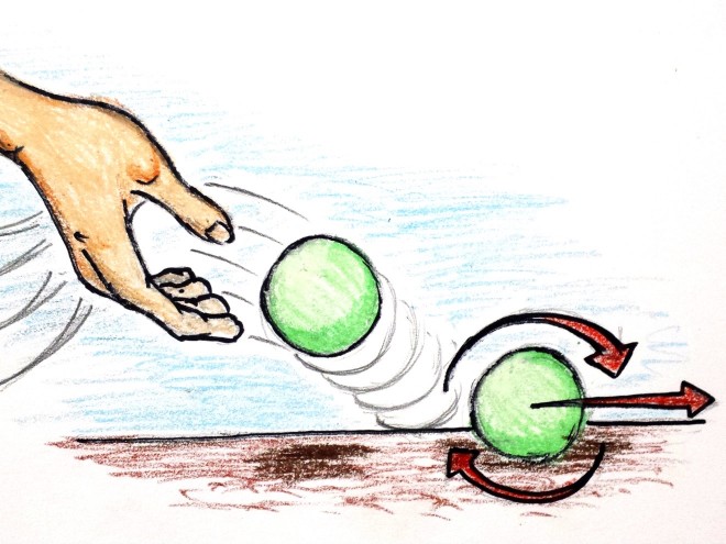
He started the talk with questions his kids ask him, like one from his 7-year-old daughter: why don’t planets stop spinning? That’s an amazingly deep question when you think about it, and even more so for a 7-year-old.
Alberto then went through some explanations, at the end of which he drew an interesting comparison: he likened the momentum of a planet’s rotation to the way answers can set his daughter’s mind in motion to produce more questions. Both keep spinning unless there’s a force to slow them down.
I particularly like the succinct way he put it: Good answers lead to more good questions. That sounds a lot like data analysis to me. And also to science. It’s quite satisfying to see a unifying theme between explanation and analysis: curiosity.
More knowledge leading to more questions is a fascinating idea. Cairo uses a quote by Ralph W. Sockman (also the basis for a book by Marcelo Gleiser), The larger the island of knowledge, the longer the shoreline of wonder. The island of knowledge is surrounded by an infinite sea of mystery. As the island grows, so does its shoreline, which is where wonder and new ideas happen.

I love this because it describes exactly the way science works. More knowledge always leads to more questions. Curiosity feeds itself. And it goes contrary to the idea that science takes away the mystery or beauty of nature by explaining things.
It's More Complicated Than That
Getting back to journalism, Alberto lists a series of principles for a good visualization. It has to be…
- Truthful
- Functional
- Beautiful
- Insightful
- Enlightening
This set of criteria is strongly based on journalistic practice and principles, and I think it makes a great package for the evaluation of any kind of visualization. Some of the criteria will look odd to the typical visualization person, such as the inclusion of beauty. But this is also what makes Alberto's book so useful in teaching visualization courses: it goes beyond the typical limited horizon of the technical and largely analytical (rather than communication-oriented) mindset that is still prevalent in visualization.
Another part of this section was my final take-away, another great little sentence that I think needs to be appreciated more when working with data: it's more complicated than that. Many times, it's hard to appreciate the complexity and complications in the data, especially when things look convincing and seem to all fit together. But simple explanations can often be misleading and hide a more complex truth. The curious mind keeps digging and asking more questions.
Images from Alberto Cairo’s slides, which he kindly allowed me to use.
Comments (1)
Posting new comments was disabled in 2020.