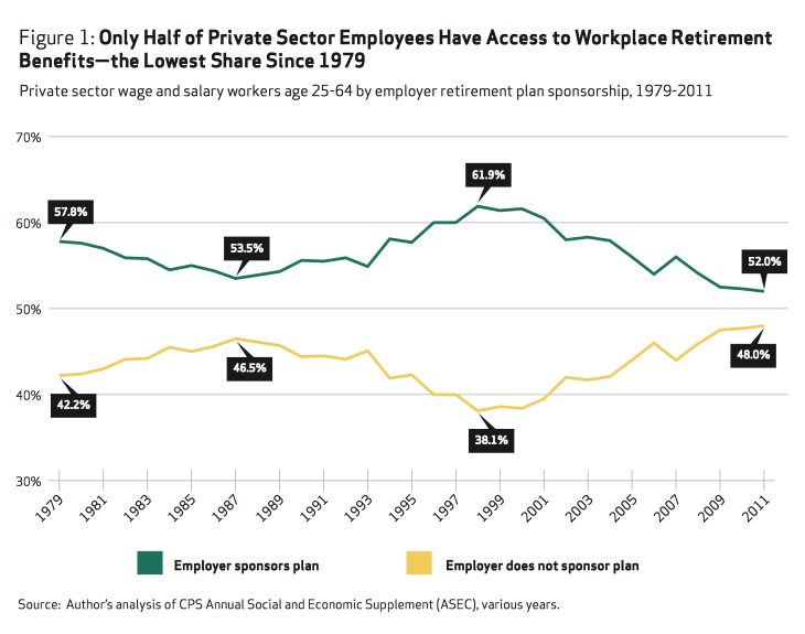
The mirrored line chart is a pet peeve of mine. It's very common close to elections when there are two parties or candidates: one's gains are at the other's expense. But it becomes even more egregious when there are two categories that have to sum up to 100% by their very definition.
In her coverage of President Obama's State of the Union address, The Guardian finance and economics editor Heidi N. Moore tweeted the following chart, which came from a report by the National Institute on Retirement Security (which, despite its official-sounding name, is a think tank):

What do the two lines here show? Or rather, what does the second line add? Nothing, that's what. Each of the labeled pairs of values sum up to 100.0%. The two lines mirror each other exactly.
It's obvious even without looking at the lines. The two categories here are "employer sponsors plan" and "employer does not sponsor plan" – that doesn't exactly leave room for a third option. They either do or they do not (insert obligatory Yoda joke here).
So what is the motivation for the second line here? Why add that when it contributes nothing? My guess is that the chart simply looked too empty and uninteresting with just a single line. It's the same reason many visualizations get overloaded with too much data. If it looks like there just isn't enough substance, even if it shows exactly what is needed, people often feel a need to add more to make it look more serious.
But what, you might ask, does it hurt? It's not made-up data, it's just the other category. The problem is that it adds clutter, and that it creates the impression of a strong inverse correlation when there is none. The two categories have to sum up to 100% by definition, there is no third option.
When the data is coming from polling results, at least there are undecided voters who add a bit of interest. Though even that is often misrepresented or downright hidden. But here, there isn't even uncertainty. It's a simple sum of two numbers. It's redundant information.

Comments (8)
Posting new comments was disabled in 2020.