
Finding the right chart for complex data is not an easy task. A reader pointed me to a presentation (PDF) by the New Hampshire Department of Education that illustrates some of the thinking behind choosing a new visual representation. The tool of choice here is the bubble chart.
Reading
The goal of the work presented in these slides is to design an accountability system for schools in New Hampshire. The slides go into some depth on the complexities of doing this from a data point of view (what kinds of measures to use, how to compare them, etc.).
To show the data, the department has chosen the bubble chart. It's not really a new chart type, since it is basically a scatterplot with additional data mapped to properties like color and size. But it has gotten a lot of attention since it was featured in gapminder and Hans Rosling's widely watched presentations.
The chart is also well designed here: labels are not only placed along the axes to show numbers, but there are qualitative labels in each corner that explain what each of them means. The goal here is obviously to make it easy for people not familiar with the chart to understand what they should be looking for.
The horizontal axis shows the increase in reading performance as a percentile, while the vertical axis shows the current achievement percentile. School size is mapped to bubble size, and color represents the number of children enrolled in free lunch programs (and is thus a proxy for poverty).

It is clear that a lot of thinking went into this chart, but it is still confusing. It's simply trying to do too much. The mapping of the axes seems a bit odd: the horizontal axis is usually the independent variable, with the vertical axis the dependent one. It seems a lot more logical to me to map achievement onto the x axis, and the rate of change onto y. That would not change the overall pattern (it would just be rotated), and the overall lower-left-to-upper-right dynamic would still be there.
The bigger issue is the amount of information, though. Using a continuous color scale and size is just too much, especially since there are no strong trends. Size does not seem to play a role, so it should be removed. There is a very slight color gradient that is visible in the vertical direction (current performance), though some of that might be due to the interaction of color with transparency.
'Rithmetic
A better use of bubble charts is shown a little further down in the presentation, when it comes to comparing subgroups. In this case, the size of the bubbles represents subgroup sizes, with color showing which subgroup a bubble belongs to. The spatial coordinates are mapped as before, but for math rather than reading.


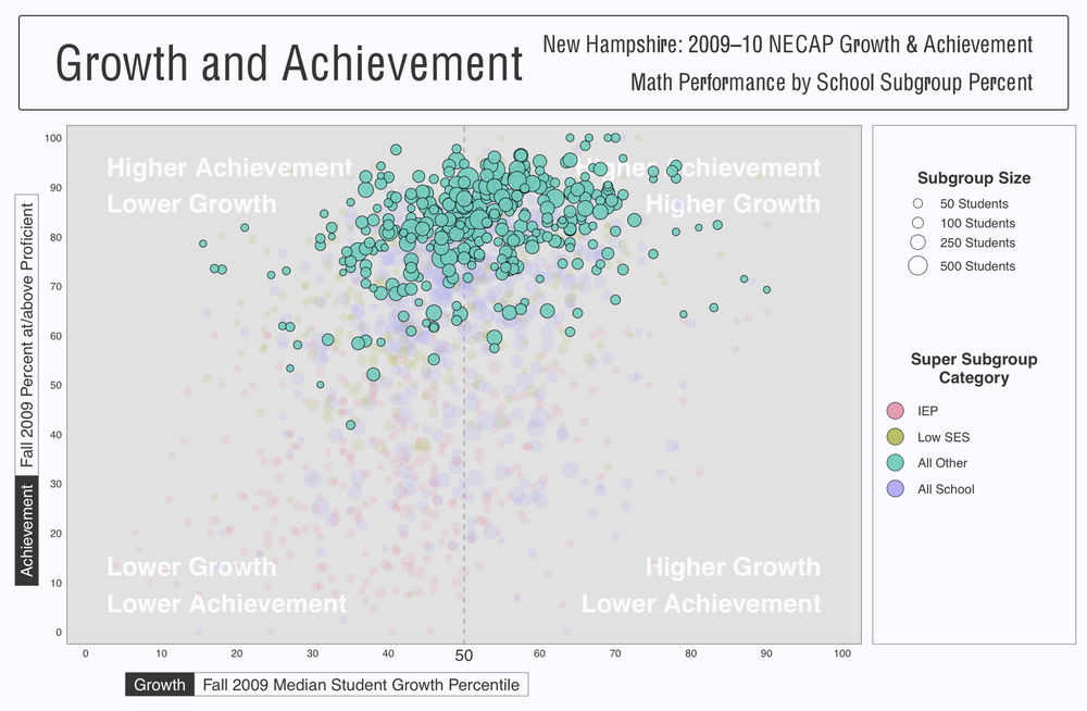
This clearly works a lot better, especially when comparing different subgroups. Color is a great choice for categorical data, especially when the number of categories is small (like here). Also, the highlighting of one subgroup, with all other bubbles pushed to the background with less saturation, is extremely effective to focus on a part of the data without losing context.
Without transparency in the foreground, and with colors that are different enough not to get confusing even if there were transparency, the bubbles are much easier to read and less overwhelming than above. The use of bubble size also makes sense here, because there are clearly size differences between the groups.
The differences between the subgroups are quite striking, and are beautifully displayed with this chart. It's an effective and useful chart that serves a clear purpose.
Percentiles
What struck me about this presentation is not only the great use of bubble charts, but also a really peculiar chart that is a combination of a bar chart and bubbles. It shows three values for a large number of schools: a median student growth percentile (in math), a target percentile for the school, and the percentage of students in each school meeting the growth target.

I have spent a lot of time staring at the chart, but have yet to fully understand it. What is obviously a problem here is the mix of two different kinds of data: percentiles and percentages. Just because both go from 0 to 100 doesn't mean that they should be shown on the same axis.
The other odd thing is the relationship between the growth target and the median student growth. Many of the schools seem to be well within their targets, which is a good thing. But these targets are often comically low: the first school seems to have a target of being in the 88th percentile, which does not seem to be very ambitious.
The target percentiles are apparently the medians for all the targets set for students in each school. Obviously, these vary widely within each school, just like the actual growth percentiles. It seems that a better approach here would be to show some kind of histogram, or at least the extent of actually observed values to get a clearer idea of what is going on in each school.
The goal, both for this chart and for the presentations overall, seems to be to boil things down to as few numbers as possible, but that obviously removes a lot of interesting information. It also greatly reduces the usefulness of the visualization, which actually becomes a lot more confusing because of this.
Conclusion
It's easy to criticize bad charts and chart choices, but it's actually much more interesting to see what people come up with given powerful tools. This example shows innovative charts used "in the wild," and by people who presumably have little or no background in visualization.
The bubble chart is gaining a lot of traction: one of the slides states that they "love the bubble charts," and they're not a bad choice in this case. But despite its relative ease of use (especially given the clever labels in the corners), it's important not to overload it with too much data.
Comments (10)
Posting new comments was disabled in 2020.