
The academic visualization community largely comes from computer science: most of the professors teach in computer science (or similar) departments, most of the students doing research are computer science students of some flavor or other. It's interesting to consider how the field might be different if visualization had emerged from a different discipline.
The inspiration for this piece comes from an article by Eric Rodenbeck of Stamen Design titled What is data visualization for? He makes a number of good points, but one part in particular stood out to me:
Computer science has about as much to say about the medium of data visualization as photographic paper engineering has to say about Instagram.
How would visualization be different if it had been invented (or perhaps co-opted) by some other field? Here are some sketches of what that might look like.
Statistics
It’s sort of painful to consider how often statistics and statisticians invented visualization. I’m not sure if William Playfair can be considered a statistician, but Florence Nightingale certainly was. Statistics embraced visuals early on, like in the U.S. censuses in the late 1800s that included lots of great graphical representations before it all turned into tables. There were others, but perhaps the most notable person to do so was John Tukey. Tukey is known for the box plot and other graphical methods he developed and promoted, but he also pioneered interactive visualization. His PRIM-9 demo is well worth watching to see what they attempted to do with early 1970s technology (and for the hilarious 1970s production values).
So statistics doesn’t just invent visualization but decides to run with it. Instead of the math focus, visuals are used to understand data and make decisions. They’re not just alternative means to the math, they are the way this is done. Fisher-style hypothesis testing is soon abandoned in favor of confidence intervals and other means of showing the fit of data to a model. Rather than insist on a small number of techniques largely invented in the 1960s and 70s (scatterplots, box plots, etc.), the field has developed a plethora of visuals that deal with all sorts of different data, like categorical data, aggregates, temporal data, etc. And given its ubiquity, statistics had to invent visuals not just for the analysis of data, but also the presentation of results, education, etc. Statistics naturally develops dual graphical methods for all its math, to the point where no statistics paper gets accepted if it doesn't include a complete graphical treatment of whatever it proposes.
What’s not to like about this picture? Despite PRIM-9, statistics largely ignored the idea of interaction in favor of static, paper-based plots (and math). The field also never quite embraced the idea of processing large amounts of data until the last ten years or so. Many statistical techniques are not suited or quite simply do not give meaningful results for more than hundreds or thousands of data points. It’s only relatively recently that more specialized techniques like data sketching (no the pencil-and-paper kind) have been developed to deal with large and streaming data. I wonder if there are any think pieces out there that talk about how math has been holding statistics back, just like computer science is/has been doing with visualization.
Cartography
If not statistics, then surely cartography would have invented data visualization. It’s odd that many people consider maps only as a means to find your way from here to there, when they’ve always been displays of data: where to find resources, how many people live where, what professions they have, the times of year to expect sea ice in shipping routes, etc. Over the last couple hundred years at least, charts displaying data were commonly found next to and connected to maps.
Cartography invents data visualization. Just as there are trade-offs whenever the world is projected onto a plane, everybody understands that the decisions that go into the choice of chart type, encodings, etc. have consequences. There is not just one right answer, and many different ways are possible. Sure, there are rules. But we understand that there are always multiple possible ways to do things. Many different people have been writing about cartography and visualization for decades, based on centuries of rich historic examples and thought, leading to a well-balanced field that isn’t dominated by a single, strong opinion. Cartography has also naturally imparted its ideas about design and aesthetics on visualization, leading to a generally high level of work that is informed by a long and rich history. And since visualization is a part of cartography, the distinction of what data should go on a map and what should not is clear and obvious. Cartographers understand better than anyone that a map isn't always the best choice, even when there is a geographical component in the data.
Would we have Web Mercator if cartography had gotten into the data visualization game early? Would there be GIS separate from data visualization systems and tools or would they all have merged into much larger, integrated, complete (though perhaps even more unwieldy) systems? Would we have the same discussions we have today about spatial components in data and whether that means it's scientific vs. information visualization?
Education
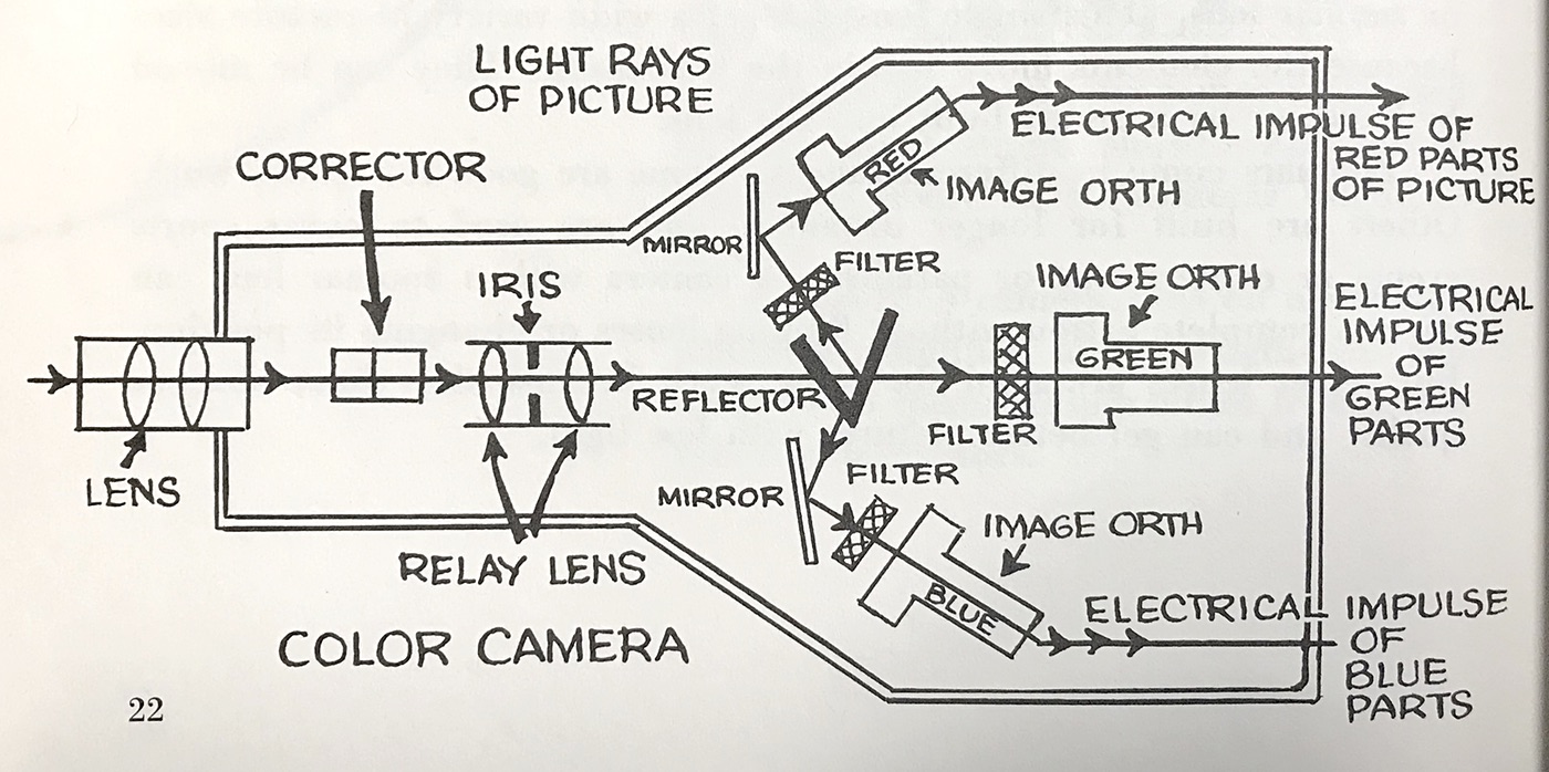
Helping people understand the world has always involved showing and explaining things. This has almost always meant pictures, often showing mechanisms and explaining how the different parts of something work together. I have a thing for kid’s books from the 1950 and ‘60s that explain technology, often in remarkably clear and surprisingly deep ways. This image and the one at the top are from Television Works Like This, by Jeanne and Robert Bendick (McGraw-Hill, 1965).
The step from finding a visual way of explaining a mechanism to using data to talk about the world doesn’t seem that big. In fact, the E in ISOTYPE stands for Education. Otto Neurath’s goal was to educate the population about the world, and to do so using numbers. After his death, Marie Neurath published a series of children’s books that often incorporated elements of data and ISOTYPE-style images (though they never purely showed data, as far as I know).
So education invents visualization. What happens? Presentation is the primary goal, not analysis. Visualization is the way to communicate using data. Of course, the data needs to be analyzed, but that is not its main purpose. And perhaps analysis isn’t considered nearly as important as the carefully thought out, argued, and logically structured presentation of the findings. The goal is understanding, not just seeing small things like correlations or outliers. What do they mean? What else do we need learn to understand what is going on? Data and its visualization is just one component of many, including annotations, labels, transitions and builds to show cause and effect, etc. Elements of this educational use of visualization make it into all sorts of presentations, which are not just endless lists of things you did, but build around the idea of explaining and guiding through the process.
This may be a little optimistic, but there are many ideas in education that presenters (and anybody, really) would be well advised to pick up. Asking, what do I want the audience to learn? would be a good start to vastly improve presentations in general, but in particular when they're showing data. It's not so much the details but the entire mindset that might be quite different.
Journalism, Public Health, Information Design
There’s a fine line between education and journalism. Where do National Geographic or Popular Science fall? If journalism didn’t invent visualization several times, it certainly embraced it. This has happened over the last ten years or so, but it goes back at least to the late 1800s. Scott Klein has collected some great examples and ran a (now seemingly defunct) newsletter documenting his finds. Perhaps the difference between education and journalism would be that the latter could be much more opinionated when that was called for.
Public health is another obvious one, and it's easy to draw a line from Florence Nightingale to Hans Rosling. Oddly, it seems that communication has never been a priority in public health, or at least not one that got the attention it needed to churn out Nightingales and Roslings by the thousands, as it should have.
Information design is already overlapping visualization quite a bit, and it only makes sense. The amount of data is usually much smaller, and the approach is much more artisanal than in the algorithm-driven world of visualization, but data is central to much of information design. We also have to thank information designers' obsession with Gerd Arntz for keeping our memory of ISOTYPE from fading (Arntz designed many of the iconic (ahem) shapes used in ISOTYPE).
What's Wrong With Computer Science?
The reason for computer science playing the role it does in visualization is pretty simple: supercomputers. Visualization as a field, and the Visualization conference, emerged out of early computer graphics that were done to make it possible to understand simulation results of new airplanes, car engines, etc.
Computer science has its own ideas about doing things, of course, which strongly bias what is considered good and valid research. One of them is the idea of algorithms and general solutions: what you do should work for any data, or at least across a large range of data and situations. That's quite contrary to ideas in art, information graphics, even journalism, where making something bespoke and unique is an important consideration.
Computing does bring a lot to the table too, though. Tools like Tableau, libraries like D3, the ability to store and process virtually any amount of data, etc. – those don't just come out of nowhere. If visualization had emerged from another field, we probably wouldn't have any of those things. That isn't to say that this is the best possible reality, but it's the one we're in. Considering the alternatives is helpful to understand our biases that come out of that, and hopefully start to address those. This is happening slowly with researchers embracing (or at least recognizing the value of) sketching, using data journalism pieces to understand how data can communicate, and even making the occasional piece of data art.
Comments (3)
Posting new comments was disabled in 2020.