
Chernoff Faces are discussed in every information visualization course, and are referenced in many papers that talk about glyphs. Yet the only serious use of faces in visualization is for calibration, not for data display. Faces are so special that we better know their perceptual properties really well before we can use them, which we don't.
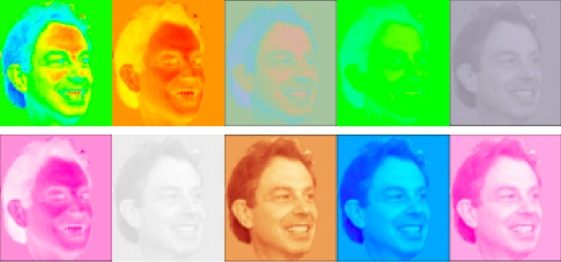
Chernoff's paper from 1973 [1] proposed simplified face shapes to represent a number of variables in a data set, by mapping numbers to the size and curvature of the face, position of the eyes, length of the nose, position of the mouth, etc. Chernoff claims that up to 18 data dimensions can be displayed with the method, allowing the user to visually cluster the data. These faces are a type of glyph, a graphical object whose properties represent data values.
Face Perception
Let's assume your best friend is not sitting right in front of you. Can you precisely describe his or her face? Can you describe the differences between the faces of your two best friends so that a stranger would be able to tell them apart?
Face perception works in a holistic and hierarchical way. We do not see a nose, ears, eyes, eyebrows, etc., and then piece them together (at least not consciously). Rather, we recognize a person. The face is so much connected to the personality that we (think we) are able to tell something about a person's character just from looking at his or her face, and certainly about his/her mood. That is also why we immediately see a face that is drawn as a bunch of lines to be happy or sad: we can't help it.
What is even more problematic, however, is that there is a strong hierarchy in which features we look at, and how we identify people. There are features that are clearly much more important (eyes, lips) than others (overall shape). Thus, representing data through these visual features means that some data will be much more visible than others.
Faces where there are none: Pareidolia
Seeing a face means two things: recognizing a shape as a face, and (possibly) recognizing the person from the face. Both are incredibly important tasks, and we are very good at both of them. So good, in fact, that we see faces even where there are none.
The fact that we see a few lines as a (Chernoff) face is testament to this. Even an image that is reduced to two points, two lines, and a circle, is seen as a face that can be curious or scared, happy or sad. This is also how caricatures and cartoons work: a distorted or reduced face, even when attached to a thing or an animal, is recognized as a face, and the attached object as a person. This also works for the design of certain objects like cars, which have headlight "eyes."
The fact that we have faces around us almost everywhere we look makes it hard to appreciate this phenomenon. So let's look at some faces that appear where there clearly are none. This effect is called Pareidolia.
Perhaps the most famous example is the "Face on Mars", which was photographed by a Viking probe in the 1970s. It inspired a lot of speculation about life on Mars (and some crappy movies), but it later was shown – not surprisingly – to not be a face at all.
 |
 |
In times of Google Maps, faces can also be found on closer planets. The ones in the following images are called "Medicine Man" (even wearing an iPod!) and "Face of God" (or perhaps Slartibartfast?). What is interesting especially in the left image is that the face is clearly visible, while the hair/headdress makes much less visual sense.

Finally, there are faces in our every-day non-visual communication: smilies. Two or more punctuation characters can express joy, astonishment, shock, and affection. Who would have thought that these mundane characters that just structure the more important text could convey so much meaning?

Faces in Visualization
The Which Blair Project [2] uses faces to calibrate displays without the need for special hardware. It works on the simple principle that we see a face when the luminance values that are mapped to the gray levels of a photograph are monotonically increasing in brightness. This way, a large number (maybe 100) possible color maps can be presented to the user, who then simply clicks on the images where s/he sees a face. This is completely effortless thanks to our natural ability to see faces.
An extension of this idea is Face-based Luminance Matching [3], which lets the user not just select, but also construct color maps. To do this, a two-tone image of a portrait is shown using a gray level and a color, in both possible configurations (i.e., one quarter of the image below). The user moves a slider towards the side where s/he sees the face, changing the value of the color. When the point is crossed where color and gray appear equally bright, the face appears to jump to the other image. That way, the user has found a color with the same perceived brightness as the gray once s/he cannot decide where the face is anymore.

Other Glyphs
Apart from the reasons stated above that show how peculiar faces are, there is also another reason that make Chernoff Faces a strange choice: faces for everything? Why should faces work for any type of data?
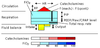
General glyphs can be tailored for any data, and can also be based on metaphors. Take the following glyph for visualizing patient data in an intensive care unit (ICU) as an example. The VIE-VISU [4] system is loosely based on the human shape, without invoking it too strongly and thus creating a gestalt. Could they have used a face? Definitely. But which values do you represent with the eyes? Which make the face smile or look sad?
Hard Evidence
In addition to the circumstantial evidence above, there is a small amount of relevant work in visualization that has actual scientific weight.
Colin Ware [5] recognizes the object-like appearance of Chernoff Faces, which is useful for perception. However, he goes on to caution readers that there are likely strong interactions between the different features, and that "the perceptual space of Chernoff Faces is likely to be extremely nonlinear" (pp. 264-266).
Morris et al. [6] examined the preattentive nature of Chernoff Faces, and found no evidence for it. Rather, comparing facial features is a serial search task, and is not helped at all by our (possibly preattentive) ability to quickly recognize familiar faces. They also found that a hierarchy of features exists, with eye size and eyebrow slant being the easiest to perceive and to compare.
Conclusions
Faces are clearly special and their perception is poorly understood. While we can recognize a face very quickly, differentiating between and comparing features is much more difficult. All this makes faces a bad choice for visualization. While compelling anecdotal and circumstantial evidence exists, more hard scientific work is clearly needed for a final judgment.
[1] Herman Chernoff, The Use of Faces to Represent Points in K-Dimensional Space Graphically, Journal of the American Statistical Association, vol. 68, no. 342, pp. 361–368, 1973.
[2] Bernice E. Rogowitz, Alan D. Kalvin, The "Which Blair Project": A Quick Visual Method for Evaluating Perceptual Color Maps, Proceedings Visualization, pp. 183–190, IEEE CS Press, 2001.
[3] Gordon Kindlmann, Erik Reinhard, Sarah Creem, Face-based Luminance Matching for Perceptual Colormap Generation, Proceedings Visualization, pp. 299–306, IEEE CS Press, 2002.
[4] Werner Horn, Christian Popow, Lukas Unterasinger, Support for Fast Comprehension of ICU Data: Visualization Using Metaphor Graphics, Methods of Information in Medicine, vol. 40, pp. 421–424, 2001.
[5] Colin Ware, Information Visualization: Perception for Design, Morgan Kaufmann Publishers, 2004.
[6] Christopher J. Morris, David S. Ebert, Penny Rheingans, An Experimental Analysis of the Pre-Attentiveness of Features in Chernoff Faces, Proceedings Applied Imagery Pattern Recognition, pp. 12–17, 1999.
Comments (8)
Posting new comments was disabled in 2020.