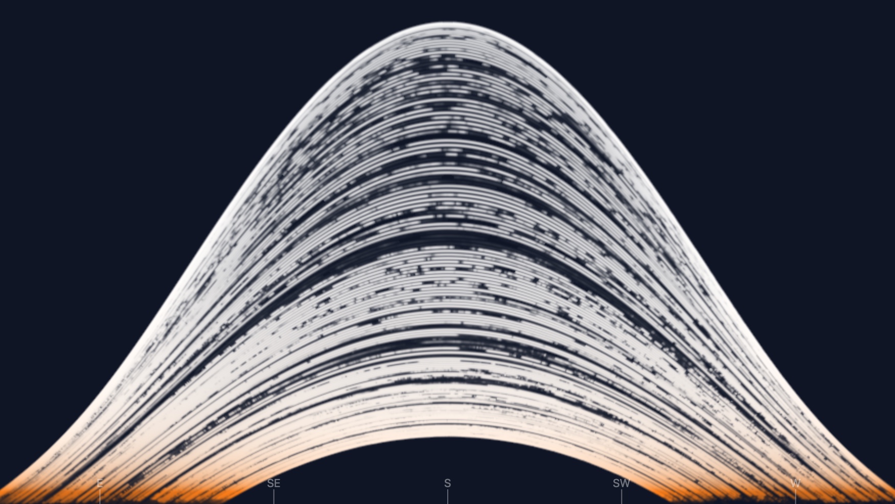
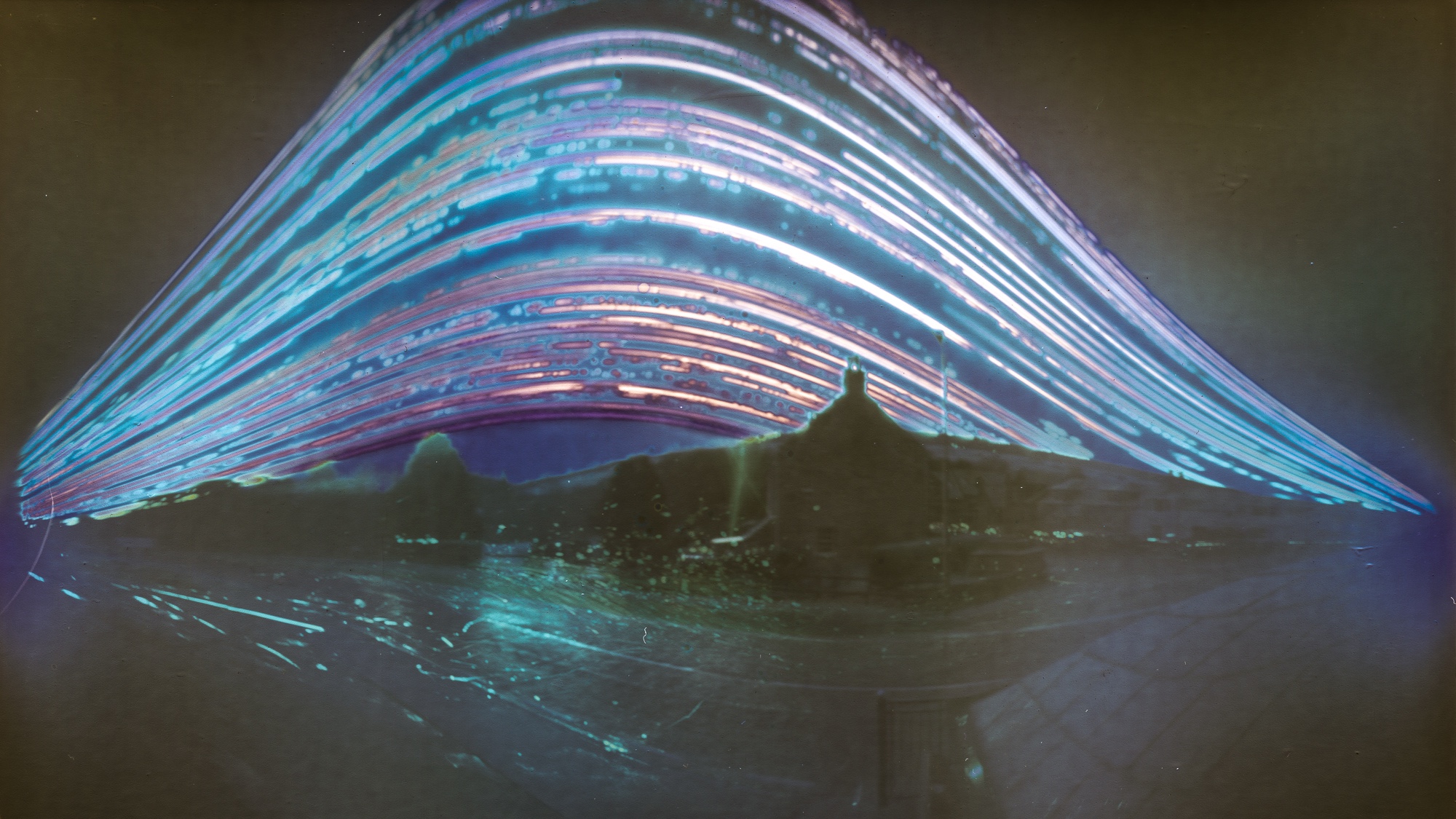
Skip to content

eagereyes.org

Visualization and Visual Communication

The New York Times now has a web Flash player

The New York Times now has a web Flash player

Before we had D3 and all this fancy web technology, interactive news pieces on the web were usually built using Adobe Flash. Since the demise of Flash, they have all benn broken, but now the NY Times has added a web-based Flash player to their archives so they can be experienced again in all their interactive glory!

Posted January 08, 2024

Rainbow Colormaps Are Not All Bad (Paper)

Rainbow Colormaps Are Not All Bad (Paper)

Rainbow colormaps are among the most derided ideas in data visualization, second only to pie charts. And yet, people use them. Why? A recent paper looks at some of the reasons why they are so popular and points to research showing that they might not be so bad if used for the right tasks. There's even opportunity for interesting research in rainbow colormaps!

Posted July 12, 2023

Paper: Notebooks for Data Analysis and Visualization

Paper: Notebooks for Data Analysis and Visualization

Computational notebooks offer an alternative to the common GUI-based tools used for data visualization and BI today. In this new paper, I talk about what they are, their pros and cons, and how research could fill in some important gaps.

Posted May 01, 2023

Course on Data Vis Fundamentals and Best Practices

Course on Data Vis Fundamentals and Best Practices

I'm teaching a short course on data visualization for Observable. It's free, and you should join! Starts March 7.

Posted February 23, 2023

New video: Exploring the connections between companies with They Rule

New video: Exploring the connections between companies with They Rule

Josh On's They Rule is back, and I've made a video about it.

Posted February 09, 2023

Site Changes Coming, How to Follow Sites, and Where I've Been

Site Changes Coming, How to Follow Sites, and Where I've Been

This site has been around for over 16 years now, and a lot has changed in the world during that time. I'm currently working on an overhaul and wanted to give everybody an idea of what I'm thinking about and why there has been little activity. In light of recent developments, here are also some good ways to follow good old-fashioned blogs and an alternative to Twitter.

Posted November 06, 2022

Midjourney is a Trip

Midjourney is a Trip

Of the several AI-powered systems that can create images from text prompts, MidJourney is the most easily accessible one right now. I've had some fun playing with it.

Posted June 28, 2022

New video: Gauges for Data Visualization, The NY Times Election Needle, and Circular Bar Charts

New video: Gauges for Data Visualization, The NY Times Election Needle, and Circular Bar Charts

Gauges aren't very popular in visualization, but they have some interesting properties. There is, of course, the infamous NY Times "election needle," but you're probably using gauges every day without giving them too much thought. There's also an interesting connection with circular bar charts, which I think can work well when used as part-to-whole charts. I talk about all of this in my new video.

Posted May 17, 2022

Watch My Outlier Talk: This Should Have Been A Bar Chart!

Watch My Outlier Talk: This Should Have Been A Bar Chart!

I gave a talk at the Outlier conference earlier this year, with the somewhat elaborate title, The Joys – and Dangers – of Bespoke and Unusual Chart Types. Though I eventually decided to go with the much shorter, This Should Have Been A Bar Chart! You can watch it on YouTube now.

Posted April 26, 2022

Paper: More Than Meets the Eye: A Closer Look at Encodings in Visualization

Paper: More Than Meets the Eye: A Closer Look at Encodings in Visualization

Encodings play a central role in visualization, but I believe our thinking about them is too simplistic. In a new paper, I argue that we need to distinguish between the encodings that specify how a visualization is drawn and the ones that are readable or actually read by an observer. While they largely or entirely overlap in some charts (like bar charts or scatterplots) they don't in others (pie charts, line charts, etc.). And what exactly do you even specify in more complex visualizations like treemaps?

Posted April 19, 2022

The (Possible) Stratagem Behind the Biden Bar

The (Possible) Stratagem Behind the Biden Bar

A bar chart with a distorted vertical axis isn't very unusual. But what if that chart was posted by the White House and what if it was done on purpose – not to overstate the number shown, but rather to evoke a particular kind of response?

Posted January 30, 2022

The NY Times COVID Spiral Is Off-Center

The NY Times COVID Spiral Is Off-Center

An opinion piece in the New York Times last week got a lot of attention in visualization circles for its use of a spiral chart as its opener. While the choice of chart and color scheme can be debated, I want to discuss the fact that the spiral is disconcertingly off-center.

Posted January 09, 2022

New Video: The Science of Pie Charts

New Video: The Science of Pie Charts

The common explanation for how pie charts work is that we read them by angle. That of course would mean that donut charts would be bad, because you can't see the angle when you take away the center of the pie. Changing the radius of a slice wouldn't matter though, because that doesn't change the angle. But there is no evidence that angle is how we read pie charts, quite the opposite actually. In this new video, I walk through five reasons why angle is not how we read pies, and what that means for other things we like to assume about them.

Posted November 16, 2021

Paper: From Jam Session to Recital: Synchronous Communication and Collaboration Around Data in Organizations

Paper: From Jam Session to Recital: Synchronous Communication and Collaboration Around Data in Organizations

Who are the people who use data and visualization as part of their work every day? In particular, how do people use data as part of meetings, to present to others, to discuss their findings and recommendations, etc.? My colleague Matt Brehmer and I ran a pair of studies to find out.

Posted October 26, 2021

EagerEyes Turns 15

EagerEyes Turns 15

EagerEyes is 15 years old today! Rather than look back at 15 years of visualization and blogging (though I will do a little of that too), I want to reflect a bit on what blogging means today and where things are going.

Posted October 01, 2021

Can A Timeline Pie Chart Work?

Can A Timeline Pie Chart Work?

Can you put ranked data into a pie chart that also represents time? This chart tries, and I think it succeeds.

Posted September 15, 2021

New video: Chart Appreciation, Iraq's Bloody Toll by Simon Scarr

New video: Chart Appreciation, Iraq's Bloody Toll by Simon Scarr

How do you make people not just see numbers when looking at a chart, but feel something? This chart of the number of deaths during the Iraq war has always given me a visceral response like no other, and it’s still as powerful as when it was made almost ten years ago. So I made a chart appreciation video to explain what I think is so great about it.

Posted July 22, 2021

When the Wrong Chart Is the Right Choice

When the Wrong Chart Is the Right Choice

We all agree that the direction of the bars in a bar chart should correspond to the direction in which the values grow. Or do we? When it comes to running or audio recording and processing, it turns out that the seemingly wrong choice can be the right one – because a more semantically meaningful representation can help us understand and use the data much more easily.

Posted June 27, 2021

New Video: Linear vs. Quadratic Change

New Video: Linear vs. Quadratic Change

Scaling objects to represent a value is a key part of visualization, but it's not without its pitfalls. Especially when it comes to fancy infographic bar charts, it can easily distort the value's appearance. Why that is, and where else this can happen, isn't always obvious. In my new video, I show how it happens and how to do it right – and how this issue inspired ISOTYPE.

Posted June 15, 2021

New video: Florence Nightingale's Famous Rose Chart (aka "Coxcomb")

New video: Florence Nightingale's Famous Rose Chart (aka "Coxcomb")

It's Florence Nightingale's 201st birthday tomorrow! Since I missed her 200th, I figured I'd make a video about her famous chart. What made it tick? What was it about? Who was Nightingale, anyway?

Posted May 11, 2021