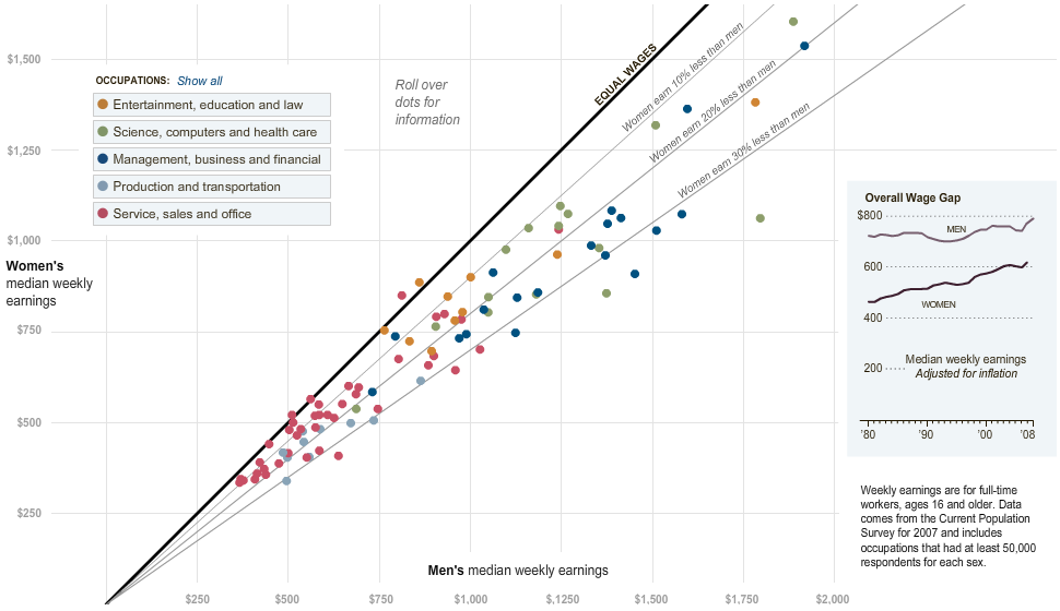
As newspaper graphics go, scatterplots are a fairly advanced technique. They tend to show a reasonably large amount of data as single points, and they require the reader to have an idea what to look for. Most newspapers never bother using scatterplots for that reason, which is really too bad. With some explanation, a scatterplot can be a very effective means of displaying data, and in particular to allow the user to drill into the data a little bit.
In 2010, The New York Times' Hannah Fairfield and Graham Roberts created a wonderful interactive visualization of the pay gap between men and women (requires Flash). While at first it seems like a straightforward scatterplot, there are some simple yet clever additions that make it much more approachable.

The scatterplot shows men's wages on the horizontal axis, women's on the vertical. There is a dot for each type of job, like nurses, programmers, physicians, etc. The coloring groups them into larger occupation categories. If men and women made the same amount of money in one particular job, that point would sit on the main diagonal. That diagonal is clearly pointed out by the heavy black line. For jobs where men make more, the point moves to the right of the diagonal, and thus ends up below it.
What makes this design so clever is the addition of the 10%, 20%, and 30% lines that give the reader a sense of the size of the difference. That is not at all easy to read in a plain scatterplot (neither is it always obvious whether a diagonal is really the main diagonal or if there's a shift, etc.), so these annotations add very useful context even for an expert. For somebody unfamiliar with scatterplots, they provide a gentle introduction that allows them to explore the data even without fully understanding the chart.
An Alternative Version
Nathan Yau recreated this chart in D3 and added some more recent data (requires a modern browser). His version not only provides a way to show the data over time, there are also more categories.
But what Nathan's version is missing is the story. The additional data mostly adds confusion: move your mouse over the year in the lower right, and what do you see? Lots of points are moving around, but there doesn't appear to be a clear trend. The additional categories are interesting, but what do they add?
The New York Times version provides two kinds of interaction: hovering the mouse over a point shows what category that point represents and how much more or less women make than men in that category. The other is a filter that is applied when clicking on one of the Occupation bars. But not only does that reduce the points to only the ones in that category, it also adds annotations.

These annotations provide interesting detail beyond the numbers and help tell the story. If this were purely an analytical visualization, there would be no annotations, nor would there necessarily be a need for them. The analytical display provides the outliers that the user can then look into to find out why they are outliers. In this case, however, the point is to present the story, so the outliers need to be annotated.
Analysis versus Presentation
What this shows is not only the difference between analysis and presentation, but also how much overlap there can be between the two. I don't know of a visualization tool that can add these percentage reference line to a scatterplot, but they strike me as a good idea. They are useful for both analysis and presentation, and for both beginners and advanced users of scatterplots. Annotations are clearly a presentation tool, though they can of course also be useful for analysis.
In analysis, it is typically desirable to have as much data as possible to work with; in presentation, less is often more. The selection of interesting groups of occupations, so the focus on a particular year when there is no clear temporal story makes sense. Perhaps the saying about design being complete when nothing can be removed is also true of focused storytelling.
What is remarkable about this chart is how little needs to be added to turn a fairly difficult analytical chart into a tool for explaining facts based on data.

Comments (1)
Posting new comments was disabled in 2020.