Let’s talk about plots and joy. The Joy of Plots, if you will. Also, Joy Plots.
Henrik Lindberg coined the term Joy Plot on the weekend , and it’s quite clever. Not only does it describe a plot of things people enjoy, it’s also a nice reference to that Joy Division album cover everybody knows even if they’ve never heard the actual music.
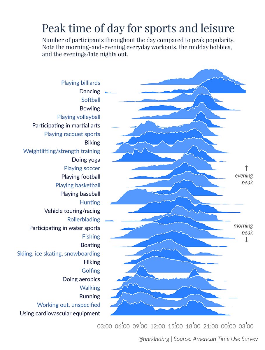
It’s also a clever chart that shows the data quite well. There are some issues with the depth stacking that hide a few parts of the data. We’re not sure what’s happening between the morning and evening peaks in doing aerobics, for example (fifth from the bottom). Is there a small noon bump? A few other timelines also have some parts hidden, but for the most part it’s all visible.
Is there a more “correct” version? Of course there is! The offset y axes might be an issue, as is the slight angle caused by the ordering that makes it harder to see the precise times. Perhaps a heat map would work better? Or a sort of heat map violin plot?
The best solution might be Xan Gregg’s horizon plot redesign:

It’s not a bad chart. But it’s not nearly as interesting (despite the more exciting choice of color). The horizon chart is still harder to read than a plain old bar chart, not as interesting to look at, and it doesn’t evoke the album cover. In a word, it’s… joyless.
The point of the original wasn’t precision as much as it was just showing some data. So what if you’re missing a few minor details, you get the main ideas and the overall patterns clearly enough. Throw in a clever name and you’ve got something that stands out. The horizon chart just doesn’t do that.
From Bars to Dots and Arrows
Somewhat relatedly, there’s this redesign of a bar chart by Jon Schwabish. The original bar chart shows the data but is hard to figure out:

The redesign gets to the point much more clearly and is easier to read. This may be a tiny bit less precise (and you could quibble about where the zero of that axis is), but it’s not like subtlety is important given these large differences.
What this chart and the Joy Plot have in common is that they’re the more uncommon charts. They’re not crazy out there, just not the first thing you’d do. But they both succeed in showing data in an interesting way, if perhaps at the expense of a small amount of precision. But what they do is present the data in a way that’s easy to grasp, which strikes me as much more important. If you’re really after precision in these charts, you’d want to have some sort of mouse-over to show you exact numbers anyway.
What they both have in common is also that they show the value and fun in exploring slightly unusual chart types for relatively mundane data. It can be a joy to plot data. Joy plotting data. Joy plots. I’ll just keep saying that because it’s fun to say. Joy plots.
(Also it’s vacation time and nobody’s reading anything I write here anyway)
Comments (6)
Posting new comments was disabled in 2020.