I always wondered how much those swing states actually swing. So I looked at the results of presidential elections over the last 100 years, and it's not easy to determine which states actually are swing states from just looking at their history. Rather, there seems to be a pattern of relative stability for a few election cycles, and then big, sweeping wins for one side.
The data for this chart was collected from the U.S. National Archives and Records Administration, which unfortunately does not provide this in a very usable format. The format also switches at some point, making things more work than necessary. I had originally collected the data in a year-by-state matrix, which turned out to be a poor choice. I used Hadley Wickham's reshape package for R to "melt" the data into a more useful format. That data was then fed to Tableau to produce this chart.
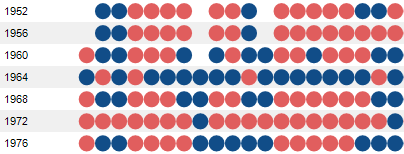
I chose a red that is quite a bit brighter than the blue to make the two colors easier to differentiate. Blue, of course, represents democrats, and red Republicans. There is also the Progressive Party of 1912 (not to be confused with the Progressive Party of 1924, but I still gave them the same color), as well as the "Dixiecrats" who only ran in 1948. They were all so short-lived that I didn't pay a lot of attention to them, but you can find them in the chart if you look closely.

What is also interesting to see is how recently some states (like Alaska and Hawaii) became proper parts of the US, and that even "contiguous 48" states like Arizona and New Mexico were not represented 100 years ago. The District of Columbia is the only "state" to never change color, but there are a few that have fairly consistent records, like Vermont and Massachusetts.
The goal was to make a chart that would show the progression of state winners over time. The vertical time axis is not optimal, but due to the large number of states, there really is no other choice. This layout makes it possible to see each year as one unit, and also to follow each state separately (in the large version of the image, anyway).
So this is really more a starting point than a finished visualization. I don't think I really succeeded in showing the crucial structures here, and there is more information to be included (though I did not collect data on the number of electoral votes over time). The data is available below for you to try your hands on. Let me know what you come up with!
Data: Elections_1904-2004.zip
Comments (26)
Posting new comments was disabled in 2020.