Wednesday is more than the halfway point of the conference, and was clearly the high point so far. There were some great papers, the arts program, and I got to see the Bertin exhibit.
InfoVis: Interaction and Authoring
Revisiting Bertin matrices: New Interactions for Crafting Tabular Visualizations by Charles Perin, Pierre Dragicevic, and Jean- Daniel Fekete was the perfect paper for this year. They implemented a very nice, web-based version of Bertin’s reorderable matrix, very closely following the purely black-and-white aesthetic of the original. They are also starting to build additional things on top of that, though, using color, glyphs, etc.
The reason it fits so well is not just that VIS is in Paris this year (and Bertin actually lived just around the corner from the conference hotel), but it also ties in with the Bertin exhibit (see below). They also made the right choice in calling the tool Bertifier, a name I find endlessly entertaining (though they clearly missed the opportunity to name it Bertinator, a name both I and Mike Bostock suggested after the fact – great minds clearly think alike).
iVisDesigner: Expressive Interactive Design of Information Visualizations by Donghao Ren, Tobias Höllerer, and Xiaoru Yuan is a tool for creating visualization views on a shared canvas. It borrows quite a bit from Tableau, Lyra, and other tools, but has some interesting ways of quickly creating complex visualizations that are linked together so brushing between them works. They even showed streaming data in their tool. It looked incredibly slick in the demo, though I have a number of questions about some of the steps I didn’t understand. Since it’s available online and open-source, that’s easy to follow up on, though.
VIS Arts Program
I saw a few of the papers in the VIS Arts Program (oddly abbreviated VISAP), though not as many as I would have liked. There were some neat projects using flow visualization to paint images, some more serious ones raising awareness for homelessness with a large installation, etc.
The one that stood out in the ones I saw was PhysicSpace, a project where physicists and artists worked together to make it possible to experience some of the weird phenomena in quantum physics. The pieces are very elaborate and beautiful, and go way beyond simple translations. There is a lot of deep thinking and an enormous amount of creativity in them. It’s also remarkable how open the physicists seem to be to these projects. It’s well worth watching all the videos on their website, they’re truly stunning. This is the sort of work that really shows how transcending art and science can produce amazing results.
InfoVis: Exploratory Data Analysis
This session was truly outstanding. All the papers were really good, and the presentations matched the quality of the content (almost all the presentations I saw yesterday were really good). InfoVis feels really strong this year, both in terms of the work and the way it is presented.
The Effects of Interactive Latency on Exploratory Visual Analysis by Zhicheng Liu and Jeffrey Heer looks at the effect latency has on people’s exploration of data. They added a half-second delay to their system and compared to the system in its original state. It turns out that the delay reduces the amount of interaction and people end up exploring less of the data. While that is to be expected, when asked people didn’t think the delay would affect them, and a third didn’t even consciously notice it.
Visualizing Statistical Mix Effects and Simpson’s Paradox by Zan Armstrong and Martin Wattenberg examines Simpson’s Paradox (e.g., median increases for entire population, even though every subgroup decreases) in visualization. They have built an interesting visualization to illustrate why the effect occurs, and make some recommendations for mitigating it in particular techniques. This is an important consideration for aggregated visualization, which is very common given today's data sizes.
Showing uncertainty is an important issue, and often it is done with error bars on top of bar charts. The paper Error Bars Considered Harmful: Exploring Alternate Encodings for Mean and Error by Michael Correll and Michael Gleicher shows why they are problematic: the are ambiguous (do they show standard error or a confidence interval? If the latter, then which one?), asymmetric (points in the bar appear to be more likely than points over the bar, at the same distance from the bar’s top), and binary (a point is either within the range or outside). Their study demonstrates the issue and then tests two different ways, violin plots and gradient plots, which both perform better.
My Tableau Research colleagues Justin Talbot, Vidya Setlur, and Anushka Anand presented Four Experiments on the Perception of Bar Charts. They looked at the classic Cleveland and McGill study of bar charts, and asked why the differences they found occurred. Their study is very methodical and presented very well, and opens up a number of further hypotheses and questions to look into. It has taken 30 years for somebody to finally ask the why question, hopefully we’ll see more reflection and follow-up now.
I unfortunately missed the presentation of the AlgebraicVis paper by Gordon Kindlmann and Carlos Scheidegger. But it seems like a really interesting approach to looking at visualization, and Carlos certainly won’t shut up about it on Twitter.
Bertin Exhibit
VIS being in Paris this week is the perfect reason to have an exhibit about Jacques Bertin. It is based on the reorderable matrix, an idea Bertin developed over many years. The matrix represents a numeric value broken down by two categorical dimensions, essentially a pivot table. The trick, though, is that it allows its user to rearrange and order the rows and columns to uncover patterns, find correlations, etc.
The exhibit shows several design iterations Bertin went through to build it so it would be easy to rearrange, lock, and unlock. Things were more difficult to prototype and animate before computers.

The organizers also built a wooden version of the matrix for people to play with. The basis for this was the Bertifier program presented in the morning session. While they say that it is a simplified version of Bertin’s, they also made some improvements. One is that they can swap the top parts of the elements by attaching them with magnets. That way, different metrics can be expressed quite easily, without having to take everything apart. I guess it also lets you cheat on the reordering if you only swap two rows.

They also have some very nice hand-drawn charts from the 1960s, though not done by Bertin. They are interesting simply because they show how much effort it was to draw charts before computers.
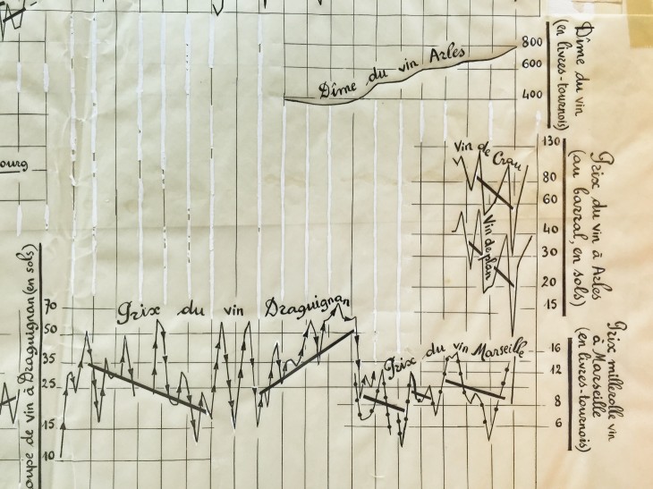
Note the amount of white-out used above to remove extraneous grid lines, and below to correct mistakes on the scatterplot.

I was also reminded of this in the Financial Visualization panel, where one of the speakers showed photos of the huge paper charts they have at Fidelity Investments for deep historical data (going back hundreds of years). Paper still has its uses.
In addition to being interesting because of Bertin's influence and foresight, this exhibit is also an important part of the culture of the visualization field. I hope we'll see more of these things, in particular based on physical artifacts. Perhaps somebody can dig up Tukey's materials, or put together a display of Bill Cleveland's early work – preferably without having to wait for him to pass away.
Running and Partying
The second VIS Run in recorded history took place on Wednesday, and that night also saw the West Coast Party, which is becoming a real tradition. The first session on Thursday morning was consequently quite sparsely attended.