Data visualization is often used to just display data, with little thought put into supporting visual thinking. Giving people tools to do some visual math is a good idea; the visual properties need to be picked carefully however, to make this work.
The following example is from the Census Data Visualization Gallery. Like many of the other visualizations there, it shows some good thinking but ultimately fails to do what it was designed to.
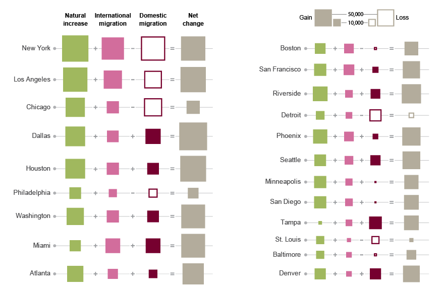
You don’t have to be Alberto Cairo to realize that using area here is problematic. Not only is it difficult to compare and properly read differences in area, it is also close to impossible to add areas to each other. The other problem is that the numbers here can be negative (which is also important for the story here, so this isn’t just an inconvenient detail), which area obviously cannot express. Using the outline to indicate negative numbers is a reasonable idea, since color is already used to indicate the different categories of numbers. It doesn’t help with the visual math though, and I’d argue that while you might have a chance to add up areas, even if it is hard and not very accurate, subtracting areas is pretty much hopeless.
An obvious alternative here is to use bars. Stacked bars naturally communicate the idea of parts adding up to a whole. Unfortunately, stacked bars cannot typically contain negative numbers, at least not in any visualization program I am aware of. I have seen some examples where people have drawn stacked bars by hand, with negative bars hanging off the positive ones (to the side), and then perhaps more sitting on some kind of ledge at their base. That is actually quite an effective way to communicate how things add up or where they are taken from, but it requires manual drawing.
Bars, in Columns
But the next best thing isn’t bad either: bars in columns. These don’t provide quite the same effective way to show how things add up, but they have some other advantages. They can express negative numbers, and they allow for some interaction that I’d argue is more useful and interesting than the visual math in this case.
The trick, if we are serious about the visual math, is to keep all the scales the same so that the bar lengths are comparable not only within each column, but between columns. That leads to some of the columns only containing short bars, since the values there are smaller than in the others. This could be a problem if the numbers were very different (i.e., the largest value being hundreds or thousands of times larger than the smallest), but that is not the case here.
What we gain, though, is the ability to sort by any column. That is useful, because it easily lets us answer a variety of questions: which cities get the most domestic migration? Which ones get the most international migration? Which ones have the most natural growth?

Click on the column headings to sort by natural growth, domestic migration, international migration, or net change instead of city name. Now compare to the original and tell me that this isn’t more informative and interesting.
Relative Change
An issue that is partly caused by the idea of visual math is the use of absolute numbers. It makes a lot more sense to add up people than percentages. But that also makes comparison between cities difficult. The largest metro area in this data set, New York, has over 19 million people, while the smallest, Denver, is just over 2.5 million.
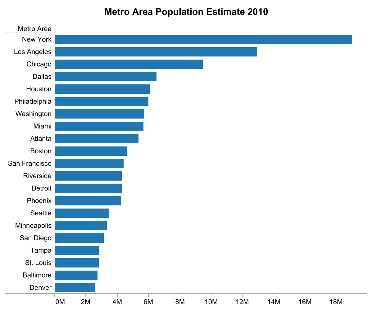
The number for, say, natural growth thus means something quite different for each of them (since you’d expect all cities to grow naturally by the same percentage, but not the same absolute number of people).
Looking at the number as a fraction instead makes the comparison more meaningful. I simply divided the growth numbers by the population, so the resulting numbers do not ave an interesting unit. In more statistically meaningful terms, it would make sense to be able to speak about growth per 100,000 people or similar. Either way, it turns out that the natural growth is the highest in New York when looked at in absolute terms (not surprising), but in the lower half as a percentage of total population.

Conclusion
Visual math is a good idea and has its place. But it needs to be used judiciously and with the right data. Especially when negative values are involved, the visual representation must be chosen very carefully, and the tools must be provided to deal with that.
Quite often, a novel or unusual representation gets in the way more than it helps, while a boring one like a bar chart would provide a lot more value; in particular, when interaction is involved.
Comments (10)
Posting new comments was disabled in 2020.