
Wether you believe that global warming is real or not, a bit of validation of the source data is still interesting. This is my second look at the global temperature data recently released by the UK's Met Office, this time using Tableau. There are some interesting data issues here, and a rather analytical visualization.
Data Preparation
The data contains monthly temperature averages for a total of 1718 weather stations across the globe. The first reports are from 1701, with the latest data from October 2009. The data is provided as a large number of files, one for each weather station. They contain information such as geographic location, country, height, etc. Missing or otherwise unavailable data is indicated by a temperature of -99. Out of about 1.6 million data points over 309 years, about 1.4 million are valid. All temperatures are in degrees Celsius (aka Centigrade).
I converted and reshaped the data into a CSV file that is much larger (because it contains a lot of redundancies), but that is much easier to work with in Tableau and other programs. This file also contains the continent classification and the first year of data recorded per station. You can also download my packaged Tableau workbook if you have Tableau or want to look at it in Tableau Reader.
While the overall data is nice and large, it also has a number of problems. The image below is from my first attempt at visualizing it using Protovis. The overall difference in temperature is suspiciously high, and there are some jumps that don't appear likely.

In particular, 1950-51 shows a jump over more than 2º, which is obviously impossible (the same difference takes over 100 years before that). A look at when stations came online gives a hint at the source of the problem

The huge spike in 1950 mostly contains new weather stations in Africa, which obviously leads to a higher overall average from then on. The other spikes are more evenly distributed, and do not contribute to the average in an obvious way.
This highlights the main problem with this data: sampling. What is a fair sampling? How do weather stations need to be distributed to get a good overall picture? And how can you add new stations without distorting (and perhaps invalidating) the comparison with before?
So I decided to take a conservative position and only use weather stations that had come online by 1901. The data only considers "good years," so 1901 being the first such year means that the station was providing reliable data at that point. This reduces the number of stations from 1718 to 443. By only considering data from these stations from 1901 forward, I ensure that I get data from all stations for the entire range of years (except for the occasional missing data). In addition, most analysis will be done by continent, to compare reasonably local data and not average over the entire world.
The following map shows all the stations in the data set. The coloring is by continent, according to the list of weather station codes. Note that Antarctica is considered part of South America, and Russia is split into a European and an Asian part.

This is the subset of stations that were added up to 1901:

The samples in the subset are much more centered around Europe, North America, and parts of Asia, with Africa, South America, and the Pacific being much more sparse.
The Analysis
Before diving into the details, here is the temporal overview. This chart shows worldwide averages from 1901 to 2009, for the subset of stations described above.

While the big jumps are gone, the overall trend is still there: temperatures are rising at around 0.1º per decade (p < 0.0001), in line with the general consensus
Looking at continents, the same overall pattern is visible as well, even though they obviously all have different average temperature zones. While it may look cluttered, this chart allows for easier comparison between the continents. The conveniently are also only a few overlaps.
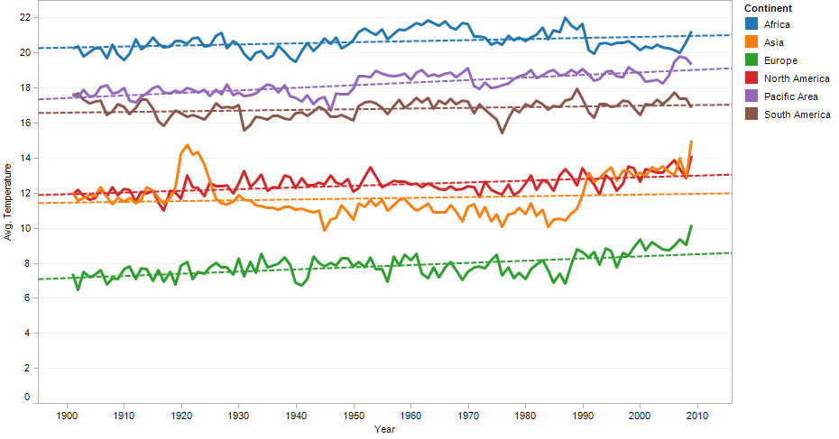
The grid lines are mainly there as reference for the direction of the trend lines. With all these lines at similar angles, it is easy to underestimate how steep they really are. The temperature rise varies between 0.03º per decade (South America) and 0.15º per decade (Pacific).
So far, there are really no surprises. That is a good thing, replicating results is what science is all about, after all. And it shows that my sample was well chosen, given that the actual scientists work with a variety of data sources, and obviously know a lot more about the actual phenomena.
What interested me more than the long-term differences was how the seasons change due to global warming. That was also the idea behind my flawed interactive visualization (which I will update with the data subset soon).
The following image shows the temperatures over the course of the year, with one line per decade (values are averaged), per continent. The color scale goes from blue (1900s) to orange (2000s), following Clint's suggestion in the comments. The reason for going by decade here is that there are considerable yearly fluctuations that make this chart nearly unreadable if done at that level.

Some interesting patterns emerge here. While it's not possible to see exactly which lines are which decade (the colors are too similar, and there is too much overplotting), this is really more about trends, which are quite apparent.
All continents except for South America show darker colors at the top, meaning that temperatures get warmer for most of the year. Africa gets warmer summers but cooler winters: note the orange lines at the bottom of the pack on each end. The two regions in the southern hemisphere are clearly visible because they have their minima in the middle of the year.
South America has a pattern that looks very similar to Africa, with warmer summers and colder winters (just at different times of the year). The Pacific and Asia have darker colors at the top and the bottom because they had some colder years in the 1970s and 1980s. These outliers do not invalidate the general trend, though.
The Conclusion
Analyzing this data was a lot more difficult than I expected. The naive approach of just throwing it all into Tableau and looking at some quick charts did not lead to very reliable results. There is still a lot more to be done (i.e., actually understanding some of the issues with data quality, as Kelly O'Day suggested), but I think this analysis is a good first step.
With all the talk about citizen journalists, scientists, etc., actually getting our hands on the real, (relatively) raw data is still quite amazing. Of course, this also requires a certain level of understanding and responsibility to not just tout the first pattern that happens to be visible and that fits your agenda. Also, if you don't believe climate change is real, this analysis (and the data) likely won't sway you. Clearly, the data must have been carefully manipulated before it was released.
The Met Office has promised more data, which should provide a stronger foundation for this analysis. There are also a number of other datasets available, with more coming out. This is a great opportunity to show what we can do with this data visually, and to provide easier ways for people to understand what's actually behind all that talk of global warming.
Comments (23)
Posting new comments was disabled in 2020.