Last week, I gave one of the visualization primer talks at BioVis in Dublin. My goal was to show people some examples, but also criticize the rather poor visualization culture in bioinformatics and challenge people to do better. Here is a write-up of that talk.
Seán O’Donoghue introduced me by calling me “infamous” for speaking my mind and criticizing things, which was the perfect setup for my talk. I had originally planned a more academic talk about data mapping etc., but I think this will have more impact in the end. Also, it was more fun to prepare and deliver.

Title slides are pretty boring, but I’m using this again later on. The translations into gaelic are courtesy of Google Translate and, I’m told, not terribly accurate (in particular when it comes to the word visualize…).

Hi, I’m Robert. I work at Tableau. I live in Seattle. It doesn’t actually take twelve hours to get to Dublin from Seattle, more like ten. And I didn’t just come to Europe for this talk, I spent the beginning of the week in London at our Tableau Conference on Tour in London (the talk was on Friday).

Obligatory dog photo (I’m probably going to retire this one now). I spend my time frolicking in the sun, and…

…doing research. I’ve been soft-launching our Tableau Research website in several talks now, so I might as well make it a bit more official. The site is not entirely done, but it has some information on the people doing research at Tableau (beyond just the core research team – the best-looking research team in the industry!), as well as a list of publications. We also have job openings in research, in particular for people with backgrounds in machine learning and databases (these are linked from there).
So, the talk. The initial title was meant to be a bit provocative: tell people at Biovis how to visualize data. Depending on how you look at it, this might seem like a huge task, or pretty trivial. Either way, I started hating the title the moment I actually started putting the talk together.
There is a much more pressing question. The how is important, but it is only relevant if we figure something else out first.
The why. In particular in bioinformatics, that question is clearly not asked often enough. There is a lot of thoughtless work being done by people not asking that question.
Alternative title. Words, they meant things. Pictures, they mean things. This is important to recognize if you want to do visualization work that’s any good.
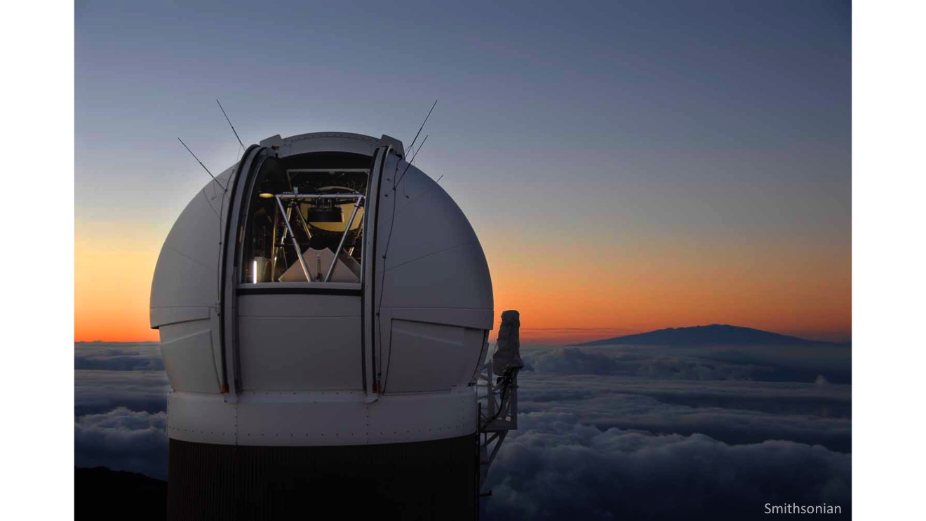
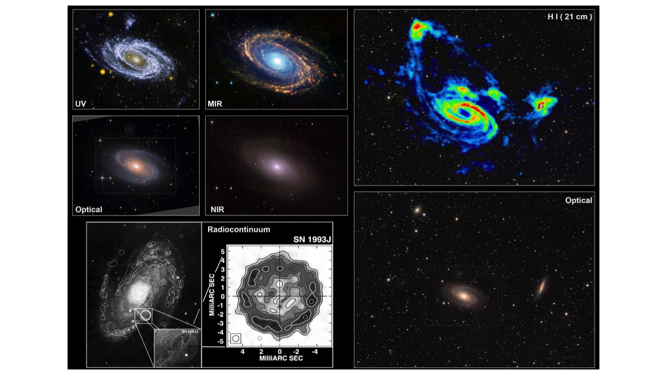
Let’s look at some other sciences and how they approach images. Let’s say you’re an astronomer and you’re trying to learn something about the stars. How do you do that? They’re too far away! You can’t see them!
The answer is to build a telescope, of course. A telescope lets you see things that are too far away.
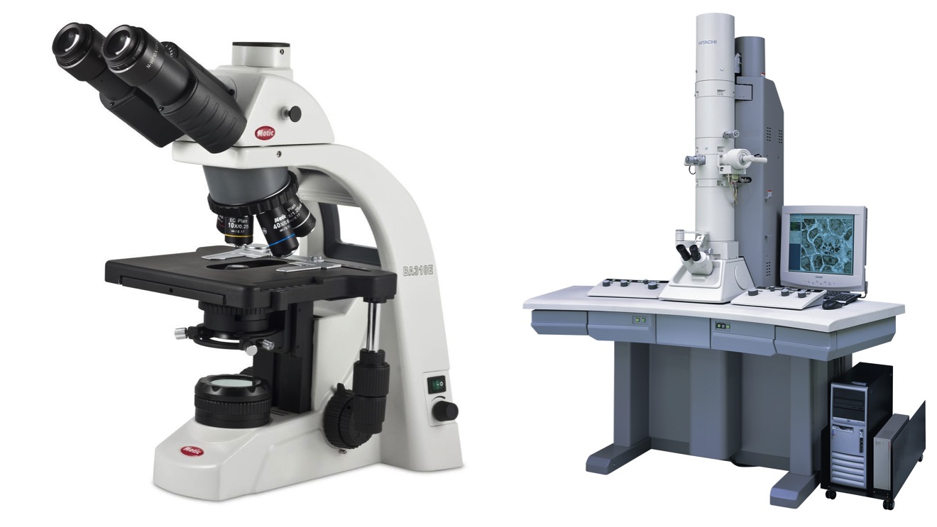
A bit closer to the bioinformatics crowd: imagine you’re a biologist studying single-cell organisms of some sort. How do you do that? They’re too small! You can’t see them!
The answer is to get a microscope, of course. A microscope lets you see things that are too small.
Now let’s think about data. Imagine you’re trying to understand data. How do you do that? We can’t perceive data. We can’t smell it, we can’t taste it, we can’t see it.
The answer is to enlist the help of our friend, the computer. Using tools to turn data into pictures lets us perceive data.
But wait. I’ve only talked about the apparatus so far. But there is a lot more to these things. Astronomers don’t just sit there every night, staring into the sky with their telescopes. Instead, they actively ask questions and then figure out how they might answer them. To do this, they might use different imaging modalities and wavelengths, like infrared or x-ray, and lots of other tools.

Same with biologists. You don’t actually see much when just put a sample under the microscope, you have to prepare it. Samples are frozen and cut into extremely thin slices with a microtome, they are stained to reveal certain structures or types of microorganisms, etc. Just staring into the microscope only gets you so far.
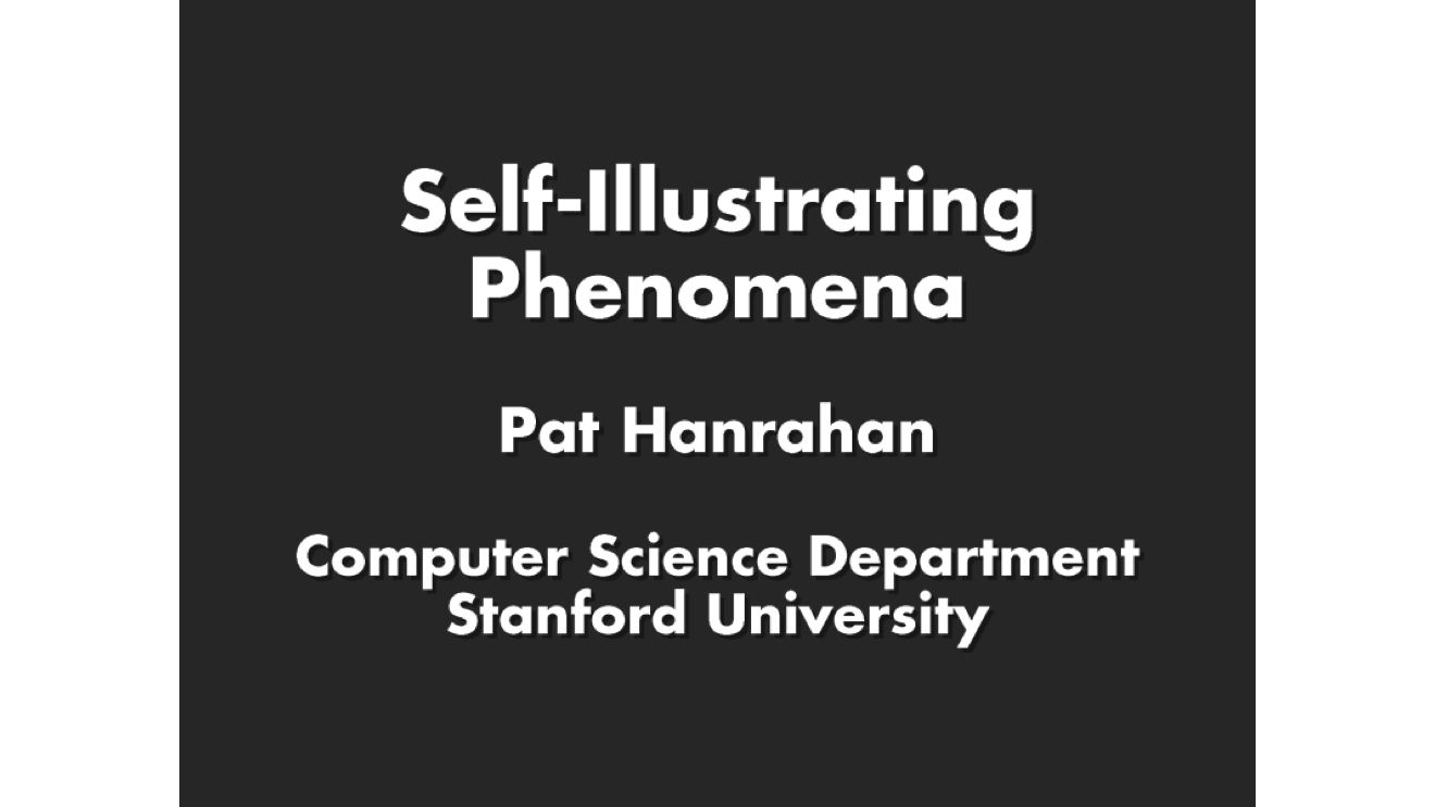
A brief excursion here. Pat Hanrahan gave the capstone at Vis 2004. It’s a talk that I still remember well, first because I found it fascinating when I saw it, but then because it kept bothering me. Pat talked about self-illustrating phenomena, here are a few slides from that talk.

Among the examples he used was this wonderful picture showing the flow vortices created by a plane, made visible by the cloud layer right underneath and behind it. It’s a beautiful picture.
But Pat didn’t take this with his cell phone from his window seat (that would have been an incredibly dangerous situation!). Instead, this shot was meticulously planned and expertly executed by people who know what they were looking for. This image is not an accident. It’s certainly not self-illustrating.

Similarly, Pat cited William Herschel’s discovery of infrared light in 1800. Herschel set up this brilliant experiment to show that components of sunlight were not visible. He darkened a room so that light could only enter through a small opening. That is where he placed a glass prism that would separate the colors of light into a rainbow pattern (they’re labeled in the illustration). He then placed thermometers in an area where there apparently was no light and, crucially, also in areas where no light could conceivably fall. The difference in temperature between those thermometers showed that there was light beyond what we could see.
It’s an incredibly smart experiment, but hardly self-illustrating. It must have taken Herschel weeks if not more to figure out how to do this.

This is James Watt’s steam indicator, a tool to measure the stroke and power output of steam engines. The way this work is that a pen is attached to a lever that is moved in two directions: one is the piston as it moves back and forth during one steam cycle, the other the amount of pressure in the chamber. The area inside the curve is a measure of the total power the engine is putting out, and parts of the curve can be read to learn more about how well the engine is running. This is such a powerful analysis tool, actually, that Watt kept it secret for as long as he could to reap its competitive advantage.
Anyway, this is not something that just happened by itself. A mechanism had to be devised and constructed that would do this. You’re not just reading the little puffs of steam released by the engine here.
All these examples are very elaborate setups that produced these images. It's important to understand that these weren't just created for fun or to make something pretty, they were tools to explore phenomena, proof points, and understand the world.
Visual tools are intentional. They are created by people, they don’t just happen. But the intent isn’t always clear, and often what works for one purpose does not for another.
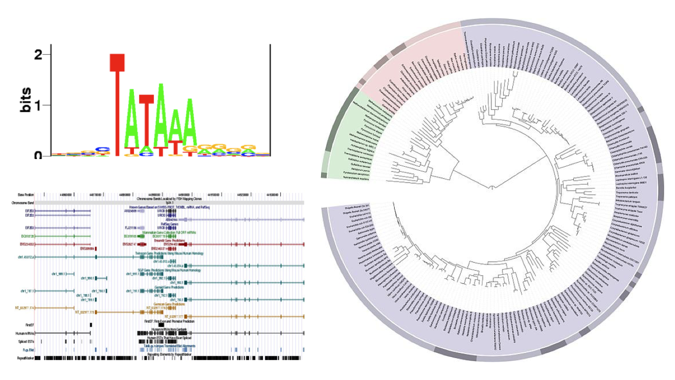
Here are some random examples I picked that represent a few common tropes in bioinformatics. The circular dendrogram on the right, the genome browser on the bottom left, and whatever that thing is in the upper left. What is that thing, anyway? Why use letters to show data?
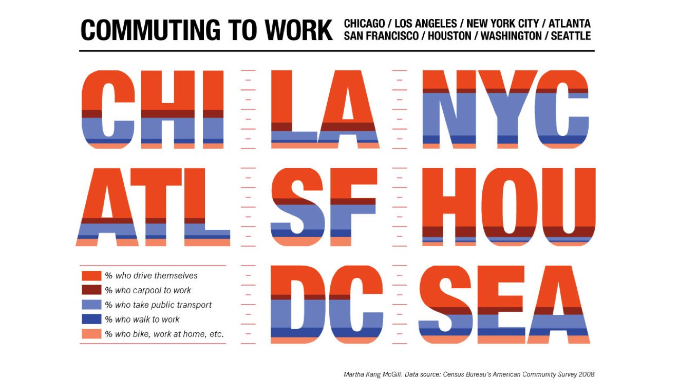
Letters are a bad way to represent data. Here is an example from a different domain, since it’s easier to see problems when looking at stuff outside your own field. This visualization represents different ways people get to work in different cities in the U.S. At first, you only see the letters and wonder what they tell you. Then you notice the colors and figure out that it’s really a set of stacked bar charts.
It’s not even a terrible chart, but it has its problems, The shapes make comparison harder, in particular angled and rounded ones. And getting a sense of the overall distribution is impossible since the horizontal component is randomly wider or narrower not because of data, but because of letter shapes.
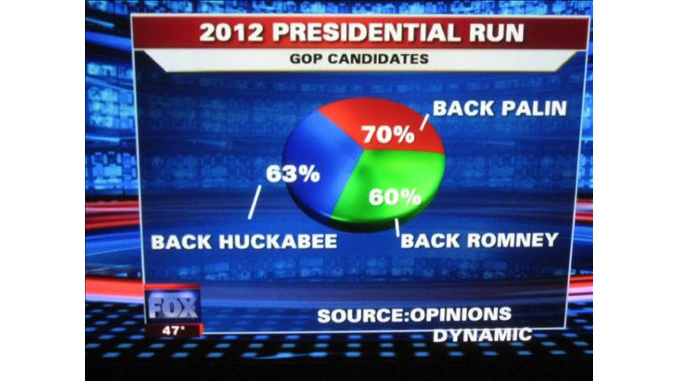
There are many bad charts out there. What interests me here is not so much that they’re bad, but why. This example is famous: a pie chart where the percentages sum to 163%. Why make a pie chart? Who thought this was the right way to show the data? Clearly, people could pick more than one candidate, so the total didn’t add up to 100%. But then, why show it like this?
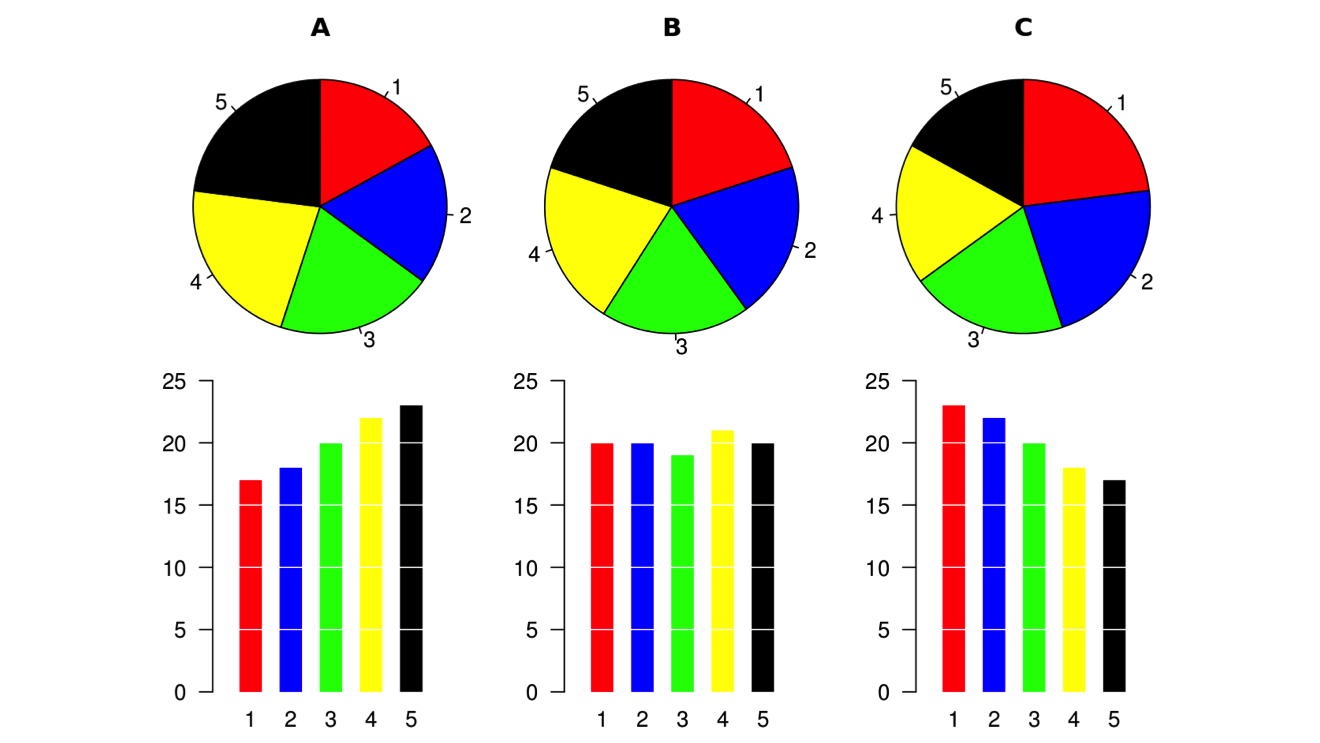
People often make fun of pie charts, to the point of thinking that pie charts are always bad. But that’s not true. Pie charts are not the problem. Using the wrong is. Here’s a great illustration I stole from Wikipedia. It shows how hard it is to compare slices when the differences are small.
But pie charts work when the number of slices is small and the values are different enough to make comparison easier.

Speaking of pie charts, here’s one of my favorites. This shows the population of the 56 states and territories of the United States. This was on the Wikipedia page for the list of states for a while, and was removed after I complained about it.
It’s not only bad because the slices are too small, it’s also bad because there’s no way to pick 56 different colors that people can actually differentiate. But more interestingly, look at the last dozen or so slices: whoever made this realized that the labels were getting too small, so he or she combined them into an other category. Even so, the visual slices are still all there without any sort of labeling or purpose.
Again, what interests me is not the criticism, because that is too easy. What interests me is the why. Why was this made? Why was this uploaded to Wikipedia? How did anybody think this was a useful chart?
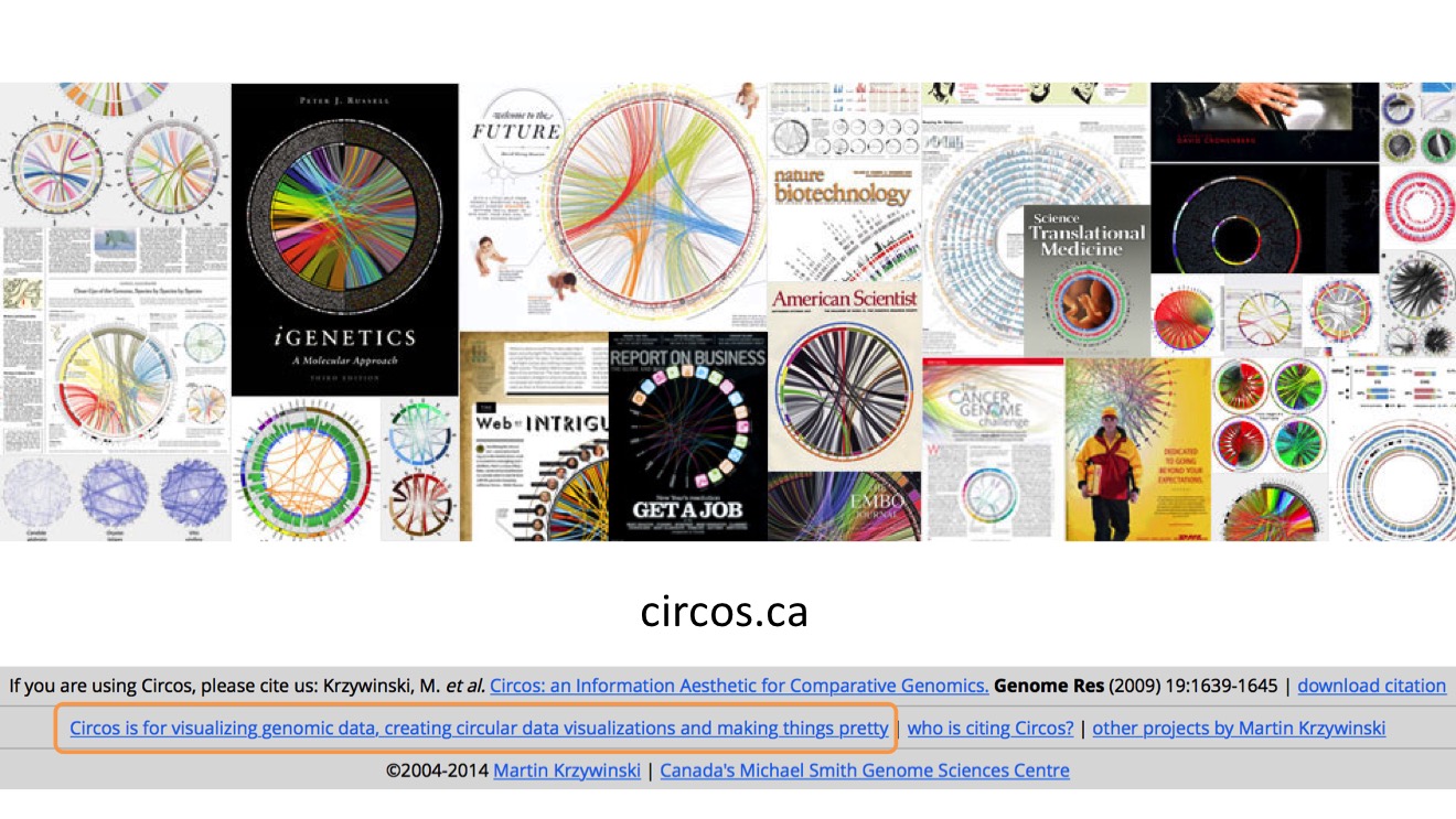
This transition is not just an accident. Circos is a popular technique used in bioinformatics, but I question how often it actually helps people gain insights, and how often it’s used to dress up data and hope to get onto the cover of a glossy like Science or Nature.
And it’s not even just me saying this. Martin Krzywinski, who created Circos, says so right in the footer of his website: Circos is for visualizing genomic data, creating circular data visualizations, and making things pretty.

I saw a talk at The Graphical Web conference last year by Nikola Sander and others of the Austrian Academy of Sciences, where they talked about how they had used Circos to get people’s attention (instead of their boring tables and maps), and to get a paper onto the cover of Science.
Now I’m not against presentation at all. But it needs to be understood what the respective goals are, and when to use what. And it’s almost becoming a cliche that Circos gets you onto the cover. That’s not the right basis to choose a visualization method.
Now why do we need all these visualization techniques? Why bother with different representation? The answer should be familiar to bioinformaticians: evolution. We did not evolve to be plugged into the matrix or sit in front of computers all day ingesting data. We need a bit of help.
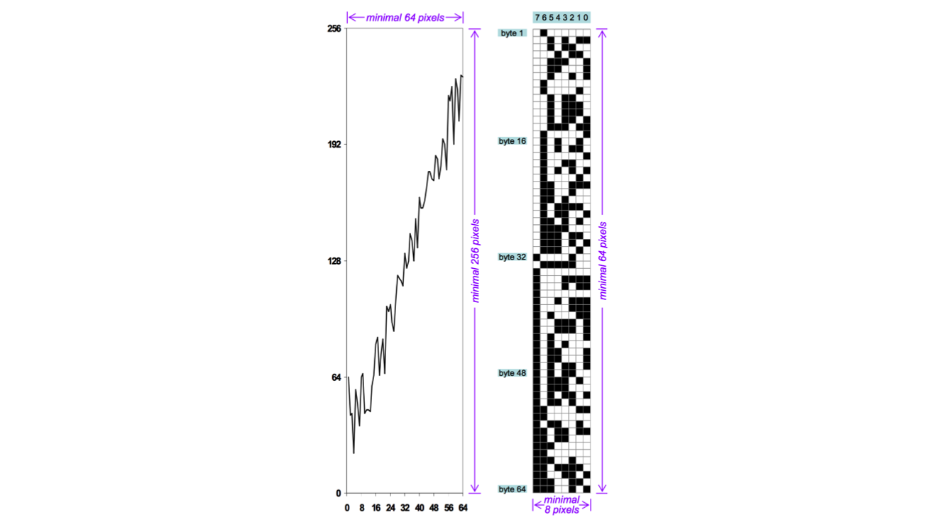
I love this image from the paper by Min Chen and Heike Jänicke. It shows the amount of information in a real, useful chart (on the left) and a theoretical optimal representation on the right. The actual information in the chart is 64 data points with a resolution of 8 bits each. That means 64 bytes or 512 bits of real information, but in the image they are represented on a 64x256 grid, which means 16,384 bits are needed to show the data (32 times as much!).
This is not efficient, but the representation on the right is clearly not readable or useful to a human.
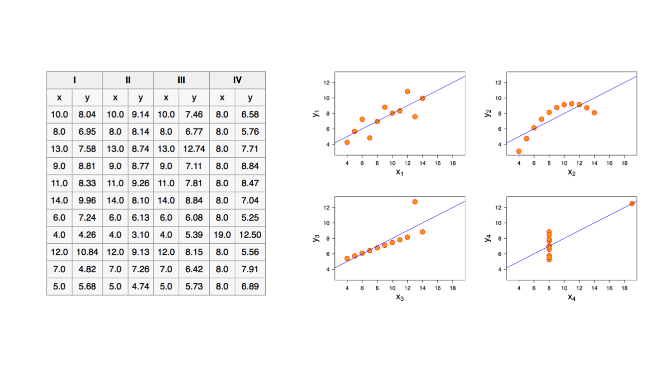
This is a famous example that helps make the same point (I first showed the numbers and asked if anybody recognized them, and a handful of people did). It is called Anscombe’s Quartet. These are four data series with identical means and medians on both axes, and even the regressions look identical. Yet they are quite different, as you can see when creating simple scatter plots of the data.
So showing the data is useful, but just any representation isn’t going to cut it. It needs to fit an actual question.
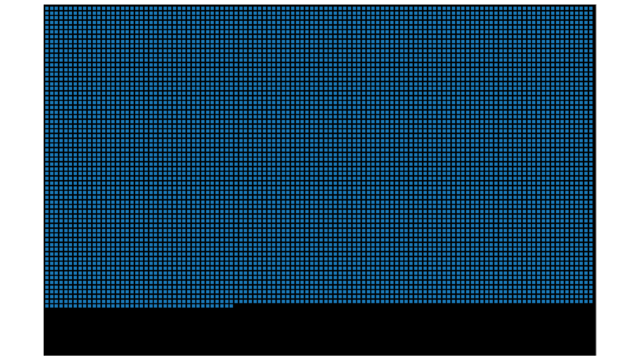
My colleague Jeff Pettiross was interested in looking at data from the Kepler space telescope (which is looking for planets around distant stars). He downloaded some data to find out how many Earth-like planets had been found. This is the first image, simply showing all the records. This is the genome browser of planet hunting: all the data is there, but it’s not shown in a way that helps you make sense of it.

Next he colored the data points: orange are confirmed planets, blue are candidates, and gray are what has turned out to be false positives: there are other explanations for what seemed like planets at first.
(I chose this example because of the similarities with genome browsers: there are annotations for putative and confirmed proteins and other structures, and I can imagine showing false positives as well – no idea if that’s actually being done though).

There are other questions you can ask, like what is the distribution of those planets? Do they all occur in certain areas? So here is a view that maps the planets to their position in the night sky. But whoa, what is that? Is that a glitch in the matrix? Dark matter? Are we seeing some sort of cosmic superstructure here?

Actually, no. This is what the imaging sensor on board the Kepler telescope looks like. Uncovering artifacts like this is – or should be! – an issue in bioinformatics as well.

There are other ways of looking at this, too. What if we showed the entire sky around us, how much does Kepler actually cover? It turns out that it’s staring very intently at a very small part of the sky.
(Somebody pointed out to me after the talk that this mapping was akin to the Mercator projection, which overstates the areas further away from the equator. So the area is actually much smaller!)
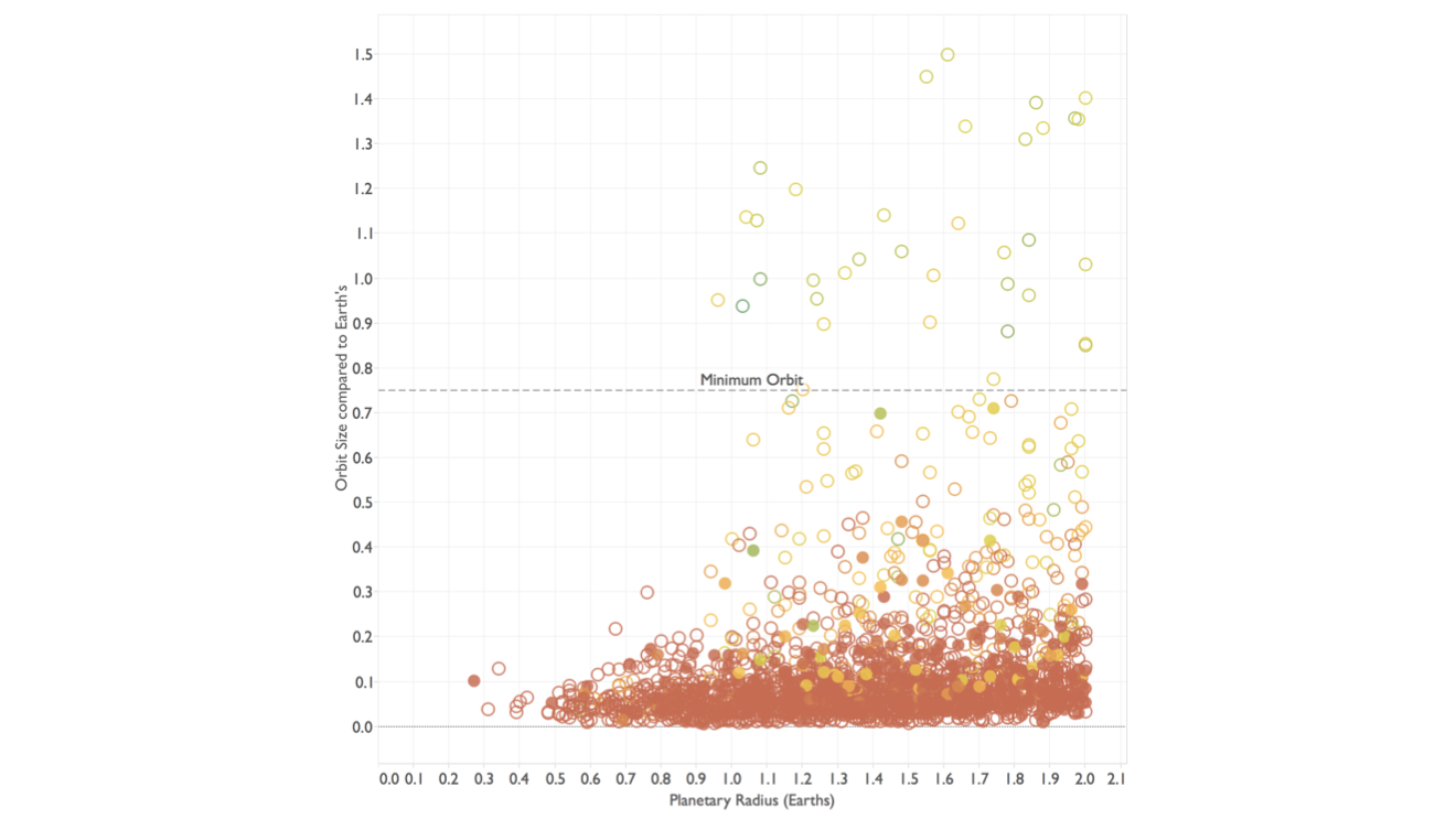
But let’s not lose track of what we were after here: finding space aliens on Earth-like planets. So let’s switch from the browser to a view that lets us ask a question. This shows the planets by their size and the size of their orbit, both relative to Earth’s size and orbit, respectively. Planets too close to their star are too hot for liquid water to exist, so we need to find a cutoff from which we expect the planet to be able to at least have water.
This is an important step, and one that I find to still be fairly uncommon in bioinformatics: the data is shown in a way that is too literal, and there are often no views that allow the user to directly ask questions rather than look through the data.

As a little interlude, I was showing this image of the bathroom signs at the Montcalm Hotel in London where TC On Tour had taken place. Hotel employees all wear these bowler hats, and their signs represent this in a way that you might consider whimsical or silly.
Either way, consider how much visual information is used here to represent one bit of information: left or right!
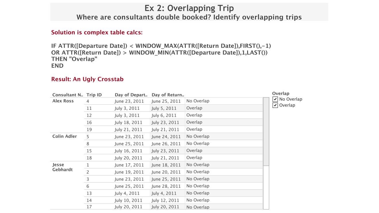
At that conference my colleague Bethany Lyons, a product consultant in our London office and a table calculations wizard, had shown me this example. She had been asked to figure out a way to calculate overlaps between intervals like trips by different people (this generalizes to lots of other things like projects, allocations of resources like machines, etc.) and create a list of those.
You can do this, but it requires some trickery in Tableau, which is tedious and results in some expensive queries and calculations. And in the end, you have a list (which is what the customer wanted), but what does that even tell you? There’s really little to be gained from this.

Instead, she said, why not just look at it? Creating this chart is much easier, and by adjusting the transparency, you can see the overlaps very clearly. What is more, you can see overlaps between more than just two intervals, and see how often they occur for different people, etc. This view is much easier to read and provides more information by giving you additional context..
The art of visual problem solving has become lost a bit because computers can calculate so many things so fast that would have been done visually in the past. But as this example so nicely illustrates, there is a lot to be gained still from making the construction of the chart less time-consuming, and of course gaining more information than just a simple list.

This is the model we use of the way visualization works, it’s called the cycle of visual analysis. It starts at the top, with a question or task. To answer it, you go find some data, figure out a visual mapping, and try to understand what it’s showing you. From that, you develop some amazing insights that you then turn into action (a decision, a recommendation, etc.). Of course, in practice that never actually works, which is why there are all those arrows through the center of the circle: you find that you need more data, different visualizations, that your task isn’t clearly enough defined, etc. This also looks a lot like science.
Either way, it is a deliberate process that is governed by the task at hand, not the tools. The tools must never dictate what you do.
(At this point, I was going to show the Tenure Pipeline at Harvard Business School example, but had to skip that because I was running out of time. Since my slides only contained the images from that anyway, I’m just linking to it rather than including those slides here.)

My final example is from another scientific paper outside of bioinformatics, but I think it nicely illustrates the difference between just making a chart and making it useful. This paper was published a number of years ago in the Archives of General Psychiatrics. It compares three different ways of assessing kids for autism and autism spectrum disorders and compares the accuracy of those diagnostic tools.

This was its first image. Somebody posted this as a challenge, to ask if anybody could do better than this. Challenge accepted!
Venn diagrams are among the most misused visualizations. They’re nice as teaching tools for understanding basic sets, but they’re really of no use for data visualization. (I went on a bit of a rant at this point, and I think I made my point – people came to me afterwards to discuss this with me).
Look at the numbers I’ve highlighted: 23 and 51 cases, 17% and 98%. The areas don’t correspond to either of those. What does the area represent? Nothing. All this does is show you the fact that three sets have eight possible combinations. A table would have shown the same data and been less confusing.

I took the numbers and turned them into a simple bar chart, sorted by how well each combination did. I then added the number of cases underneath and grayed out the bars where that number was very small. I figure out what each bar represented in terms of sets, and that turned out to be quite interesting: the Clinician had the most impact, followed by ADI-R, and finally PL-ADOS. The left chart shows this for autism, the right one for autism spectrum. This is now an actually useful figure that adds value: it shows the numbers in a meaningful way, and it provides analysis.
(I removed all the build-ups from the slides I'm showing, including from this one. I showed each component separately, so this was clearer than it appears here. I have a write-up of this here and another one here though, so you can get a lot more detail.)

We often start by asking how to visualize data. That’s a reasonable question, but I think it’s the much less important one. It doesn’t get to the heart of the issue, and it often leads to poor choices.

Instead, the question must be why. What is it that I’m trying to do here? What do I want to get out of this? Why visualize the data in the first place? What is the actual goal of this?
That question is much more helpful and leads to much better decisions. It’s also a harder question to ask, perhaps, but it’s definitely worth it.

I like to end my talks with pointers, so I showed these three books. I’ve reviewed Isabel Meirelles’ Design for Information and Alberto Cairo’s The Functional Art at length here, and will add Tamara Munzner’s Visualization Analysis and Design shortly. All three of these address the why in addition to the how.
And with that, I thank you for your attention and I’m happy to answer any questions!
I actually got some questions and got into a little argument with Raghu Machiraju about what self-illustrating phenomena really are. I also had a few people talk to me afterwards who said they liked the talk. And to my great satisfaction, somebody tweeted the key take-away, giving me some confidence that I did succeed in getting my point across.
Comments (1)
Posting new comments was disabled in 2020.