• Skip to main content
  • Skip to primary sidebar
  • Skip to footer

eagereyes

Visualization and Visual Communication

  • Explore
    • Starter Pack
    • Blog Calendar
    • Blogroll
    • eagereyesTV YouTube Videos
  • Practical
    • Basics
    • Pie Charts
    • Techniques
    • Book Reviews
    • Journalism
  • Academic
    • Speaking Mistakes
    • Acceptance Rates
    • Papers
    • Conference Reports
    • Lists of Influences
    • Criticism
    • Peer Review
  • Admin
    • About
    • Contact
    • License

Robert Kosara / September 4, 2007

Caring about the Data

Titanic visualizations

When demonstrating Parallel Sets to guests and visitors, I often use the Titanic data set, because people can relate to it and it is entirely categorical. I like pointing out interesting facts the visualization shows (like that the second class was smaller than the first class), but it’s really just a collection of numbers to show what the visualization can do. Some of the people I have shown this to feel different about it, though.

Perhaps the first reaction that made me think of the Titanic as not just numbers was an artist who asked me how I could present such a horrible incident with such lovely colors. Of course I was aware that almost 1500 people died when the Titanic sank, and most of them in horrible ways. But it’s also almost 100 years ago now and just so abstract and distant that it never occurred to me to be specifically sensitive about it.

Titanic visualization using parallel sets. Too neat and colorful?

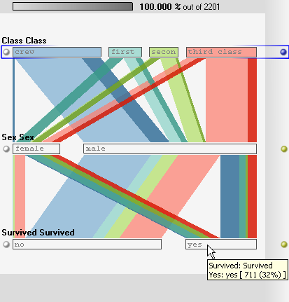
Another incident involved a Titanic buff who pointed out an error in the data: the only girl in the first class did not survive (as our data says), but rather drowned because here parents would not let her get into a life boat without them. This was another thing I was not prepared for, because first of all I assumed the data set to be correct, and second I was only using it to show off a visualization method, why would I care about the correctness of the data?

Titanic visualization using an information graphics style. Easy to read, but every figure represents a number of people. Also perhaps a bit too playful?

Of course, telling a good story about a data set requires understanding and interest. The impact of Hans Rosling’s TED talk (which I keep linking because it has made a lot of visualization people rethink why they do what they do) comes as much from his obvious interest in the data (and its relevance) as from his presentation style and gapminder graphics. Would we care that much about a presentation that just used the data to show off the gapminder visualization?

Interesting in this regard is also Swivel’s official source program, which allows organizations (like UNESCO, WHO, OECD, etc.) to publish their own data directly on Swivel, providing trustworthy data for people to scrutinize and compare with other data. Swivel’s focus is clearly not visualization (and I like to chastise them for that), but the data. Is this a good approach? Not if you’re only looking for the best visualization techniques, but in terms of data availability and analysis, it’s an absolute necessity to build credibility and a stock of relevant and interesting data sets.

Titanic visualization using an extended pie chart. Each dot represents a person; color, size, and placement describe properties sex, age, and class/survival, respectively.

Ultimately, who cares about a visualization or a particular statistical method to figure something out? The only people who even know about John Snow’s use of graphics are visualization people, but I doubt that the people cared whose lives he saved. What counts are the outcomes, not the tools that get you there.

Does that mean visualization is irrelevant? Of course not. But we need to understand the context we are working in and we must become better at telling stories about the data. The only way to do that is to care about the data we are analyzing at least as much as about the new visualization technique we developed just for it.

Filed Under: Blog 2007

Robert Kosara is Data Visualization Developer at Observable. Before that, he was Research Scientist at Tableau Software (2012–2022) and Associate Professor of Computer Science (2005–2012). His research focus is the communication of data using visualization. In addition to blogging, Robert also runs and tweets. Read More…

Reader Interactions

Comments

  1. Nathan says

    September 5, 2007 at 12:04 am

    Absolutely. Context is super important and I think, unfortunately, a lot is lost when data is shared between people and groups. It’s like a game a of telephone where we have no idea what the data is going to look like at the end of the line.

    Reply
  2. Tom Carden says

    September 5, 2007 at 1:22 pm

    I finished a recent blog post with some open questions along a similar theme:
    "It’s a fairly regular topic of conversation at Stamen: how can you make a visualisation of e.g. 911 calls actually look like emergencies, and not birthday parties or toilet flushes, without freaking people out and without making it mundane? Is it possible to use great circles to connect air travel destinations without it looking like missiles? Can you animate growing and shrinking red and yellow circles on an aerial map without it looking like Gulf War I weapons company propaganda?"

    More at http://www.tom-carden.co.uk/2007/09/04/designyahoo-web-20-meets-war-games/

    Reply
  3. Hadley Wickham says

    September 6, 2007 at 12:03 pm

    Your parallel sets visualisation reminded me of the rather lovely hammock plots by Matt Schonlau, http://www.schonlau.net/publication/03jsm_hammockplot.pdf. You don’t reference them in your paper, so perhaps you haven’t seen them before.

    Reply
  4. Robert Kosara says

    September 7, 2007 at 10:02 am

    I haven’t seen them, thanks for the pointer! There are a number of variations of parallel coordinates like that, but they all have their shortcomings. Set-based approaches like treemaps, Mondrian, and parallel sets are more useful for most of the questions people like to ask about categorical data. We are working on a taxonomy paper and some new ideas in that direction, so the input is appreciated.

    Reply
  5. Hadley Wickham says

    September 7, 2007 at 1:48 pm

    What do you think are the questions that people ask about categorical data? Many of the “statistically” interesting questions, e.g. are these two categorical variables independent, can not easily be answered with treemaps or parallel sets. (And you mean mosaic plots, not Mondrian, right?)

    (It’s also Hofmann not Hoffman for the mosaic plots paper – and you should probably check out her more recent work, e.g. H. Hofmann. Constructing and reading mosaicplots. Computational Statistics and Data Analysis, 43(4):565–580, 2003)

    Reply
  6. Robert Kosara says

    September 7, 2007 at 3:38 pm

    I was thinking of the Mondrian program, which is of course an implementation of Mosaic plots. Sorry about the typo in the name.

    I’m thinking of questions like "how many of the women in the first class survived?", "Was it more likely for a child to survive in the third class than a man in the second class?", etc. So these are questions about subsets, which cannot be answered easily with techniques that just space out points on a parallel coordinates view (though I haven’t actually read the hammock plots paper so far, so I can’t say if I may be wrong in my categorizing it), because those show you individual data points (that tend to all converge to one point, too) rather than how many items or how many percent there were in each subset.

    Reply
  7. elias says

    September 7, 2007 at 4:56 pm

    Aren’t good visualizations supposed to trigger questions?

    Reply
  8. Hadley Wickham says

    September 10, 2007 at 3:31 pm

    Those seem like low level questions (and I agree that pcp’s don’t make answering them easily). Could you just answer them with a table? Questions that seem more interesting to me are: how does this categorical variable affect this continuous variable? How are these two categorical variables related? Does conditioning on this cat. variable change the relationship between these two continuous variables? The titanic dataset is interesting, but in real-life most datasets have both continuous and categorical variables (see http://lib.stat.cmu.edu/S/Harrell/data/descriptions/titanic.html for a titanic dataset with a slightly richer set of variables)

    How do you think parallel sets compares to using simple bar chars/spineplots + linked brushing?

    Reply
  9. Hadley Wickham says

    September 10, 2007 at 3:33 pm

    Aren’t good visualisations supposed to answer questions too? And what questions should a visualisation trigger? (Presumably not questions like: “What does that label say? I can’t read it because it’s so small”)

    Reply

Leave a Reply Cancel reply

This site uses Akismet to reduce spam. Learn how your comment data is processed.

Primary Sidebar

More Blog 2007 Articles

  • Expressive Visualization, Updated Presidents Chart
  • InfoVis 2007: InfoVis for the Masses
  • Further Steps Towards World Visualization Day
  • InfoVis Panel: The Impact of Social Data Visualization
  • A Nobel Prize for Charts

Recently Popular

  • Data: Continuous vs. Categorical
  • Midjourney is a Trip
  • Watch My Outlier Talk: This Should Have Been A Bar Chart!
  • The Simple Way to Scrape an HTML Table: Google Docs
  • New video: Gauges for Data Visualization, The NY Times Election Needle, and Circular Bar Charts
  • Continuous Values and Baselines
  • Paper: More Than Meets the Eye: A Closer Look at Encodings in Visualization
  • Facebook
  • GitHub
  • LinkedIn
  • RSS
  • Twitter
  • YouTube

Subscribe via Email

Footer

  • About
  • Contact
  • License

Copyright © 2006–2022 Robert Kosara · All original materials are available under CC-BY-SA