
I recently criticized Ben Fry's visualization of health care cost data from GE and claimed that I knew how to do it better. While my analysis may not be as pretty and flashy as Fry's, it provides actual insight into the data. It also reveals an interesting issue: the data is really dull. So dull, in fact, that a visualization was needed to cover up that fact.
My original plan had been to create something interactive, but I simply lack the time to do that right now. So the analysis was done in Tableau and is presented here as images. If you have Tableau, you can also grab my packaged Tableau workbook to play with, or download the data in a consolidated and reshaped CSV file.
The data was extracted from the applet on GE's Health Costs page. Tom Carden pointed out how to interpret the original data and produced some first graphs; Martin Theus also provided an analysis. While they both found some first trends, I don't believe they really got to the bottom of this.
Overview
To get a first idea of the data, let's look at the number of patients and cost over age. The age range here is actually wider than what the original applet showed: from 1 to 79 years of age (the data even contains an age 0, which I discarded).

Not surprisingly, the number of patients increases with age up to the mid-50s and early 60s, and then decreases again. Note that these are absolute numbers that have no discernible relationship to the U.S. population as a whole. Not surprisingly, the costs very closely mirror the number of patients, with a skew towards older patients. In fact, the correlation appears to be so strong that I had to look at it in a separate chart.
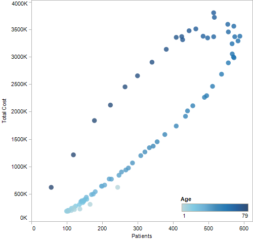
The shade of blue here represents age, with lighter shades being younger, darker older. As people get older, the costs increase; but the overall correlation is incredibly strong. This makes exploration of this data by users somewhat pointless, but more on that below.
Tom and Martin used stacked bar charts to summarize the data, though I don't find those particularly useful in and of themselves. A stacked chart does provide some context for the following analysis, though.

We see that the most common disease is hypertension (dark purple), and that osteoporosis (dark brown), diabetes (light green), and acid reflux (dark blue) seem to be the other major ones across most of the age range.
Drilling Down
My original idea for a redesign of the visualization was to use small multiples. This is very easy to do in Tableau, and much more useful to see actual patterns (without different categories distorting each other). Ignoring the less common diseases, we get a very clear, concise chart.

This visualization shows percent of the total number of patients at each age, so patterns do not depend on the considerable differences in the number of people in the data set over the ages (a chart showing patient numbers is at the very top of this page). It answers the original question I had when I saw the applet, but was not able to answer using it: what is the distribution of diseases over time?
Some interesting patterns emerge here. Acid reflux has its biggest spike at age 1, and then only really comes back in the late 20s. Asthma seems to be much more prevalent with children and teenagers than people over 20. Chronic sinusitis is common among children and then very slowly drops off as people get older. Depression has its peak around age 20 and drops off considerably with age. Diabetes, hypertension, and osteoporosis are the problems that get more severe as people get older.
Of course, GE thought people would be interested in cost. So let's look at hypertension: number of patients, total cost, and cost per patient. The bottom chart essentially shows what the scatterplot showed above, but in this case only for one disease.

Apart from some noise at ages below 20 (where there are very few patients), there is a very clear and smooth upwards trend in cost per patient. It's not surprising, since older patients presumably need more care, surgery, etc. What this does show, though, is that the costs continue until the end, because I decoupled them from the sample size. The applet did not do that, but inexplicably showed shrinking pie slices over age 70 or so.
The trend is to be expected, and while you may or may not have predicted it to look exactly like this, it's not really very exciting. Healthcare costs more as people get older, big surprise.
One question (potential) patients as well as GE should be interested in is what fraction of the cost the patient pays compared to the insurer. So let's look at this in yet another bar chart: insurer cost is at the top, patient/personal cost in the middle, and the personal cost as a fraction of total cost at the bottom.

Another dull chart! The percentage is around 18% on average, with a very slow downwards trend with age. This chart could easily be summarized in a single number. Or maybe in another scatterplot to show how closely the two costs correlate:

This is even stronger than the cost vs. age chart above. It's really pointless to even show that information (like Fry's applet does with the two colors in every wedge) if it doesn't change in a meaningful way over time or within subsets of the data.
The Point of Showing Data
There is something even more concerning that I discovered here than simply a bad chart: a gratuitous visualization. The data is mind-numbingly dull. The pretty, interactive, animated visualization was simply there to cover up that fact. Perhaps if people can play with a rotating pie thingy they won't actually question the data?
If this was really about information, a few numbers or a few simple charts would have provided a lot more insight. They would also have been more honest. Look, people get more sick and they cost more as they get older. Hypertension, diabetes, osteoporosis, and acid reflux are the big issues (it's interesting that they left out cancer, btw). You pay about 20% of the actual costs. That's it.
That would have been much less interesting to look at, but people would have gotten something out of it. So what is (or should be) the priority here: entertainment or information? Is making something look a lot more complex than it is an honest way of presenting data? Would people feel cheated if they saw the summary after playing with the applet for a few minutes and not learning anything? Or is the engagement the only thing that really matters?
These questions may sound biased, but I am really interested in finding this out. What is the right way to present data? What do people really care about?
Making It Better
Given the data, I think there are better ways than an interactive visualization for this kind of information. Why not make it a quiz? Show some distributions over age and have people guess which one is which disease. I'm sure there are some more interesting patterns in the other diseases, even if they don't make up a large portion of the data. But the point here would be to present different qualities of distributions, not just the biggest issues. These wouldn't even have to just be aggregated by year, perhaps seasonal distributions would be interesting, too.
Another part of the game could be to present the distribution of two or three diseases and have the user guess the age at which this configuration occurs. Do that based on percent of patients or percent of costs. All of these things could be accompanied by numbers showing total costs (since that is apparently what GE wants to communicate).
And why not make the costs part of the quiz? Guess how much you'll spend on acid reflux at age 65. Maybe break it down by day/week/month. Or guess how much all 65-year-olds are spending across the U.S. taken together. I realize that that latter part is not in their current data, but it shouldn't be too hard to get some decent estimates.
Visualization is not Obfuscation
Using visualization to make the data appear to be more complex and interesting than it is is kind of sad. Visual complexity should be used to help understand data, not to obfuscate it. Building a Potemkin Village of colorful shapes is just as bad as scaling a circle by radius: it's deceiving and visually dishonest.
Comments (5)
Posting new comments was disabled in 2020.