2013 was another exciting year for visualization. Between many new developments in data storytelling, a new wave of news graphics, new visualization blogs, better automated infographics, and visuals designed to hit you hard, it is difficult to decide what was most important. Here is a look back, and some ideas about where we're going.
Storytelling
If there was a topic that clearly left its mark on 2013, it’s storytelling. Coming from me, this may not be a big surprise – after all, I predicted this at the beginning of the year. But if you’re a doubter, 2013 gave you lots of reason to doubt your, um, doubts.
First, the academic world. There were a number of papers at InfoVis on storytelling and related topics. Memorability, narrative, and real-world scales all made an appearance. I believe this was also the first time a session was actually named Storytelling in InfoVis. And who could forget the paper I wrote with Jock Mackinlay for IEEE Computer: Storytelling: The Next Step in Visualization? That paper has just been republished in a special issue of IEEE Computing Now on current trends in visualization, which also includes four other great papers (including Mike Bostock and Jeff Heer’s paper on D3). There is also a video of me talking about storytelling from an industry perspective and demoing story points.
Will this continue? Yes, of course! I know that there are a number of papers on storytelling under review for EuroVis right now, and I have no doubt that there will be a good number of submissions on the topic to InfoVis and VAST. Alberto Cairo also just announced that he will be the keynote speaker at IEEE VIS in Paris in November, which should be very interesting. No pressure, Alberto!
Then, there are the conferences. 2013 saw the first Tapestry conference, a conference specific to storytelling with data; its second incarnation is just over a month away. And it's not the only one: the speakers at Visualized are also called storytellers, and the new OpenVis conference led with Amanda Cox last year and will have Mike Bostock headlining this year. It’s great to see the cross-pollination between visualization people, designers, and news graphics folks. This is going to lead to many exciting new things.
And finally, products. Last year saw the introduction of the GEDViz storytelling tool which, while limited in scope and not a commercial product, is certainly pointing in the right direction. Tableau also announced the Story Points feature, which will be part of the upcoming 8.2 release. The competition isn’t asleep either, many of them have announced storytelling features for upcoming releases. Not all of them really are storytelling features in the way I understand the term, but the word is certainly being thrown around a lot.
I don’t see any of this losing steam, quite the opposite. 2014 is the year when a large number of people will have access to these new tools for the first time, and will start building stories. That is a qualitatively new thing, and it will be exciting to see what people end up creating.
Automated Infographics
An idea that I first saw a few years ago really took off in 2013: automated infographics. Rather than just visualizing the data on a sort of dashboard, why not make an information graphic with nice production values and fill in people’s own data? This was the original idea behind Visual.ly, and the possibilities are endless. Vizify creates a multi-page information graphic from your LinkedIn and other social network data, WordPress sent out a custom annual report to users of wordpress.com and Jetpack (for self-hosted blogs), Google created a personal video for Google+ users, etc.

WordPress’ annual report is quite neat. It uses the common scrolling format to show what are essentially pages of information: overall stats, the most popular postings, search terms, commenters, etc. at the top of the page (and behind the information pages as you scroll down), animated fireworks represent the blog postings, etc. A lot of work went into this, and it looks great. Many companies would kill for an annual report as slick and well-designed as this one.
What is interesting about this is that there is apparently a need to make things more interesting than just plain visualizations. I use two different site trackers, but I still found the little summary in my WordPress annual report quite interesting. Plus, it’s much more fun to look at. Of course, that approach would not work for regular site stats: I want more depth for those, and I certainly don’t want to watch fireworks going off in the background whenever I want to see my site stats. But once a year, this is great.
I don’t believe that infographics are going to replace generic visualization, but I have no doubt that we will see a lot more context-specific graphics like that in the future. Not only are they more interesting, by standing out, they are also much more likely to be remembered.
News Graphics
Last year also saw some interesting new developments in news graphics. In particular, we're seeing more use of relatively complex visualizations. I remember Matthew Ericson talking about scatterplots in his Vis keynote in 2007, and essentially saying that the New York Times would not print scatterplots.
How things have changed. Last year, we saw slope graphs/parallel coordinates, scatter plots, networks, as well as more elaborate visual data stories using the usual line and bar charts on the jobs report, spending, etc.
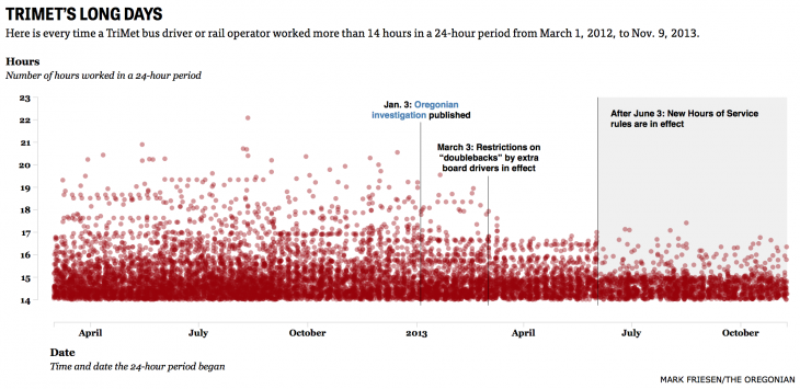
I particularly liked this scatterplot when I happened across it while in Portland recently. It's sort of a meta-visualization: it shows the effect The Oregonian's reporting has had on the shift lengths of bus and tram drivers in Portland.

This past year has also seen some very interesting movements of visual and data journalists, between different media as well as from media to other companies. Andy Kirk listed a good number of them in a posting on significant events of the latter half of last year (his posting on the first half is also worth a read). This is a good sign, because it means that there is an active labor market, and it also means a transfer of knowledge. People staying in the same place don't help ideas move from place to place. I think we should see the results of many of these moves in the next months.
More Thinking About Visualization
I just wrote about WTFViz, ThumbsUpViz, and HelpMeViz, and how I see those new websites as a sign of a richer online visualization culture. You may not agree with all of them, or any of them, but they finally show some new directions. It will be interesting to watch them evolve over this year and see where they are going. They certainly provide a lot of food for thought about visualization best practices.
I'm also throwing in Isabel Meirelles book, Design for Information, here. I really liked the approach she took in her book, and I hope that this will finally get people to write more thoughtful, informative, and interesting books about visualization. The reliance on pretty pictures without much depth is getting old.
Visualization That Punches You In The Gut
Perhaps my favorite development of 2013 is what some have called emotive visualization. Behind that anemic term hides a category of visual storytelling that doesn't just state facts, but wants you to feel them. Sure, they are based on numbers. But the point is not just to give you the numbers, but to hit you with them, and hard.

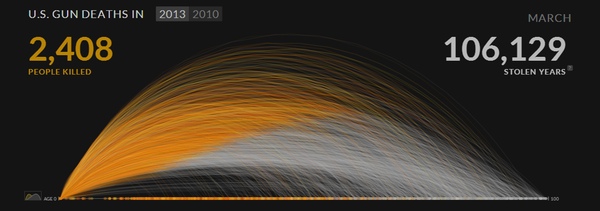
The pieces on drone strikes and gun deaths published last year achieved that goal and got a lot of people talking, as did a video discussing wealth inequality. I hope we will see more of this kind of work going forward. This is the wilder side of storytelling, and the more visceral one. While numbers may seem boring, making them visual makes them real, in a very powerful way.
2014 And Beyond
What all these developments have in common is that while they are visualizations at their heart, they add significant context to it. Whether there's a story, a deeper concern, or infographic elements, there is a lot of added value. This goes against the established wisdom of minimalism and starkly empty visualizations, but it's also a completely different use case. I hope that 2014 will be the year people will finally realize that presentation and analysis are vastly different, and that we need to understand those differences, and establish good criteria for work in presentation and storytelling.
Beyond that, I'm just looking forward to more exciting work. It's a good time to be in data visualization.

Comments (4)
Posting new comments was disabled in 2020.