It has never been easier to record your daily activities. The data is all well and good, but the real value comes from visualizing it. Why visualize your mundane, boring life? Because it helps you track what you are doing, and provides motivation to get your ass to the gym.
 For a little over a month now, I've been carrying a [Fitbit](http://www.fitbit.com/) around with me. It records how much I move around during the day, and how often I wake up at night. It's unobtrusive and easy: I don't have to do anything, the data gets uploaded to the Fitbit servers wirelessly and automatically, so I can look at it at my leisure. The only thing I have to remember is to charge it once a week or so.
The Fitbit is basically a step counter with an Internet connection. It records the number of steps taken every minute, and can store up to a week of detailed data (and up to a month of summary data). It's simple, small, and unobtrusive.
It shows me my daily activity in two ways: on its built-in display and on the Fitbit website. The display on the Fitbit shows you the number of steps taken that day, calories burned, and distance traveled. It also has what they call an "avatar," a flower that grows with activity. As silly as it sounds, that flower is a surprisingly satisfying reward after a workout or just running around all day.
Fitbit also has a very nice website that presents you your uploaded activity and sleep data, and lets you record additional activity, food, etc. It's not big on analysis, but it covers the things that are most relevant to most users. It also has a progress bar towards a weekly goal of 70,000 steps (or 10,000 steps per day).
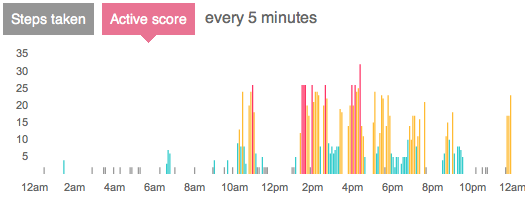
The displays on the Fitbit site are thankfully simple and effective (if we disregard the bouncy animation when they are loaded). Color and bar height encode activity, there are four levels: sedentary (gray), lightly active (cyan), fairly active (yellow), and very active (red).
There is also a monthly view to show you what you've done over a longer period. As you can see, I'm nowhere near reaching the 70,000 steps per week.

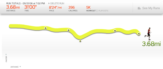
Nike's Nike+iPod service has slightly fancier graphs, but also has to make do with less data. It's also a step counter, but it's only used to record runs. It shows speed and stops during a run, and your progress towards fitness goals. It's incredibly motivating: my girlfriend stated using Nike+ recently, and is already running a lot more than she used to. It's frustrating for both of us to leave our Nike+ tracker or Fitbit, respectively, at home when working out.
Nathan at FlowingData also has a service named your.flowingdata that allows you to track your activity and food intake via Twitter direct messages. His graphs are more sophisticated in terms of visualization, and provide more interaction and ways of drilling into the data. It does require actual work to record anything, though.

I don't generally buy into the self-surveillance thing, and I'm simply too lazy to record my activity and food. I've gone through several food tracking applications on my iPhone without much success. Automated systems that collect the data for me make the tracking feasible, though.
But the real beauty of all these systems is that they're visual. The visualization is what makes them possible in the first place. Nobody wants to look at a table of data, even if it's their own. But even a simple visualization of your own real data provides a lot of motivation and keeps you interested in tracking your goals. Images are a powerful thing.
Comments (3)