Visual.ly's launch today made big waves, but a lot of people seemed to be disappointed by what they saw. The problem is that what you can see on the website is not the really exciting part of Visual.ly. What is much more interesting is how they want to turn the creation of data-based graphics from a tedious manual process into something fast and flexible. That has a lot more potential impact than you might realize at first.
Exploration, Analysis, Presentation
Let's take a step back and look at the three stages we generally talk about in visualization: exploration, analysis, and presentation. Academic work and tools like Tableau focus on the first two, while there is still very little actual work on the latter. The usual assumption is that the same tools and techniques can be used there as for exploration and analysis, and little attention is typically paid to it.
The result is that presentation is taken over by infographics with varying levels of quality, because people simply get tired of looking at the same bar chart for every piece of data. I think it's clear that infographics aren't just popular, they are also more memorable, and when they're done well, can be very effective.
The key difference between visualization and infographics is that the former is easy to automate and generic, while the latter are specific and usually hand-drawn. Now imagine a better way to create infographics based on data: a way that lets designers work with numbers more easily to create graphics that are visually exciting while still true to the data; a way that encourages and embodies best practices in visualization for designers. That's Visual.ly.
The Infographics Creation Tool
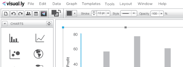
Visual.ly is working on a tool that will make all of this possible. If you have seen a program like Adobe Illustrator before, parts of this mock-up should look familiar, while other parts should be surprising.

The key idea is to combine a design tool with visualization. No longer will designers create a first chart in Excel and copy that over into Illustrator to make the actual graphic. It's all in one, web-based tool. Note the charting and data tools on the left and the design tools on the right. You can put different elements on different layers, just like in design tools, to have more control. The Action palette at the bottom right allows you to link views, create slideshow-like transitions between views, etc.
Changes to the data mappings are immediately reflected, even after the charts have been customized. Chart elements will be customizable to a much larger degree than in existing tools today, and in ways that make sense for charts (like scales, etc.).
What you see above is a design, not a finished program. There is no clear timetable for when the tool will be available, but first versions (with reduced feature sets) will be released over the next few months. There will be a limited free version, with paid tiers for more advanced features and higher-volume users.
This is Disruptive Technology
I watched two fascinating demos today, though just one was actually meant to be a demo. The one that wasn't was watching a designer turn a line chart in an infographic into an area chart and add grid lines that were supposed to only interact with the bar chart in front and not with any of the other elements behind it. That took more than half an hour, involved manual tweaking, layer masks, and numerous steps to perform what seemed like a simple enough change. This is the old way.
The actual demo was a very simple, custom tool that allowed the user to change numbers (shown as two pie charts) and text in a simple sidebar-style box. You change the number, the charts update immediately; you change the text in the input field, the text in the box changes. At any time, you can export the chart as an SVG file. This may not sound exciting, but this turns work that currently takes designers hours, can introduce errors, and require long turn-around times when changes are requested into something that is reliable and takes minutes. This is the new way.
Most people don't appreciate how much work it takes to create even simple graphics from data, even without interaction or super-fancy design. Making this process easier allows designers to focus on much more interesting work, and editors to more directly control the contents of the graphical elements of the page. For many smaller publications, it allows designers and reporters on very limited time budgets to create interesting and engaging visuals.
Why don't they use Protovis? While it's an incredibly clever tool, its extensive use of intricate JavaScript tricks makes it tough to figure out for designers and reporters with little to no programming background. Also, designers want to work visually when making changes, not type hex codes into hundreds of lines of JavaScript code.
More Than Meets The Eye
Visual.ly's current website is somewhat disingenuous because it makes it appear to be one thing, when it really is much more. What I haven't even talked about are the tools for finding data, visualization templates, or the custom work they are doing for a number of large media companies. This diversity is a great strength, because they're not only building things for other people, they have developers and users in the same company. This makes it harder to pin down what exactly they're doing (in fact, I wonder what their elevator pitch is), but it also means that the results will be much better.
In a way, the current website shows the least interesting part of Visual.ly. But things will be revealed over time, and the more exciting projects will soon be made public. If there really is a middle ground between infographics and visualization, Visual.ly is in the best possible position of getting us there. I think that is an exciting prospect.
Who is Behind Visual.ly
Visual.ly was founded by the former Director of Marketing at Mint.com, Stew Langille, and Lee Sherman, who edited Mint's popular blog. The team includes Jess Bachman of WallStats (the Death and Taxes poster) as creative director and a lot of other talented people (including Kristen Chan, who heads the design of the tool described above).
I am honored to be an advisor for Visual.ly, together with an impressive roster of business folks from silicon valley and beyond. Visual.ly could not have paid me for posting this, and they didn't. I also paid for my trip to San Francisco myself, with a well-timed visit on launch day being a nice side effect.
Comments (6)
Posting new comments was disabled in 2020.