Blog posts filed under Conference Report

Highlights from EuroVis 2019, Part 2

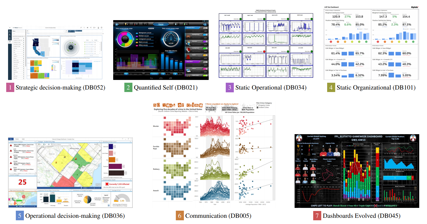
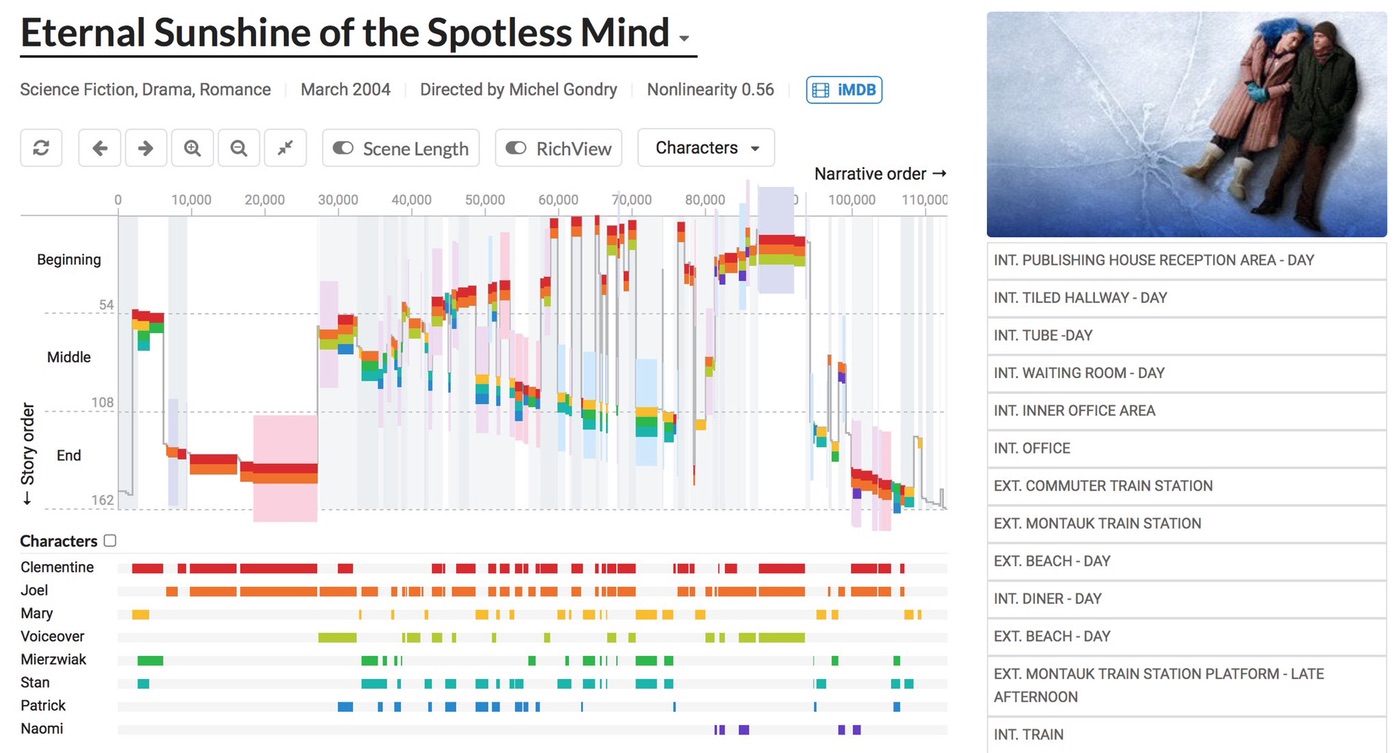
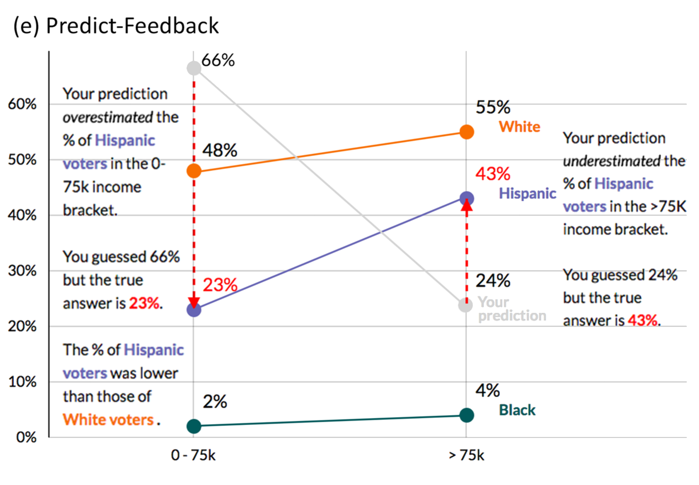
This is the second part of my highlights from EuroVis earlier this year in Porto, Portugal. There are papers about decision making and interaction, as well as a report on the capstone talk and a look to next year’s conference, which will be a bit different.

Highlights from EuroVis 2019, Part 1

The EuroVis 2019 conference took place in early June this year in Porto, Portugal. While I enjoyed the city and conference venue, I found the program a bit underwhelming this time around. I’ve kept pushing off writing this report because I found myself griping rather than talking about the content.

EuroVis 2018, Wednesday through Friday

EuroVis raged on through the end of the week with talks, posters, and lots of food. This second part covers papers about visualization evaluation, high-dimensional structures, graph layouts, etc., as well as the capstone and closing (with information about next year).

Seven Visualization Talks That Terrified Me At CHI

I recently attended CHI 2018 in Montréal, QC. Normally conferences leave me excited for the next idea or the next direction (and also physically exhausted). This was one of the first where I was left feeling terrified: a lot of the work did an excellent job of highlighting core problems about our assumptions as visualization researchers, and poked at big intractable issues that I had mostly been ignoring for a long time. Here are the seven most terrifying talks.

IEEE VIS 2017: A SciVis Perspective

Since my (Robert)'s conference reports are almost entirely focused on InfoVis (and a bit of VAST), I have asked Noeska Smit, medical visualization professor and my collaborator in the Vis Potpourri postings, to write about VIS from the SciVis perspective. Everything below are Noeska's words.

IEEE VIS 2017: Best Papers and Other Awards

The IEEE VIS 2017 conference took place last week in Phoenix, AZ. I’m slower to write about it than in previous years, but to make up for that I’m not going in chronological order this time, but will break this report up in a more logical manner. This first part covers the opening, which included presentations of the best papers from all three tracks plus a new Test of Time award category.

EuroVis 2017 Conference Report, Part 2

On the first full day of the main EuroVis conference, we learned that estimating correlation from scatterplots may not be as great as we thought, saw a number of new ways to show what is and is not in the data, and got some new tools for making browser-based visualization fast.

InfoVis Papers at CHI 2017

The two main conferences in visualization are VIS and EuroVis, but recently CHI has also gotten some very interesting submissions (CHI is technically a conference about human-computer interaction, or HCI). This year looked particularly strong,

Ten Great Talks at Information+ 2016

The Information+ Conference took place in Vancouver earlier this year. It brought together people from information visualization and information design (and design more in general). All of the talk videos are online on the website, but since there were a lot and it's kind of hard to decide where to start watching, I'm listing my favorites below.

VIS 2015 – Friday

The final day of the conference was much shorter, only one full session and then the closing with the capstone. Here is a report on a few more papers, the capstone, a panel left over from Thursday, and a few random tidbits.

VIS 2015 – Thursday

Between the sessions, parties, discussions, running, and the occasional short sleep break, I fell a bit behind on the blogging about VIS 2015. After separate postings for Tuesday and Wednesday, this part covers Thursday. The posting about Friday will be short, but squeezing both days into one felt like a bit too much.

VIS 2015 – Wednesday

The second full day of VIS 2015 brought lots of papers on applications and design studies, and also a panel on solved problems in visualization. As on the first day, I have some observations and thoughts.

Report: EuroVis 2015

I attended EuroVis 2015 last week in Cagliari, Sardinia. This is the second-most important conference in the academic visualization world, and there were plenty of good sessions to choose from (full and short papers, state-of-the-art reports, and industry sessions).

Conference Report: CHI 2015

Last week, I had the pleasure of attending the CHI 2015 conference in Seoul, South Korea. CHI technically stands for Computer-Human Interaction, but it has become a name rather than an acronym in recent years. And CHI’s scope is very broad, it covers many areas that are not strictly part of HCI (Human-Computer Interaction – why use one acronym when you can have two?).

VIS 2014 – Friday

Wow, that was fast! VIS 2014 is already over. This year’s last day was shorter than in previous years, with just one morning session and then the closing session with the capstone talk.

VIS 2014 – Thursday

Thursday was the penultimate day of VIS 2014. I ended up only going to InfoVis sessions, and unfortunately missed a panel I had been planning to see. The papers were a bit more mixed, but there were agains some really good ones.

VIS 2014 – Tuesday

The big opening day of the conference, Tuesday, brought us a keynote, talks, and panels. Also, a new trend I really like: many talks end with the URL of a webpage that contains a brief summary of the paper, the PDF, and often even a link to the source code of the tool they developed.

VIS 2014 – Monday

IEEE VIS 2014 technically began on Saturday, with the first full day open to all attendees being Sunday. Monday continued the workshops and tutorials, and that is where we join our intrepid reporter.

Conference Report: Tapestry 2013

About 100 attendees, three keynotes, five short talks, demos, discussions, food, music, and a fantastic atmosphere: the Tapestry conference for storytelling with data took place on February 27 in Nashville, TN. Here is a conference report with links to talk videos, as well as some first news on Tapestry 2014.

Schloß Dagstuhl

For many computer science researchers, the name Dagstuhl rings a bell. Anybody who has been there has fond memories of interesting talks, great conversations, and lots of social interaction (lubricated by the abundantly available wine and beer). But what is Dagstuhl?

VisWeek 2012 Digest, Part 2

In this second installment, I pick some of the more noteworthy papers and events from Wednesday, Thursday, and Friday at VisWeek 2012. There was some remarkable work, which I think and hope will shape the future of visualization research.

VisWeek 2012 Digest, Part 1

I gorged myself on talks, panels, and tutorials last week. And parties, oh the parties. Time to digest all of it and, um, extract the most important bits. Since there is so much to talk about, I have split this up into three parts. Parts 1 and 2 will discuss individual papers and events, part 3 will add some more general observations.

EuroVis 2012, Last Day and Wrap-Up

The last day of EuroVis brought back the sunshine we had seen yesterday, but had missed for the first half of the conference. This was a short day, with only one paper session and the keynote. The latter proved to be quite controversial and interesting.

Malofiej 20

Malofiej was an exhausting week with many great conversations, fascinating insights, and great company. My sleep-deprived and jet-lagged brain is buzzing with things to write about, and this is only the first of several articles about or inspired by Malofiej. I start with a discussion on why I think The New York Times did so well this year, and what other newspapers can do to catch up.

My Journey to the Kingdom of NIPS

Over the weekend, I had the opportunity to visit the strange land of NIPS (Neural Information Processing Systems), a kingdom in the far corners of the West, where the Machine Learners dwell. Some of the noblemen there had invited me so that the locals could get a close-up look at one of us Visualization People at one of their workshops.

I Want to BELIV

Evaluation of visualization systems and techniques is a vital part of visualization research, but is often neglected. While there are established methods for basic perception studies, many other kinds of questions are much more difficult to answer in a controlled study. The CHI workshop BELIV (BEyond time and errors: novel evaLuation methods for Information Visualization) is the place to discuss new ideas about evaluating visualization.

InfoVis Panel: The Impact of Social Data Visualization

Visualization for the masses is a powerful means of communication, in an age where we have access to incredible amounts of data, but still little understanding based of what it all means. I have argued that visualization sets information free, I have criticized Swivel and Many-Eyes, and I have argued for reassessing who our users are. At Vis/InfoVis, I am organizing a panel with people from Many-Eyes, Swivel, and Gapminder.