Line charts are one of the most common and useful charts out there. But why draw straight lines between the data points? They almost never represent what the data is actually doing, no matter if the data is single observations or aggregated over time. How do line charts actually work, and what do they imply about the data?
I'm going to look at two cases here: single observations where each value is a separate, original data point (row-level data, if you will) from a single point in time, and aggregated data where the values are totaled up or counted or similar, to yield a value that applies to a span of time.
Observations: Temperature over Time
Let's look at a typical line chart the way it's supposed to be used: for observations over time. This example shows temperatures over time, one value per minute. The important thing here is simply that each is an individual reading from a specific point in time, so there is no averaging or similar going on. The points are spaced equally in time here, but it doesn't matter.

What do the lines mean here? What we actually have is just the observations, which are individual values.
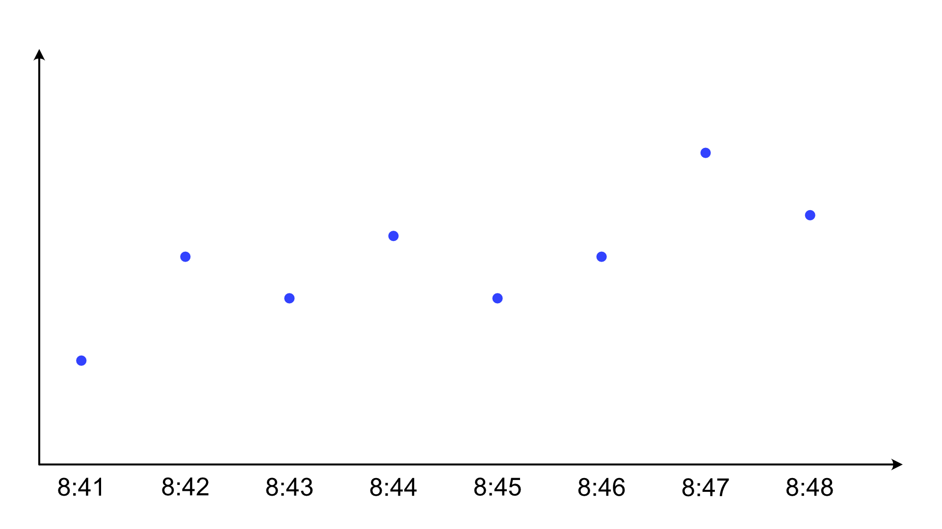
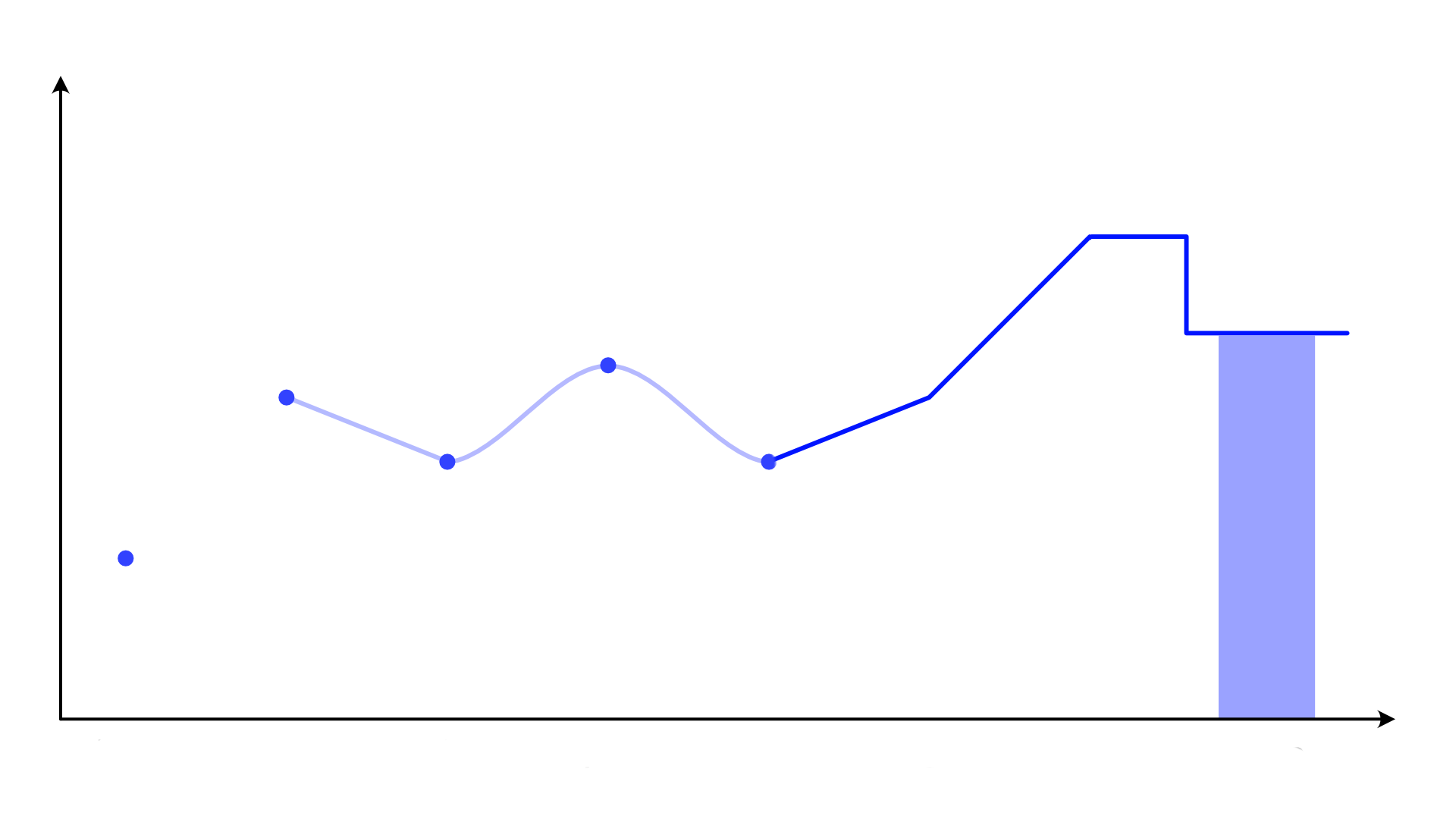
We could show them like this, but we usually don't. Instead, we draw a line. And typically, we don't even draw the dots. Instead, we usually rely on the line having enough kinks to let us see where the points are. That often works, but not always. And it emphasizes the line rather than the points.
Instead, we might draw a like chart like this.

You might argue that this is a reasonable representation because surely, temperatures exist even when we don't measure them, and they change continuously between the points. To which I say: yes, but not in straight lines! Temperatures change in a continuous way, but not at a constant speed from one measurement to the next and then suddenly change their direction and speed to aim for the next one.
This is what smooth transitions would look like:

This would be the most reasonable chart of this data (other than the pure dots). What is so surprising about this is that nobody draws line charts like this. Why not? The typical argument is that such a smoothed line is just made up data! But the same is true of straight lines. Straight lines might seem more straightforward, but they're basically always wrong. Temperatures do not change in that way. Any reasonably smooth approximation is going to be a much more realistic picture of what is actually happening.
But, you object, nobody is fooled by the lines! People surely understand that the lines are just connecting the dots, not representing data. Perhaps, but then why insist on straight lines?
The lines between the points either matter or they do not. If they matter, why insist on them being straight? No natural process behaves like that. And if they don't matter, then there is no reason to not draw the more realistic smoothed lines.
If you're familiar with sampling theory, here's another argument for the smooth line: if we chose our sampling interval to be fast enough to pick up the fastest changes, then the smooth transitions reconstruct the actual behavior perfectly. And if we didn't, it's still the best approximation we have without making up data that doesn't exist (or bringing in some other knowledge) to force the straight lines.
Aggregated Values: Sales per Month
Now let's look at the other scenario where the data is aggregated. Let's say we have sales data here for each month (or something else that you can count or total up over a month, it doesn't matter), one number per month. Look, it's a line chart!
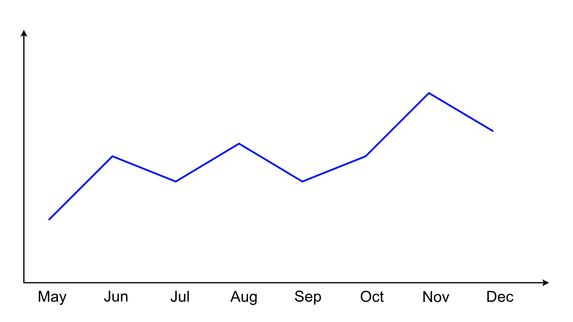
As before, all we have are really just the values for each month, nothing in between. This will look familiar.

Now if we were to draw lines, what would those mean? The difference from before is that these aggregates, like the sum of sales in a month, don't make sense between the points. There is no transition from May's sales to June's sales, linear or otherwise. The numbers are totaled up at the end of each month and then apply to the entire month. Straight lines between these points make no sense.
A more accurate representation would be this, though you might even argue that the vertical lines make no sense here. I just wanted to keep the line contiguous, though. Stepped line charts are also reasonably common and easy to make in visualization tools, as opposed to broken lines.

If this looks like a different kind of chart, you might be thinking of this:

Yes, a bar chart. Now I don't argue for bar charts lightly (I have a really strong aversion to the everything should be a bar chart school of thinking), but it's a more meaningful chart (other than the dots above). How would lines connecting the points make any sense here other than to make a nicer, more connected-looking chart?
The lines either matter or they don't. If they matter, they need to be meaningful. Lines between aggregated values are not meaningful. If they don't matter, why not do away with them in favor of a chart that matches the actual semantics of the data?
Now What?
So what are you supposed to do now? Am I saying line charts are evil and should be avoided? No. But I think we need to start thinking about how we represent data, and how we admonish people about best practices, a bit more carefully.
First of all, it might not matter. If you have enough data points that you don't even see the lines between them, this is a moot point. If you're happy with your line charts and never get confused by the points between the lines, don't worry about them. I have no desire to stop anybody from using line charts.
What I'm after here is simply to get a better understanding of what these common and basic charts do. And to ask why we do certain things and not others. Why do we draw straight lines and not Bezier curves? Why insist on certain chart types where they might be commonly used, but really not very meaningful?
And why the aversion to smoothed lines? The common misconception aside that smoothed is somehow more made up than straight lines, one common argument is that they can overshoot the actual values, which is often perceived as a problem. I don't understand that position, though; if the Bezier curve overshoots, that might indicate that the value really was outside the range that was observed. And it might mean that more observations are needed. Instead of forcing a meaningless straight line to paper over the problem, why not figure out what is really happening? Either way, the data and the chart are not fully capturing the phenomenon they're supposed to represent.
Perhaps it's time we started thinking about visualization and charts more like statisticians think about their models. An aphorism attributed to George Box states that all models are wrong, but some are useful. In the same vain, I propose that all charts are wrong, but some are useful.
Comments (15)
Posting new comments was disabled in 2020.