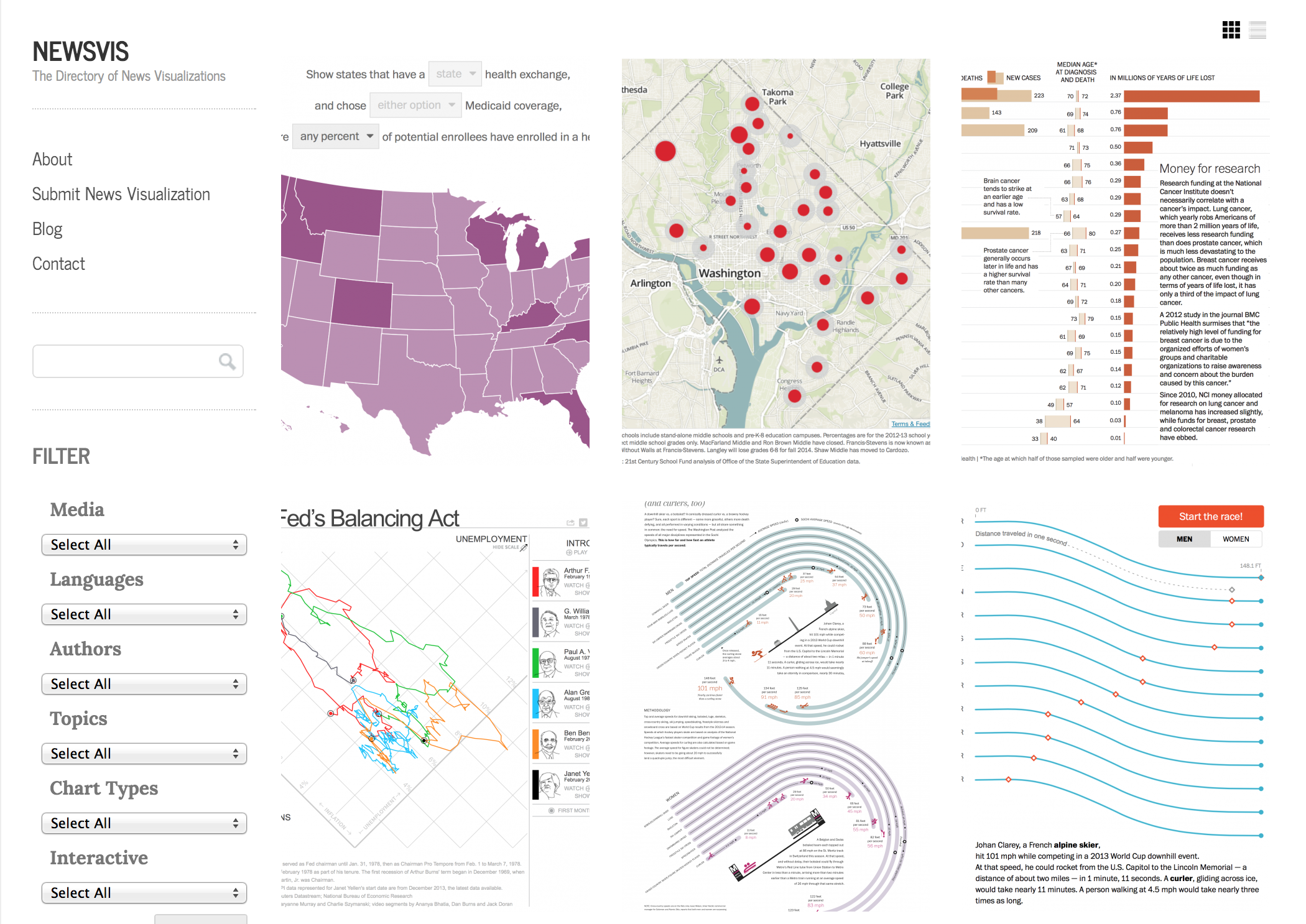
When I was in Portland over the holidays a few weeks ago, I noticed a visualization in the local newspaper, The Oregonian. I had never heard of that before, nor of Mark Friesen, who created it. Wondering how many visualizations I might be missing, I decided to build a website that would collect them all: newsvis.org.
There are of course the usual suspects who we all know, and who do a lot of great work: The New York Times, The Washington Post, etc. But is that it? Are there not many others that create data visualizations for journalism?
Also, it is close to impossible to find news visualizations. I remember that scatterplot-like thing showing groups of voters who were going to vote for Romney vs. McCain in the Republican primaries in 2008, but where was it? And when? For a while, The New York Times was downright hiding its graphics: you’d see them on their front page for a short time, and then you’d never be able to find them again. Too bad, you’re too late; it’s gone! This has changed, and there are now Twitter accounts and tumblrs to follow, but none of them are searchable in any reasonable way.
There are also many other questions you might ask about news visualizations. When was the first scatterplot published? How many timelines have there been about sports in the last five years? Does The Washington Post create more bar charts or line charts?
Enter NewsVis.org
NewsVis.org can’t answer all those questions quite yet, but it’s a start. The site is fairly basic right now, but in the spirit of kaizen, I have decided to publish it and start collecting material and feedback for improvements.
There are three main parts to it:
- The front page, which lists visualizations in reverse chronologic order (by their publication date).
- The sidebar, with filters to pick particular visualization types, media, etc.
- The submission form – easily the most important part of the site
The sidebar is currently quite ugly, but it serves its purpose. It allows you to see how many items there are in each category (by clicking on the drop-downs), and to filter to just one or a combination of them by picking them and then hitting the Search button.
This is the part I want to replace the most, but I decided to prioritize releasing the site over redoing it. I have some ideas for what I want that to look like, but that will have to wait until after the InfoVis deadline (end of March).
Submissions
The key to making this work is the submission form. I can’t possibly populate the site with all the work out there by myself. I also depend on readers to find the hidden gems that I’m not aware of.
There is a trade-off between making this form too complicated and collecting enough data to make the site useful. While it may seem a bit overwhelming at first, it’s actually quite quick to fill out and submit a graphic.
The required information currently is the following:
- The title of the piece
- The byline, which is split into two parts. The first part contains a search field that has a few people already in its list. This will be expanded over time, so it will be easier to submit work by the same people. For authors who are not yet listed there, there is a separate input field. I will add all the missing names to the top field when I publish a piece.
- Publication date. When was this published? If you can’t figure it out, a reasonable guess also works.
- The link to the piece.
- The medium. Similar to the above, there’s a quick search field and a field for media that are not yet listed.
- The topic. This is a taxonomy that I’ve built fairly ad-hoc and that I intend to keep as small as possible. I will expand it if necessary, and I certainly take suggestions. But I’m not trying to build The Ultimate Taxonomy of News here.
- The visualization technique. Same applies as above, especially since news visualizations often don't nicely fit into particular chart types.
- The language. This is also a bit of a proxy for the country/region. I’m still debating if it makes sense to include countries, states, regions, political bodies (European Union, etc.), continents, etc. This can easily snowball into an unwieldy mess, so I'm sticking to languages right now.
- Interactivity. Since this is meant to provide inspiration, I also want to be able to filter to more or less interactive pieces.
- A notes field. This is mostly to suggest things that don’t fit anywhere else (like new topics). It won’t be included in the actual published visualization page.
There is no limit on how much you can submit or whose work you submit. Submit stuff you like, or stuff you hate. Submit your own work! No reason to be shy, just submit it. You can provide a name, but there is no requirement. Provided submitter names are also not shown for now, but that might change.
Gatekeeping
The goal of this site is to be as complete as possible in a very narrowly-defined area: visualizations used in the news. I have some rules listed on the About page about what I consider news, but it’s pretty simple: if it’s published by a news medium, it’s news. If not, things get a bit more complicated and ad-hoc.
Every submission will get some loving hand-tweaking from me, and I will only publish submissions that fit the spirit of the site. I intend for this to be a high-quality site, with consistent standards for the images (cropping, resolution, etc.) and metadata. That’s really the only way to make this useful and not drown in noise.
How to Contribute and Follow
Contributing is easy: just go to the submission form and submit stuff. It’s much simpler and faster than it looks.
You can follow the site via the RSS feed and on Twitter. Both will get every new submission. Since I use the publication date of the visualization as the date of the posting, you will see items appear in the feed that seem to be coming from the past. By having just one date, I avoid confusion, and the date the item was published on newsvis isn’t really all that interesting. This also makes it much easier to always keep the list sorted in chronological order of publication date (of the original), rather than submission date.
While the visualizations are their own content type on the site, there is also a blog. Blog posts will appear in the feed and on Twitter. I don’t intend to write much there though, just notes about house-keeping and major changes or additions.
Under The Hood
I built this site using WordPress, even though Drupal is probably a more logical choice for this sort of database-centric site. After discovering Gravity Forms and seeing some documentation on Custom Post Types in WordPress, I decided to go with that, though. It wasn't exactly a walk in the park, the WordPress documentation can easily compete with Drupal in terms of disorganization and lack of reasonable navigation. There is also an incredible amount of noise when searching for answers, with lots of people simply repeating the same bits of information but never digging any deeper. But I think overall the model is still simpler, even if also much more limited than in Drupal.
Either way, I will keep improving and growing the site, and I hope that you will find it useful and contribute!
Comments (10)
Posting new comments was disabled in 2020.