How should you sequence information in a data story so it makes the most sense? Are some sequences better than others? Does time have to move forward or does it not matter? In a paper to be published at EuroVis next week, with Jessica Hullman at UW and my Tableau Research colleague Heidi Lam, we report on a pair of studies that looked into this.
There will be three postings this week about EuroVis papers. This one is about the full paper I’m on, and there are also two short papers. Two of these papers (one full and one short) are about storytelling, one of them is about embellished charts. No pie charts this year, though.

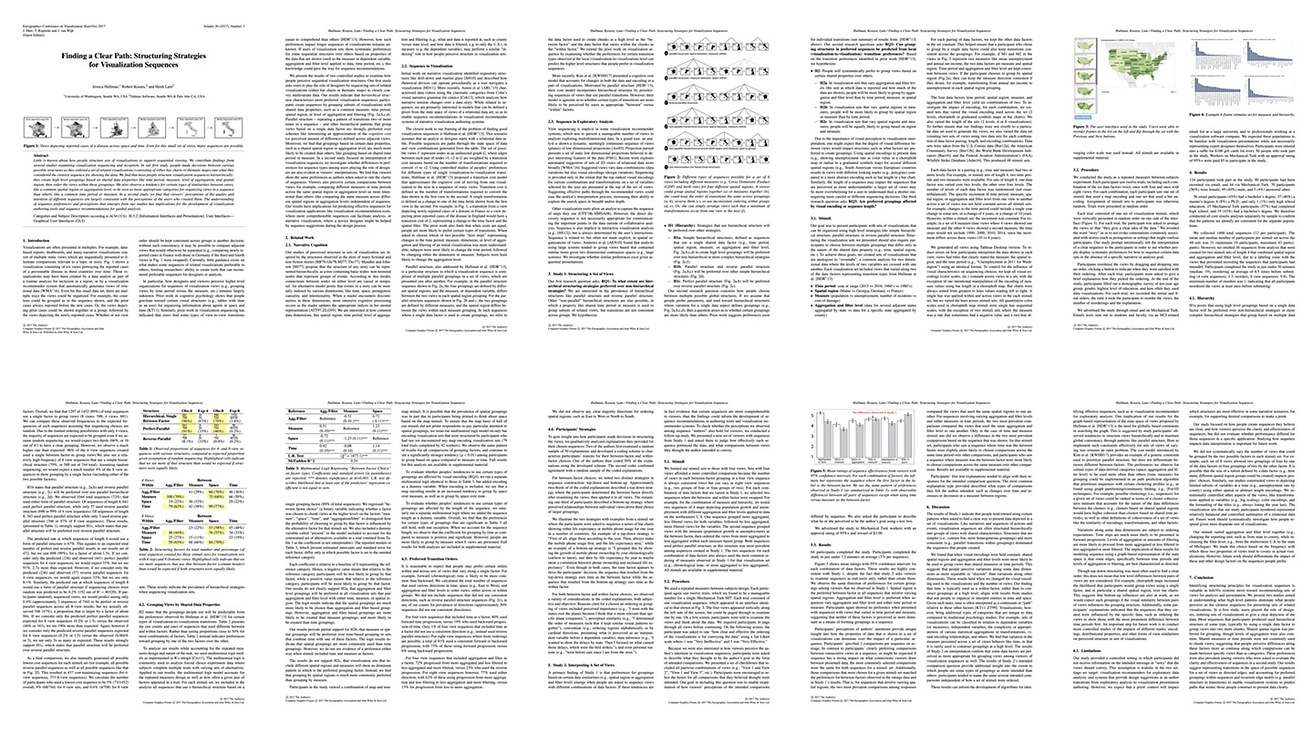
Let’s say you want to show data about the urban population in two different countries for two different years. Does it make more sense to show Country A in Year X, then the same country in Year Y, and then the same thing for Country B? Or show Country A in Year X, Country B in Year X, and then each in Year Y? Even with just a few charts, there are a lot of possible combinations. Some of them will seem more obviously the right idea, but how do you know?
It may seem reasonable to keep the direction of time the same, but does it matter? Might going forward for Country X and then going backwards in time for Country Y perhaps work better?
And it’s not just time, we looked four different factors that might change between different views:
- Time, where we wanted to know if going forward or backward (and consistency) made a difference
- Geography, where we were looking for directionality on the map: go left to right? Be consistent?
- Measures, which were unordered but we expected them to be consistent between groups, or people going ABCD and then DCBA.
- Hierarchy, how do you structure hierarchical views? Overviews first and then lower levels? Or depth-first?
The results were quite a bit more complicated than we expected, but we found some interesting patterns. People clearly prefer what Jessica called parallel structure in one of her earlier papers, meaning that they don’t change the order of the factor that changes within a set of views between sets.
Interestingly, space was a stronger grouping factor than aggregation and time, even when the visualization was not a map. Maps made the trend only stronger (as you’d expect).
There are a lot more results in the paper, like a dependency of some of the preferences on the length of the sequence (our longer sequences made people pick measures over time, while the shorter ones were more likely to be grouped by time first), and we also tested how well people understood different kinds of sequences.
This is one of the first papers to look at sequence and how people structure information in a presentation context. It’s a first step, and we’ll need to learn a lot more. But it shows that there are certain structures that work better, and if we can test more of them and tease out more of the differences, we’ll be able to construct better data stories more easily (and automatically).
Jessica Hullman, Robert Kosara, Heidi Lam, Finding a Clear Path: Structuring Strategies for Visualization Sequences, Computer Graphics Forum (Proceedings EuroVis), vol. 36, no. 3, 2017.