
Visual representations of time are particularly interesting, because they seem so logical. A point in time is a point in the visualization, an interval is a line. But things are not always that simple: planning and temporal uncertainty require more powerful visual tools. Sets of Possible Occurrences (SOPOs) are an example of a visual representation of time that is very flexible and powerful – and totally unintuitive.
The Technique
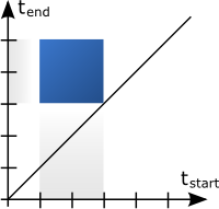
A SOPO diagram consists of two time axes, one for start time and one for end time. Consequently, any point in the diagram represents not a point in time, but an interval. A diagonal line can be drawn from the origin of the diagram, which represents all intervals with the same start and end time – i.e., all intervals with zero length, or points in time. The length of an interval is represented by its position, not its visual extent. Only intervals on and above the diagonal exist, any point below it would represent an interval that ends before it begins.

To more fully appreciate SOPOs, a little context is necessary. There is an area in artificial intelligence that deals with planning and temporal reasoning, and that entails the notion of temporal uncertainty. Most reasoning is centered around complex time annotations, which have not only one start and one end time, but an earliest and a latest start, and an earliest and a latest end. In addition, time annotations are often constrained in that they cannot be shorter or longer than a certain time, i.e., they have a minimum and maximum duration. In temporal reasoning, it is important to be able to not just consider one time annotation, but large numbers of them, and how they influence each other. That was the reason Jean-François Rit developed SOPOs in 1986 for the purpose of *Propagating Temporal Constraints for Scheduling *(Proceedings of the Fifth National Conference on AI (AAAI-86).
In a SOPO diagram, the length of an interval can be determined by its distance from the diagonal (measured parallel to any of the axes), so when we extend our point into a line parallel to the diagonal, we get a representation of all the intervals with exactly that duration (two, in the example below). This ranges from the interval [1,3] to [3,5], and anything in between. In other words, 1 is the earliest start of this set of intervals, 3 is the latest start, 3 is also the earliest end, and five the latest end. Since the (minimum and maximum) duration is 2, 3 cannot be both the beginning and the end, though – the point (3, 3) is not on the line.

But what if we wanted to extend our intervals by varying their possible durations? We simply extend our line into a square, covering a wide range of possible intervals. Starting on the lower left, and moving around the square clock-wise, we get the following corner intervals: [1,3], [1,5], [3,5], and [3,3]. The two intervals along the diagonal of the square have the same duration (2), while the upper left one has the longest (4), and the lower right one the shortest (0). Any interval between these extremes lies within our SOPO, and thus a wide range of possible start and end points, and of durations.
The exact point when something starts or ends is usually much less interesting than how long something takes. That can be a condition (if reading is above max-value for at least five minutes, do this), or a limit for an action (if patient's condition does not improve after a maximum of four hours, abort treatment and try something else). SOPOs can be constrained by cutting off the corners that are too close to or too far away from the diagonal, to set their minimum and maximum duration. This yields the following shape, which describes all intervals starting from 1 to 3, ending at 3 to 5, and being no shorter than one and no longer than three units.

The development of SOPOs was motivated by a landmark paper in 1983 concerned with Maintaining Knowledge about Temporal Intervals, by James F. Allen. Six pairs of relations between intervals were proposed there (like before-after, meets-is met by, etc.), as well as the symmetrical equals. SOPOs can not only visually express all these relations, they also allow the visual propagation of constrains from one interval to the next. The areas for before and after in the example below are determined by the horizontal and vertical axis, respectively, thus also reinforcing the meanings of the axes: horizontal for end (anything that is entirely before our interval has to end before it), and vertical for start (anything after the interval can only start after the end of that interval).

SOPOs as Visualization and User Interface
In his diploma thesis Time Shapes - A Visualization for Temporal Uncertainty in Planning, Peter Messner investigated the use of SOPOs for visualization of medical therapy plans (unofficially co-supervised by the author). A few changes were made to make SOPOs usable as an interactive visualization, like rotating the diagram, implementing diagonal scrolling, etc., and also to ease understanding of some of the connections between sub-plans and parent plans. The two images at the top of this article and below were taken from Messner's thesis, and some of the final discussion is also based on his findings.
Interesting things happen when plans consist of sub-plans that are performed in parallel (Plan D below) or in sequence (Plan C, the marked one below). The expanded Plan C does not visually contain its sub-plans, unless a triangular area is added that shows the containment. Something similar happens with parallel plans that occupy the same area, and are therefore impossible to see and hard to interact with (especially if they also contain further sub-structures).

The yellow triangle around Plan C above is entirely wrong in the context of SOPOs (it represents a completely different time specification), but it satisfies the need for spatial containment when representing temporal containment. It also adds visual clutter, though, and in the end did not add much to make understanding the diagram easier.
Interestingly, there is also an aspect of uncertainty that SOPOs cannot deal with: undefined parts of interval definitions (which were possible in the framework this was done in). While these can be shown when there are enough constraints (e.g., only the latest end is missing, but there is a maximum duration), unknown values pose a serious problem to any kind of visualization. How large should the SOPO be drawn if we do not know when it will end? Simply adding an indication for "uncertain edge" still means that an arbitrary value will have to be chosen and shown in the visualization.
Ultimately, the SOPOView was a failure, though that was not entirely unexpected. It was clear from the beginning that SOPOs were difficult to grasp, and especially with many of them shown in complex configurations, users would easily get lost. Messner performed a small user study, and the users actually did surprisingly well, considering the method and how much time they had.
Discussion
Why bother talking about SOPOs, when they are so unintuitive? While they will not replace the Gantt chart anytime soon, they have some interesting properties.
SOPOs represent something of a lost art, that of visual problem solving. By drawing those shapes, Rit was able to work with very complex temporal specifications in two dimensions rather than with just numbers or cluttered one-dimensional diagrams. The trained eye would also immediately see what the results of these operations were, and how the structure of the SOPO changed from one shape to the next. Powerful tools require training and practice, both of which are usually in short supply when demonstrating a visualization or testing it in a user study.
It would of course be silly to criticize SOPOs as a visualization, since that is not what they were intended to be. While they would ultimately be read visually, it was not Rit's intention to require a significant paradigm shift to simply explain sets of six numbers. SOPOs are almost write-only, they exist solely as an analytical tool, that draws its power from the peculiar way it represents the data visually. That way is very likely not useful as a general way of visualizing time, but it shows how specific problems can be solved using specific means.
Unintuitive as they are, SOPOs help us break out of the usual way we look at time, and make us aware of the many assumptions we make about visual representations of the fourth dimension. That alone makes studying them worthwile, even if their role is that of the ladder in Wittgenstein's metaphor: after we have reached a higher point with their help, we can leave them behind.