
When peanuts are bombs, clown-shaped cake ornaments are muzzle fires, and young guys are skateboards, we are talking about representation. We take it for granted that words can refer to things or abstract concepts, and colored spots on a piece of paper can depict data. Representation is really quite remarkable, and a better understanding of it will make a big difference in how we build visualizations.
The images above are taken from the brilliant short movie Kaboom! by PES. The movie was shot using stop-motion, and all the guns, explosions, buildings, and scenery are not actual guns, explosions, buildings, or scenery. The choice of materials is so clever, however, that it still works, and not only that: there are so many things in those movies that you don't even notice half of them. Many objects just blend into the scene so well that they won't even stand out. See also Making of Kaboom! and Game Over.
Realistic – Or Is It?
Another example is this painting by David Bailley, titled Self-Portrait with Vanitas Symbols.
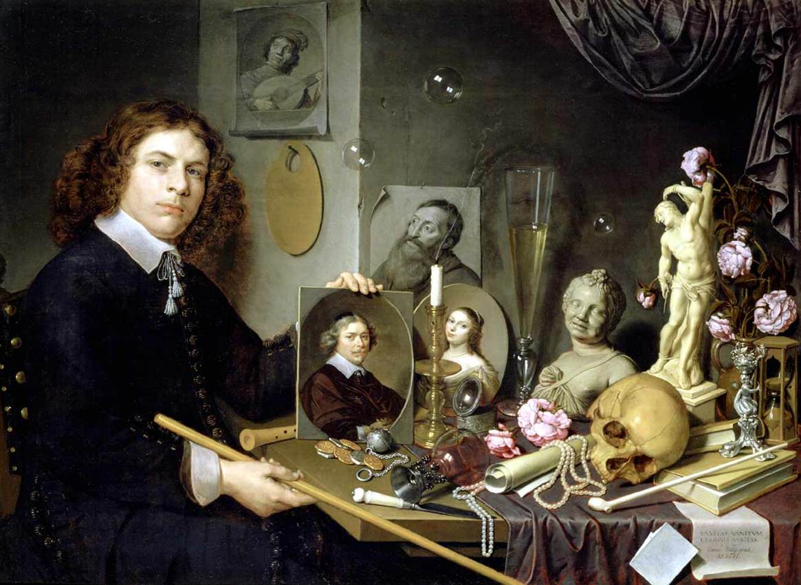
While painted in a realistic style, the depicted objects are not just there because they happened to be lying around on his desk (which might be the case in a photograph). Instead, they are symbols for vanitas, the emptiness and transience of life. The skull, the blown out candle, the soap bubbles, the hourglass, even the flowers symbolize this. There are also references to his profession (the palette), fortune (pearls, coins), and hobbies (pipe).
But in addition, it is important to know that Bailley painted this painting when he was 67. The self-portrait is therefore the picture within the picture in the center, with the young man showing a younger version of himself. The many different symbols and layers in this painting can be dazzling even for art historians.
It is also likely that all the objects were not there at the same time, or at least not for the entire period over which the painting was completed. This is certainly true for Bailley himself, but also for the flowers. Many nature scenes of still lives with flowers from that period share that same interesting property. Does that mean they are realistic depictions or not?
Ways of Representing
Representation is not only a topic in art, and certainly not confined to the visual channel. In Theory of Representation: Three Questions, Howard, Kolers, Wrolstad, and Bouma list different varieties of representation:
Jones represents (that is, "speaks for") Biddulph Township in the Provincial Parliament. That portrait represents ("depicts") the elderly Rembrandt. War and Peace represents ("describes") events of the Napoleonic War. The whale in Moby Dick represents ("symbolizes") Evil. Punch represents ("caricatures") Churchill as a bulldog. La Mer represents ("expresses") moods of the sea. Ghandi represents ("exemplifies") the spirit of nonviolent protest. Let a represent ("substitute" or "stand for") b.
Clearly, not all of these will be relevant for visualization, but more are than would appear at first sight. Is a Chernoff face a depiction, description, symbolization, caricature, or merely a substitute for the underlying data? How do we know which kind of representation we are using, and what does that mean for how we design visualizations? How do metaphors fit into the picture?
Mimesis
The oldest and probably most natural understanding of representation is to think of a picture as being as perfect an imitation as possible of nature. Plato called this mimesis, and illustrated it with a story of a painter whose paintings of grapes were so realistic that birds would peck at them.
With the existence of photography today, such an understanding seems very logical – too logical and simple, in fact. Especially in computer graphics, it is too easy to fall into the trap of photorealism and take objects in images as being just representatives of themselves. But our visual traditions are not based on realism, that is a fairly recent development. Most of the seemingly realistic art we see is in fact packed with symbols, and failing to realize that means failing to understand the message of the piece of art. Varying degrees of realism are also not simply failures at achieving a photorealistic image, but often mean that the exact visual depiction was not the goal of the painting. Realism can be distracting, and it can hide the underlying meaning.
Even abstract images can depict – an obvious fact for anybody familiar with visualization (or maps), but one that can make it hard to understand what a visualization is and how it works. Overly metaphorical and/or realistic visualization, on the other hand, can also make it difficult to achieve a useful visualization, and limit its expressive power.
Of course Plato's idea of mimesis was not just an objective description of representation. He considered mimesis deceit, because it allowed the artist to make something that pretended to be something else.
Representation Reconsidered
Nelson Goodman, in his book Languages of Art, very eloquently dissects the idea of mimesis. A painting, consisting of layers of paint on a flat piece of cloth, is more like any other painting than it is like a living person, which is three-dimensional, can move around, and is not made of oil paste and pigment. Also, there are many ways in which even photographs are distorted to look better. Goodman's example is perspective correction, but there are many other things that make a photograph appear more natural by making it less like the scene it actually depicted.
So the idea of imitation is clearly limited, especially when it comes to other painting styles than realism, and other means of depiction than photography. But what else is there? Can we simply pick any symbol and assign it a meaning? And if this all so arbitrary, why are we able to read images so easily?
Representation in Visualization
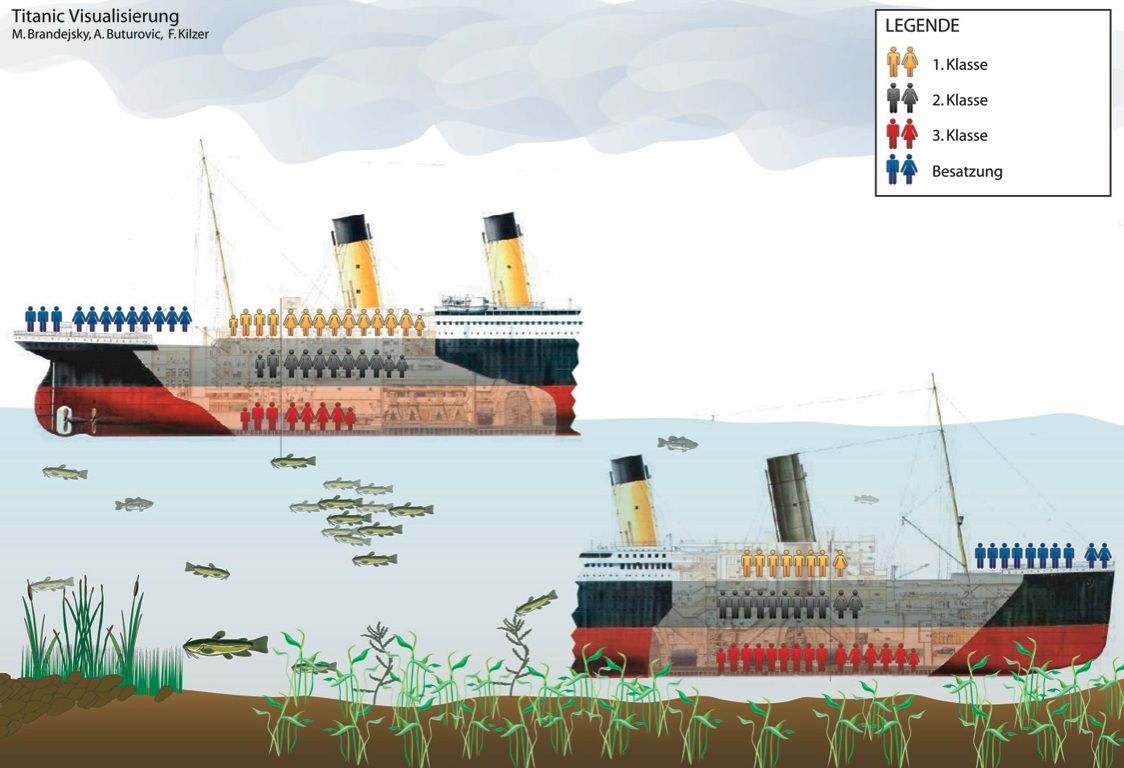
The images below show different kinds of representation in visualization. They were designed by students in my Visual Communication in Computer Graphics and Art class when it was taught in Vienna, and all depict the Titanic dataset (which contains information about people's class, sex, age, and survival).
 |
 |
 |
These examples are interesting because they cover the gamut from close to realistic (like an information graphic) to very abstract. The image in the middle is especially interesting because it is built on a familiar though non-realistic metaphor (a pie chart), which makes it easier to figure out what it means (if the structure of the data is known). The right-most image is the most abstract but also the most expressive: it allows the viewer to read basically any combination of criteria and see how this group of people compares to any other. Of course, reading this image is quite a challenge.
Conclusions
Representation is a complex topic with many facets. Theories of representation abound, and not all of them are useful for visualization. But visualization can bring a new, interesting perspective into this field: how do we represent abstract information in a way that is useful, readable, and that allows us to understand the underlying data? How can a model of representation help us connect the different points of view in art and visualization? And how can the choice of representation become a topic in visualization in itself, so that we can understand how we can make the best use of it?
Comments (1)
Posting new comments was disabled in 2020.