• Skip to main content
  • Skip to primary sidebar
  • Skip to footer

eagereyes

Visualization and Visual Communication

  • Explore
    • Starter Pack
    • Blog Calendar
    • Blogroll
    • eagereyesTV YouTube Videos
  • Practical
    • Basics
    • Pie Charts
    • Techniques
    • Book Reviews
    • Journalism
  • Academic
    • Speaking Mistakes
    • Acceptance Rates
    • Papers
    • Conference Reports
    • Lists of Influences
    • Criticism
    • Peer Review
  • Admin
    • About
    • Contact
    • License
The Point Of A Chart

Robert Kosara / August 26, 2015

The Point Of A Chart

When creating charts, it’s important to pick the one that actually fits not just the data, but the task. That can require going outside your comfort zone to use something beyond the four or five most common chart types. Here is an example where the original chart does not support comparison between two different sets of numbers, but it’s easy to fix.

On Twitter this morning, Stephen Hoskins pointed me to this story about Auckland schools in the NZ Herald as a good use of pie charts. It’s an interesting case, because individually, these aren’t bad pie charts. They show the make-up of the poorest (Decile 1, lowest decile) and richest (Decile 10, highest decile) schools in Auckland.
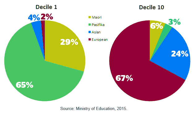
AucklandEthnicMakeup_Aug2015

They’re okay pies because they only show a small number of slices each and they’re very different. The sorting of the values could be better, but that’s a minor issue here. Looking at each individually works if you want to see each of those schools is made up in terms of ethnicities.

The problem is that pies are really bad for comparison. This is especially problematic here where the differences are huge. It takes a while to even find the corresponding colors in both charts.

So I made a quick slope graph, with the bottom decile on the left and the top decile on the right. This fits into the same number of pixels, despite Tableau’s slightly inefficient use of space here.

Ethnicities bump chart

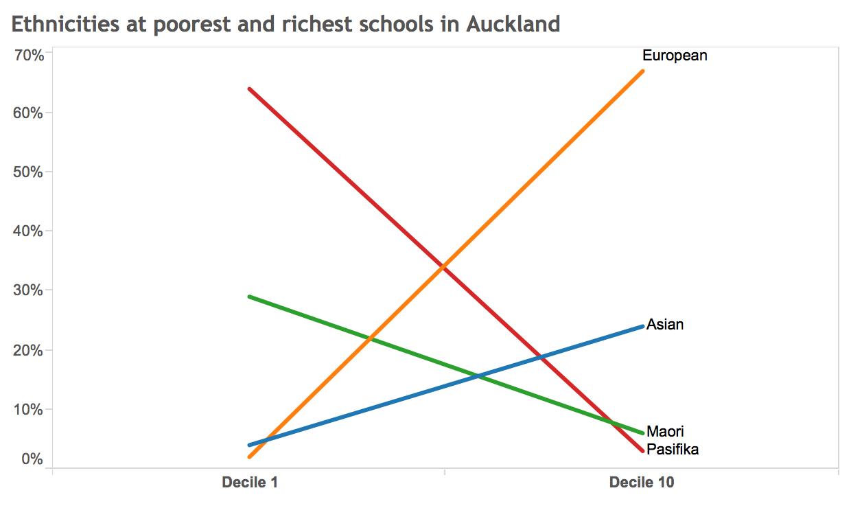
The point of this chart is really the comparison, and the differences are really stark. The slope graph makes them much more visible, and easier to understand, than the pair of pie charts. I also got rid of the color legend and instead labeled the lines directly (though I left out the exact numbers since they likely aren’t terribly important).

It’s not just about the difference in the chart type here (and avoiding the oft-maligned pie chart), but asking what the point of the visualization is. If it’s comparison between sets of values (or over time), use a chart that makes that easy and clear.

Filed Under: Blog 2015

Robert Kosara is Data Visualization Developer at Observable. Before that, he was Research Scientist at Tableau Software (2012–2022) and Associate Professor of Computer Science (2005–2012). His research focus is the communication of data using visualization. In addition to blogging, Robert also runs and tweets. Read More…

Reader Interactions

Comments

  1. Joel says

    August 27, 2015 at 7:02 am

    I like the bump chart at the bottom, but your eye is drawn to the center where there is no data. Furthermore, the first and last deciles are the most likely to contain outliers…

    Maybe if it included another decile (5th) or two (4th & 7th)?

    Reply
    • Robert Kosara says

      August 27, 2015 at 9:24 pm

      Valid points. Showing all the deciles would be best, no doubt. This is a bit of an extreme slope graph (I mixed up the chart types earlier), it usually doesn’t create such a strong x in the center.

      Reply
  2. edomaniac says

    August 27, 2015 at 7:22 am

    Is the bump chart better than say, a bar graph here? I know that’s boring, but that seems like you’d get both relative and absolute comparisons pretty easily that way.

    Reply
    • Robert Kosara says

      August 27, 2015 at 9:25 pm

      A bar chart would definitely work, but I like the stronger implied comparison of the slope graph (I mixed up the chart types initially).

      Reply
  3. Judd Bradbury (@datanarrativist) says

    August 27, 2015 at 12:30 pm

    Curious about a simple point plot with colored points? The color keys the eyes for the comparison without the line implying a trend that may or may not track in a linear fashion. I also like the idea of a side by side bar or column comparison. As always, a great simple thought generating post.

    Reply
    • Robert Kosara says

      August 27, 2015 at 9:28 pm

      Colored points would also require finding the matching ones. You’re right that the slope graph depends on the distance and the vertical scale. But I think this still works to compare without making a judgment about some sort of implied rate of change.

      Reply
      • Judd Bradbury says

        September 21, 2015 at 2:11 pm

        Agreed and having the reference line provides a great deal more “at a glance” high speed value

        Reply
  4. jonpeltier says

    August 27, 2015 at 5:21 pm

    Your chart’s better, but it’s a slope graph, not a bump chart.

    Reply
    • Robert Kosara says

      August 27, 2015 at 9:21 pm

      Ah! Of course! Thanks, fixed.

      Reply
  5. Chris Pudney says

    August 27, 2015 at 11:33 pm

    I wondered about using a scatter plot too, here’s what it looks like
    http://jsfiddle.net/cpudney/ekxnuLjz/8/

    I think the slopegraph works better.

    Reply
  6. Antoine Carriere says

    September 16, 2015 at 7:36 pm

    I would use stacked bar instead, to make addition easy (eg European+Asian are x% of decile 1 but y% of decile 10). And maybe force the comparison by adding dotted lines. What do you think?

    Reply
  7. James Russell says

    September 24, 2015 at 2:30 am

    I agree on this one. Since we are using graph or charts to give visual impacts to the audience, let’s just do it in the right way. There different types of charts or graphs for different agenda and delivery of the data. A right pick of your type will serve its purpose exponentially. Also, you should know how to use colors on them. And I must say, the discussion in your article is very clear for understanding. It is commendable…

    Reply

Leave a Reply Cancel reply

This site uses Akismet to reduce spam. Learn how your comment data is processed.

Primary Sidebar

More Blog 2015 Articles

  • Ye Olde Pie Chart Debate
  • Memorability, Science, and The Value of Thinking Outside the Box
  • Review: Munroe’s Thing Explainer and Pinker’s Sense of Style
  • Tapestry 2016 Open For Applications
  • VIS Proceedings now in the January Issue of TVCG

Recently Popular

  • Data: Continuous vs. Categorical
  • Midjourney is a Trip
  • The Simple Way to Scrape an HTML Table: Google Docs
  • Watch My Outlier Talk: This Should Have Been A Bar Chart!
  • New video: Gauges for Data Visualization, The NY Times Election Needle, and Circular Bar Charts
  • Continuous Values and Baselines
  • Paper: More Than Meets the Eye: A Closer Look at Encodings in Visualization
  • Facebook
  • GitHub
  • LinkedIn
  • RSS
  • Twitter
  • YouTube

Subscribe via Email

Footer

  • About
  • Contact
  • License

Copyright © 2006–2022 Robert Kosara · All original materials are available under CC-BY-SA


Loading Comments...