Between Surprise Maps, Dear Data, and election graphics, 2016 was an exciting year. There have also been some gaps, however, notably around storytelling. How far have we come, and where is visualization going?
Visualizing Uncertainty
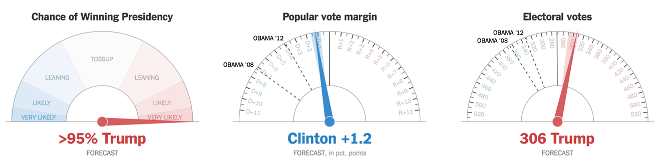
Elections always bring large numbers of visualizations with them, and last year’s U.S. Presidential election was no exception. There is a lot to be said about the various visualizations that were used (I’m no fan of choropleths). But one in particular stood out: the New York Times’ jittery gauges.
A lot of scorn and ridicule has been heaped on this design, but the situation is more complicated than it is often depicted. The idea of motion to show distributions and uncertainty has been studied in a paper by Jessica Hullman and others (this blog post nicely summarizes the ideas) and found to work well. The design was certainly well considered, but it’s always easy to criticize these things after the fact.
However, the severity of the situation, the high confidence before election night, and the unfamiliar way of showing the data all ended up causing a lot of stress in a lot of people. I think it's important to note that this wasn’t just a problem of the visual representation, but also of the expectations that had been set by the forecasts. Things wouldn’t have been nearly as bad if we hadn't been led to believe that this was pretty much a done deal for Clinton.
Communicating uncertainty is extremely difficult, even when your audience understands the concept. Doing this for a general audience is close to impossible. Many things have been tried, some have turned out better than others. Uncertainty is everywhere and needs to be shown in forecasts, estimates like the unemployment rate, etc. Too many of these numbers are still presented as certain, precise facts, when they’re not.
That this is a problem is not a secret. However, most existing ways of showing uncertainty are too difficult to understand for people without a statistics background, or don’t work well for things like timelines. A lot of work is clearly needed here. This is not an easy area to work in when doing academic research, but there’s clearly enormous potential to do good work.
Interestingly, this is a topic that has been recognized by both the data journalism and the intelligence (read: three-letter agencies) communities. I’m aware of efforts in both to bring together ideas and work on new solutions. At least the ideas developed in the former should show up for the next election, if not sooner.
Sketching and Personal Data
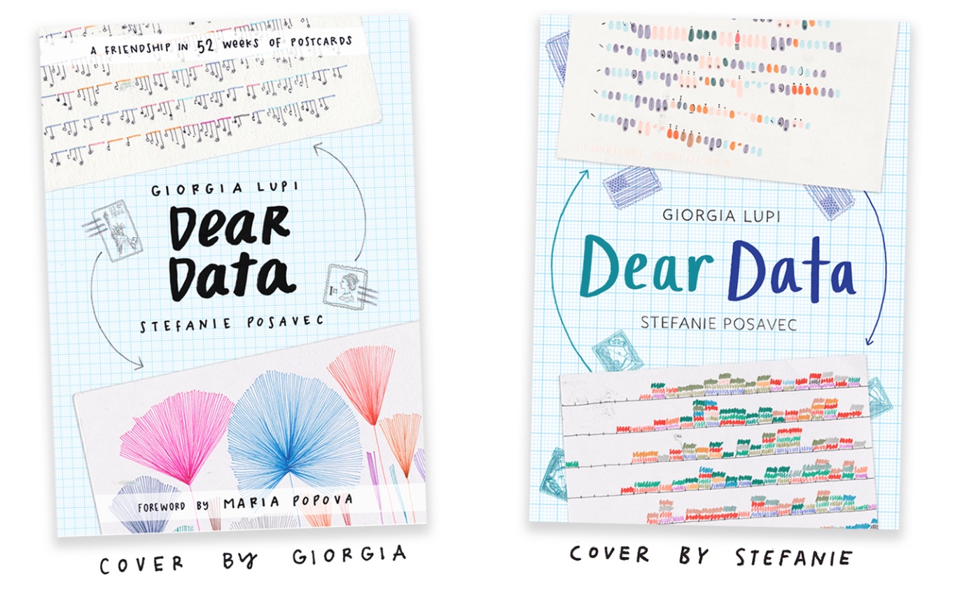
I mentioned Dear Data in last year's State of InfoVis, because I thought it was a great project – but I didn’t think it would explode into the huge success that it has become (including a very nice book, the postcards being acquired by MoMA, etc.). It has also inspired a number of other projects, like the knock-off Dear Data 2, the somewhat more thoughtful Data Sketches, and I’m sure it inspired RJ Andrews’ Profiling the Parks. Sketching has also been explored in visualization research a little bit in the past.
Drawing data with colored pencils or crayons is a good gateway drug to getting people interested in visualization. And it’s a good exercise to get your brain juices flowing, even – or maybe especially – if you’ve been doing visualization for a while. Give people a few numbers and 20 minutes of uninterrupted time, and it’s amazing how many different things they come up with.
Apart from the sketching, the other interesting aspect of Dear Data is that the underlying data is all collected by hand, and rather unusual (like the number times you've smiled at somebody, the kinds of smells you've experienced, etc.). It’s this sort of personally relevant data that we often ignore in visualization, because it’s hard to get to and difficult to handle. It is important, however, for people who might not be interested if all they see are boring and irrelevant standard datasets. After seeing Catherine D’Ignazio talk about this at Information+, I’m starting to understand how important this issue is.
Bringing more creativity into visualization is a good thing, and I hope that we’ll see more of this sort of work, inside and outside of the academic vis community.
Smarter Visualization With Statistics
Apart from uncertainty, an area that visualization still struggles with is to show what is actually important. Just displaying data is one thing, but are any of those patterns we’re seeing unexpected or interesting? The Surprise Maps paper at VIS last year presented a very interesting approach to the problem that (almost) every map is really just a population map.
The idea of asking, what do we expect and how is the data different? is very powerful. It’s kind of embarrassing that we haven’t been doing this all along in visualization. My statistics colleagues were quite unimpressed by this paper, but it’s a big step for visualization. I really hope to see much more of this kind of thinking in visualization going forward, to the point where it becomes an inherent part of how we work and think.
Storytelling
After a couple years with a lot of activity, this last year has seen a real lull in interesting storytelling work. And it’s not even limited to academia, journalism also seems to have cut back on elaborate storytelling projects.
There are still some out there, no question. But there seems to have been a bit of a reckoning with news media realizing that the effort put into those projects isn’t always worth it. Two talks by journalists, Archie Tse at Malofiej and Gregor Aisch at Information+ spelled that out in no uncertain terms.
On the academic side, I’m seeing a lot of people write surveys and retreading the same old ground, without making any interesting progress. This could be a sign that this thing has either run its course, or that we’re past the first wave of easy stuff and now need to get more serious.
I’m thinking that we’re just taking a breather after the first step. There are many interesting questions that we’re nowhere near answering. We need to figure out what we want to achieve with storytelling in visualization, how to think about developing and testing new ideas, etc.
While I’m not aware of many specific projects by others, I’m involved in a paper that is currently under review and will hopefully see the light of day soon. There’s also more stuff I’m working on, some of which I hope to get out this year. And, as every year since 2013, I'm one of the organizers of the Tapestry Conference on Storytelling in early March that promises to be quite interesting again.
A New Wave of Theory
Predicting the future gets a lot easier when you’ve gotten a peek behind the curtain to see what people are working on there. And from that, I feel confident in saying that we’ll be seeing a new wave of theoretical work in visualization in the next few years.
I’m aware of some very interesting experiments and ideas that should change the way we think about visualization quite a bit. It’s kind of funny to think that we thought we had theory figured out in the 1980s with Bertin, Mackinlay, Cleveland&McGill, and a few others. And it’s a good thing we don’t, or this would all be too easy.
I can’t talk about specifics here, but things are about to get a lot more interesting. We’ll need to get a bit smarter about understanding and modeling than we currently are. And we need to embrace uncertainty around what we know a lot more – not ignore, but understand it and deal with it. But the reward is that this could open up the field to a lot of new things that we haven't thought of yet.

Pies and eagereyes
I spent a surprisingly large part of last year thinking about pie charts. I’m glad I did. There’s a lot more to them than most people think, and they’re a good model for how we need to ask more questions about our basic assumptions in visualization.
Drew Skau and I presented two papers at EuroVis, I did a bit more work for a better presentation of our results, dug up some old papers on the topic, and turned the whole mess into a pretty decent talk for Information+ (there were also some other great talks at Information+, BTW). And this isn't even the end of it, there's more stuff coming at some point.
This site also turned 10 last year, which I took as a cue for some reflection and to finally get a decent theme and logo.
Despite my initial hesitance when I sat down to write this posting, 2016 was quite the year for visualization. Exciting things are happening, and I look forward to where this field is going in 2017 and beyond.
You can read all previous State of InfoVis postings here.
Comments (1)
Posting new comments was disabled in 2020.