• Skip to main content
  • Skip to primary sidebar
  • Skip to footer

eagereyes

Visualization and Visual Communication

  • Explore
    • Starter Pack
    • Blog Calendar
    • Blogroll
    • eagereyesTV YouTube Videos
  • Practical
    • Basics
    • Pie Charts
    • Techniques
    • Book Reviews
    • Journalism
  • Academic
    • Speaking Mistakes
    • Acceptance Rates
    • Papers
    • Conference Reports
    • Lists of Influences
    • Criticism
    • Peer Review
  • Admin
    • About
    • Contact
    • License
Review: Lupi, Posavec, Dear Data

Robert Kosara / September 11, 2016

Review: Lupi, Posavec, Dear Data

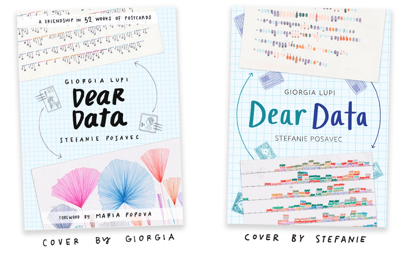
Giorgia Lupi and Stefanie Posavec have turned their Dear Data project into a book. It’s a great example of the kind of creative work you can do around visualization without computers, entirely by hand. What started with a simple idea turned into an amazing project.

Dear Data consisted of Giorgia and Stefanie, who are both visual designers, tracking an aspect of their lives for a week and then drawing a sort of visualization onto a postcard that they’d send to the other. They did that for an entire year.

What’s great about the project is that they tracked things that you can’t track with the activity trackers we now all carry around. They didn’t look at steps taken or stairs climbed or heart rate, though, but at how many times they smiled, how often their partners made them feel loved vs. annoyed, how much they interacted with friends, etc. The resulting images are also not your usual charts, but some really beautiful and unusual sketches.

Why buy a book when you can just see all the postcards on the website? For one, they’re much nicer to look at on paper than on a screen. Each chapter is also a little story about the topic of the week, told with a lot of humor. It’s great to leaf through the book and look at one postcard here or there, read the text around them, etc.

Confusingly, there are two versions of the book, one published by Princeton Architectural Press and one by Particular Books/Penguin. You can get the U.S. version of the book on Amazon US or the U.K. version on Amazon UK (or both).

Filed Under: Blog 2016 Tagged With: Book Reviews

Robert Kosara is Senior Research Scientist at Tableau Software, and formerly Associate Professor of Computer Science. His research focus is the communication of data using visualization. In addition to blogging, Robert also runs and tweets. Read More…

Reader Interactions

Leave a Reply Cancel reply

This site uses Akismet to reduce spam. Learn how your comment data is processed.

Primary Sidebar

More Blog 2016 Articles

  • A Roundup of Year-End News Graphics Roundups
  • The Dumbest User Interface of 2016
  • When Rankings Are Just Data Porn
  • The EagerEyes Holiday Shopping Guide
  • The Problem with Vis Taxonomies

Recently Popular

  • Data: Continuous vs. Categorical
  • The Simple Way to Scrape an HTML Table: Google Docs
  • Understanding Pie Charts
  • Spreadsheet Thinking vs. Database Thinking
  • How The Rainbow Color Map Misleads
  • What is Visualization? A Definition
  • Stacked Bars Are the Worst
  • Facebook
  • GitHub
  • LinkedIn
  • RSS
  • Twitter
  • YouTube

Subscribe via Email

Footer

  • About
  • Contact
  • License

Copyright © 2006–2021 Robert Kosara · All original materials are available under CC-BY-SA