
Treemaps are the single most used 'real' InfoVis technique there is. Interestingly, they have proven to be even more useful for unstructured data than for the hierarchies which they were originally developed for. Here is a brief history, discussion of current practical uses, and of the importance of treemaps for the adoption and understanding of information visualization.
Describing treemaps in words is a guarantee for blank stares from my students. The concept behind treemaps, while visually simple and compelling, is actually quite bizarre: recursively slice and dice a rectangle in different directions to represent a (potentially large) hierarchy.

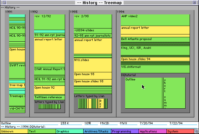
Treemaps were invented by Ben Shneiderman, who also wrote the first implementation of the algorithm. Shneiderman has a wonderful page about the history of treemaps as well as many developments by himself, his collaborators, and others (most notably Jarke van Wijk and his students).
What the treemap shows is not only the structure of the tree, but the size of the nodes. This makes it possible to see which files take up all the space on a hard-drive, or compare stock prices. It could even be argued that treemaps do not show tree structure particularly well, especially for deep hierarchies with many nodes, but showing the node size is something few other techniques do.
From Maps to Squares to Cushions
Depending on the data, the rectangles can have very different aspect ratios, making them hard to compare: a thin long rectangle of the same area as an almost square one looks very different. Bruls, Huizing, and van Wijk therefore developed Squarified Treemaps, which optimize the placement of nodes within a level to make them as square as possible. While that is a great idea to make static treemaps more readable, it causes problems when treemaps are used to show developments over time. Ordered Treemap Layouts, developed by Shneiderman and Wattenberg, solve this problem by conserving the ordering of elements while seeking to keep nodes as square as possible, and thus produce very stable layouts. While it is fairly uncommon to compare trees over time, their most interesting application is an interactive map of the market, which shows the stock market in an entirely new way. That map is available at SmartMoney.com (in the menu on the left, click Tools and Maps, and then select Map of the Market from the submenu that appears).

The power of this map is the way it shows a lot of stocks at the same time, grouped by sector. This makes it possible to see current trends much more clearly than showing lots of individual graphs, and companies that behave differently than their competitors are easy to spot. The size of the nodes in the image above shows each company's market capitalization, and the color indicates the difference of the current price from the closing price of the day before (green is up, red is down). The little Ns indicate news items, and these are particularly interesting for those companies that beat the rest of their sector (or lose when everybody else is winning).
Treemaps with lots of items tend to be hard to use because of the high spatial frequencies from the many lines enclosing small nodes. Cushion Treemaps by van Wijk and van de Wetering solve that problem by applying a texture to the rectangles that make them appear like little, shiny cushions. Because of the perceived discontinuity in texture between nodes, lines are no longer necessary to separate nodes, so more of the space can be used for the actual node display, and much smaller nodes can be shown than in a flat treemap. The image shows a part of my Documents folder, with the color indicating the file type and the size the file size.

There are a number of programs that use cushion treemaps to show the contents of a hard disk to find out how space is used by different types of files, like SequioaView (Windows), Disk Inventory X (Mac OSX), and KDirStat (Linux).
There are too many variations of treemaps to show here (see Shneiderman's page for a very exhaustive list), but one that keeps being shown in discussions of treemaps are Voronoi Treemaps. These generalize the treemap from the rectangle to arbitrary shapes by using a Voronoi tessellation of the space.
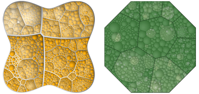
While these certainly look beautiful and interesting, they are of questionable utility. The authors claim that the fact that lines separating levels are not parallel makes it easier to see the tree structure, but comparing sizes seems difficult and there are more effective ways to show tree structure. I am not aware of any studies comparing Voronoi treemaps to other visualizations, but I highly doubt that they would be particularly useful.
A Hierarchical Visualization Method for Flat Data
The big success treemaps have had in research and certainly commercially has not been from their use in visualizing hierarchies, but rather unstructured (or flat) data sets. Hierarchies are clearly overshadowed in importance and data volume by relational data in databases, or data tables. There is no inherent structure in such tables, and the order of entries does not generally play a role. So how and why are treemaps used for such data?
A lot of that data is categorical, that means that many dimensions only contain a very limited number of different values, and these values generally mean something other than the numbers with which they are often encoded. A data set about all the people on the Titanic may contain data about the class passengers were in (four different values: crew, first, second, third class), their sex (two values), and their survival (two values). This kind of data is usually understood in terms of subsets: show me the number of people in all classes by sex and survival. In terms of subsets, this means one number for every class, sex, and survival status. In database language, this would be the cross product between these dimensions, and in terms of OLAP, this data could be retrieved using a cube or rollup query.
The hierarchy comes from repeatedly splitting up the data into subsets according to the dimensions. In the above example, we may split the data by the class first, then every class is split up into two subsets for both sexes, and each of these subsets is finally split into two for survivors and non-survivors.

Now we have a tree that can be visualized using a treemap or other hierarchy visualization. And since the size of the nodes is the most interesting here, and the structure of the tree is generally not the focus, treemaps are an excellent choice. In addition to showing the values at the leaves of the tree, they also show the aggregate sizes at the intermediate levels, thus offering a quick way to do aggregates. Of course, the order of dimensions determines the tree, and it must be possible to reorder the dimensions, add or remove dimensions, etc.
A simple, non-squarified treemap of the above data could look like this:

Beyond Treemaps: Bar and Pie Charts!
Vliegen and van Wijk published a very interesting paper at InfoVis 2006 on Visualizing Business Data with Generalized Treemaps, in which they took the elements of the treemap to construct bar and pie charts. In the illustration below, orange elements mean cases for which a notary firm made a loss, green are cases that provided revenue. The different kinds of visualization provide for easier access for people not familiar with treemaps, and make it possible to compare different criteria.

The paper also describes some interesting layout strategies for treemaps when dealing with large numbers of nodes, allowing the user to pick a "vanishing point" where the smallest (or largest) nodes will be placed. Voronoi treemaps, generalized treemaps, etc. show that there is a lot of room to explore new ideas with treemaps.
The TreeMap Industry
There is a variety of applications of treemaps to different kinds of data, hierarchical and otherwise. The news map, shows which news stories are popular, a usenet visualization offers a glimpse into the past of the newsgroup hierarchy, a visualization of slashdot stories allows the user to explore tags and keywords, a visualization of items in an exhibit provides an unusual view on a few hundred items, and there are a lot of other examples.
Treemaps have become the bigger brother of bar charts, and have been widely adopted especially for data analysis that requires more detailed views on large numbers of individual items (that cannot simply be shown as aggregate bars). SmartMoney was the first widely available treemap implementation for non-hierarchical data, and since then, a whole industry has been built around treemaps. I don't have numbers, but treemaps must be a multi-million dollar industry by now. MagnaView, The Hive Group, LabEscape, ProClarity (recently acquired by Microsoft), etc. are either exclusively or also selling implementations of treemaps for different uses. It's only a question of time until treemaps (and perhaps histograms, hint, hint) will make it into Excel and other real consumer tools.