The two main conferences in visualization are VIS and EuroVis, but recently CHI has also gotten some very interesting submissions (CHI is technically a conference about human-computer interaction, or HCI). This year looked particularly strong,
I didn’t actually attend the conference this year, so the selection below is based on my trolling the program online and watching some of the Twitter chatter during the conference. I did not include all the visualization-related papers I could find, only the ones I found the most interesting. You can find more in their searchable program.
CHI provides open access to all papers for a full year. So unlike with most other conferences, non-academics can easily read the actual papers without having to find “personal copies” elsewhere. I believe CHI is doing this for the first time this year. It’s an admirable model, and one other conferences should copy right away.
Same Stats, Different Graphs
This is my favorite paper, hands down. Justin Matejka and George Fitzmaurice took Anscombe’s idea (to create datasets with virtually identical statistics that look very different when drawn in a chart) and ran with it. It’s a modern take on an oft-cited paper from the 70s, and it’s very well done.
I also love the website they made for the paper. I even love the animated gifs (not something I’m wont to say in general). Do yourself the favor of at least scrolling all the way through it and looking at all the little animations. They’re very well done and show a few things you might not expect (like how box plots don’t show you weirdly quantized distributions).
It’s easy to say: duh, we know all that. Except we don’t. These kinds of problems pop up all the time. Now we have a much richer set of examples than Anscombe’s venerable (but limited) quartet, as well as a way to create any number of new ones.
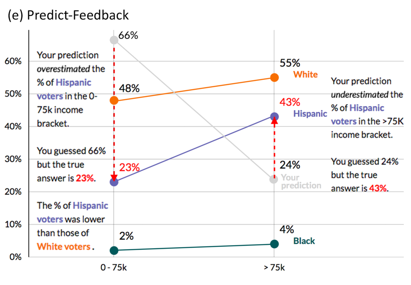
Guessing to Remember
Figuring out if people retain what they have seen in a chart has become more of a question lately, as we realize that just showing data that nobody even recalls is kind of pointless. In Explaining the Gap: Visualizing One's Predictions Improves Recall and Comprehension of Data, Yea-Seul Kim, Katharina Reinecke, and Jessica Hullman look at how actively predicting and explaining differences might help people remember what they have seen.
The ideas are motivated by educational psychology, and they prove to be effective: people remember more when they’ve been challenged to make predictions, whether they know something about the subject or not.
Eyeballing Regressions
People are surprisingly accurate when estimating regression coefficients from scatterplots. What is less well understood is how robust this is to certain known visual effects, or how much outliers are taken into account or ignored. Regression by Eye: Estimating Trends in Bivariate Visualizations by Michael Correll and Jeffrey Heer looks into this and shows some expected (outliers are easily ignored) and not so expected results (area graphs pull the regression line into the area).
Michael has also written an extensive blog posting explaining the main ideas in the paper and some of the background.
Rethinking Established Charts in Science
Empirical Analysis of the Subjective Impressions and Objective Measures of Domain Scientists' Visual Analytic Judgments by Aritra Dasgupta, Susannah Burrows, Kyungsik Han, and Philip J. Rasch is a bit of a mouthful, but they tackle an interesting problem: in many sciences, some of the most commonly-used charts are not actually good visualizations by visualization standards. They’re often the result of somebody having put something together for their own use that caught on by mistake, and then it gets entrenched because everybody uses them.
Dasgupta and colleagues look at the Taylor plot, which are used in climate science to compare models and model runs with different parameters. They test a heat map, a bar chart, and a slope plot as alternatives, and they find less resistance than one (well, I) might have assumed.
Connecting Data with People
Showing pictures of people is a good thing, right? Certainly when it comes to news graphics or trying to get people to care about refugees, donate money, etc. The paper Showing People Behind Data: Does Anthropomorphizing Visualizations Elicit More Empathy for Human Rights Data? by Jeremy Boy, Anshul Vikram Pandey, John Emerson, Margaret Satterthwaite, Oded Nov, and Enrico Bertini looked into this. They tested a number of different designs and compared them against standard charts, but found virtually no differences between them.
The paper asked an interesting question about something that is not often studied so far: how do different charts impact (potential) decisions, like whether to donate money? The comparison with anthropomorphic shapes also meshes well with my interest in ISOTYPE, which often used pictures of people to depict data (though usually to inform rather than to elicit a particular response).
CHI covers a lot more ground than just visualization, but it's certainly a conference to keep an eye on for exciting new developments. It is known to be tough to get work accepted into, but it also sometimes accepts work that seems too daring or unusual to make it into InfoVis or EuroVis. It's definitely a conference to keep an eye on.