Criticizing visualizations is a cottage industry of sorts, and an activity I have indulged in in the past as well. Redesigning those charts is also not uncommon, though it's usually other people's charts, and that isn't always welcome. Sarah Leo of The Economist has redesigned some of the charts made by that publication, and not only do her redesigns work better, her thoughts around some of the design issues are also very insightful.
This being The Economist, the charts Leo picked for redesigns aren't all that egregious to begin with, but her redesigns are clearly an improvement. Two stood out to me in particular. The first one seems to show a correlation that's a little bit too perfect.
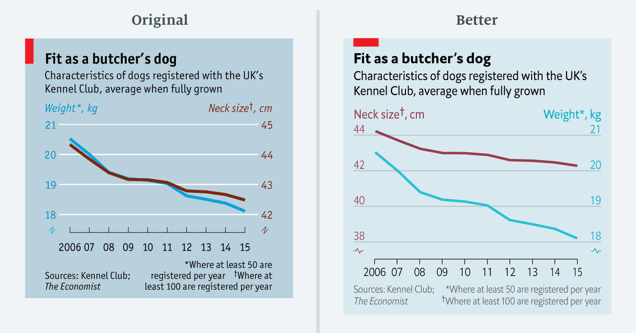
I don't know much about dogs, but I figure weight and neck size are highly correlated. It may also just be a coincidence of how the vertical scales fall that these lines end up on top of each other, so it's easy to just go with that. At the same time, we're comparing apples and oranges here and neither of the axes start at zero.
Leo makes an interesting point here about how to pick axis ranges in such a case: pick the same range as a percentage of the full scale. That at least makes the rate of change somewhat comparable and we see that perhaps the neck sizes haven't been dropping quite as drastically as the weights. I think this is an interesting idea and a useful guideline for cases where including zero would be impractical. Another approach, though possibly not one that fits the Economist's editorial style, would be to try a connected scatterplot.
The other example I though was particularly interesting is also a dual-axes line chart, this one about the U.S. trade deficit and employment.

What's extremely confusing here, and frankly not very well done in the original, is that the trade deficit is all negative numbers while unemployment numbers are all positive. The half-length red line at the top is supposed to indicate this, but I at least did not understand that and thought it was a mistake.
The redesign is clearly much better, and I particularly like that Leo chose bars here to connect the points to the axis. This way, there's no way to miss that the numbers are negative. I'm partial to downwards-pointing bars and think they should be used a lot more; but they need to be done in a way that's clear and easy to understand, or risk being misread.
This kind of reflection and redesign of your own charts (even if Leo didn't actually make all of those original charts, but they're done by the people around her) is a great exercise. It allows you to flex your design muscles and think in terms of more general design rules and guidelines that will inform and improve future work. And doing this with your own work means you're not stepping on people's toes, even when you're doing this in public.
Comments (1)
Posting new comments was disabled in 2020.