New video: Exploring the connections between companies with They Rule
Josh On's They Rule is back, and I've made a video about it.
Josh On's They Rule is back, and I've made a video about it.
Gauges aren't very popular in visualization, but they have some interesting properties. There is, of course, the infamous NY Times "election needle," but you're probably using gauges every day without giving them too much thought. There's also an interesting connection with circular bar charts, which I think can work well when used as part-to-whole charts. I talk about all of this in my new video.
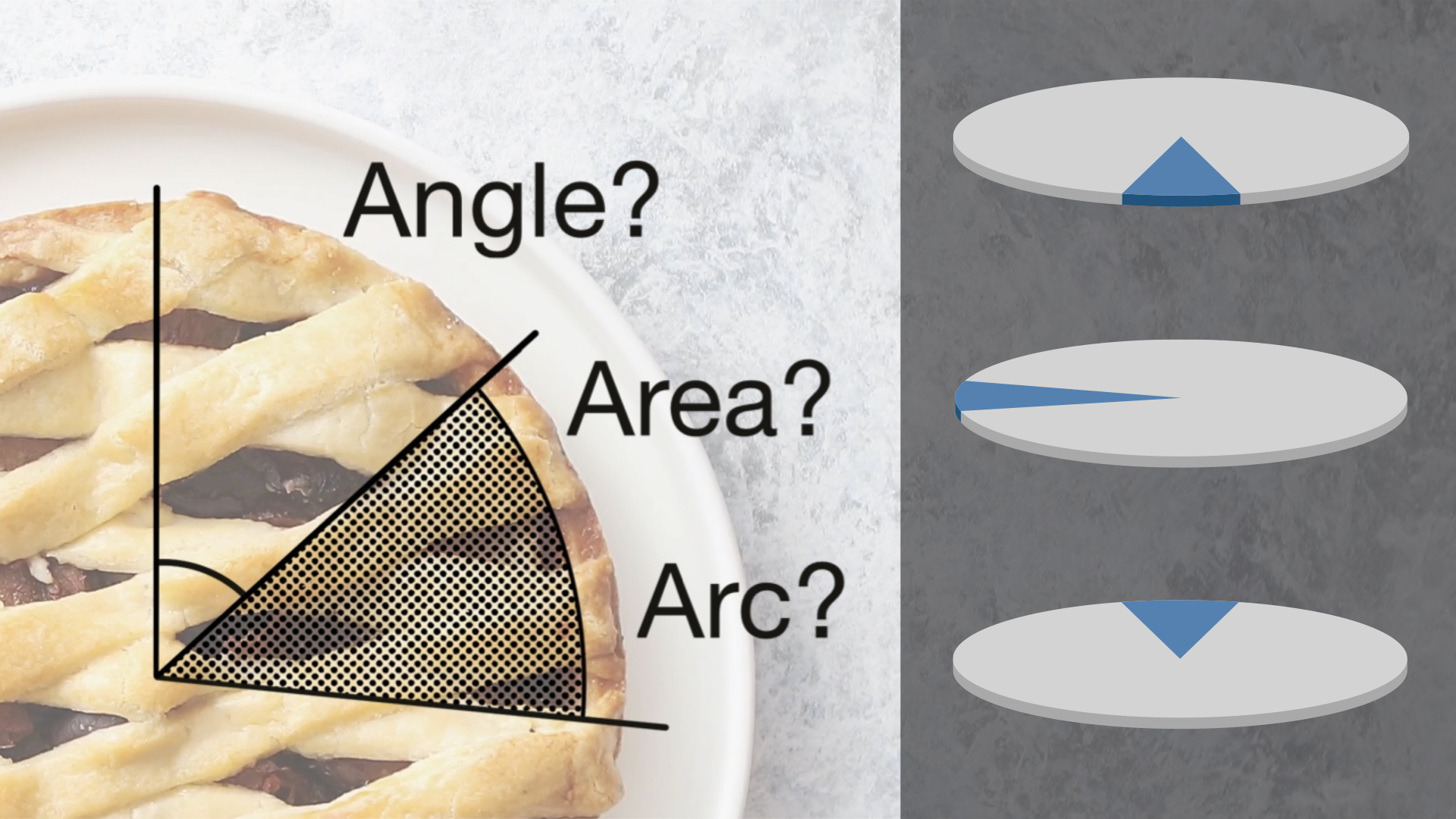
The common explanation for how pie charts work is that we read them by angle. That of course would mean that donut charts would be bad, because you can't see the angle when you take away the center of the pie. Changing the radius of a slice wouldn't matter though, because that doesn't change the angle. But there is no evidence that angle is how we read pie charts, quite the opposite actually. In this new video, I walk through five reasons why angle is not how we read pies, and what that means for other things we like to assume about them.
How do you make people not just see numbers when looking at a chart, but feel something? This chart of the number of deaths during the Iraq war has always given me a visceral response like no other, and it’s still as powerful as when it was made almost ten years ago. So I made a chart appreciation video to explain what I think is so great about it.
Scaling objects to represent a value is a key part of visualization, but it's not without its pitfalls. Especially when it comes to fancy infographic bar charts, it can easily distort the value's appearance. Why that is, and where else this can happen, isn't always obvious. In my new video, I show how it happens and how to do it right – and how this issue inspired ISOTYPE.
It's Florence Nightingale's 201st birthday tomorrow! Since I missed her 200th, I figured I'd make a video about her famous chart. What made it tick? What was it about? Who was Nightingale, anyway?
Dots fly across the screen, some of them moving up, some down. They represent black and white boys, and how their income differs from that of their parents and from each other. It's a great way to show this data in an engaging way and without having to explain percentiles. This is a chart appreciation.
This chart is a staple in every visualization course and many visualization talks. But what does it show, and what does it leave out? There's a lot more to Napoleon's Russian Campaign and to Charles Minard's work than this one chart. My new video looks beyond the surface of what is perhaps the most famous chart out there.
Line charts – they're not the most glamorous. And yet, they can be used to tell a compelling story about global warming. In this video, I talk about what I consider a modern classic of data journalism, What's Really Warming the World by Eric Roston and Blacki Migliozzi: how it works, how it's structured, and why it works so well.
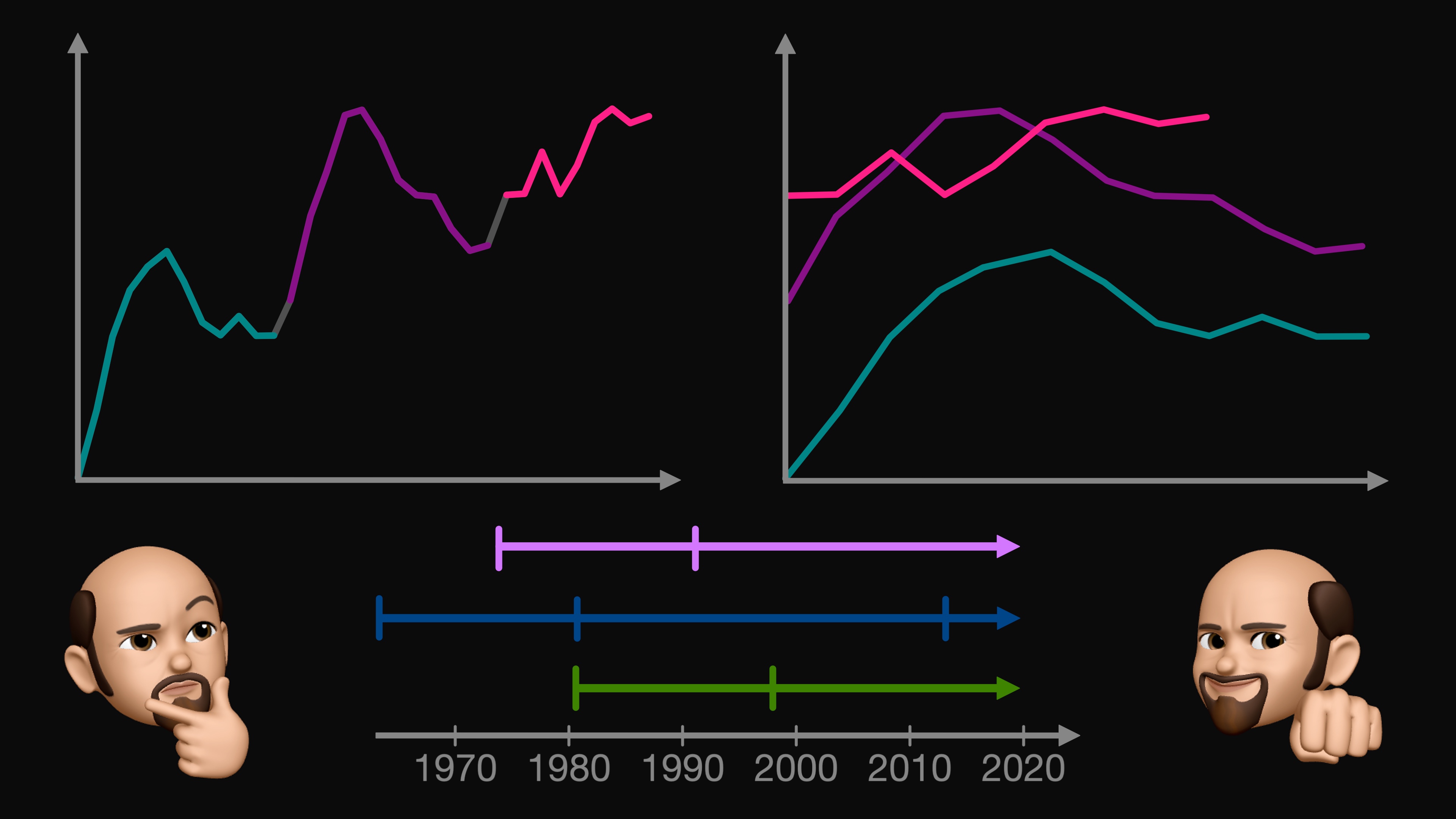
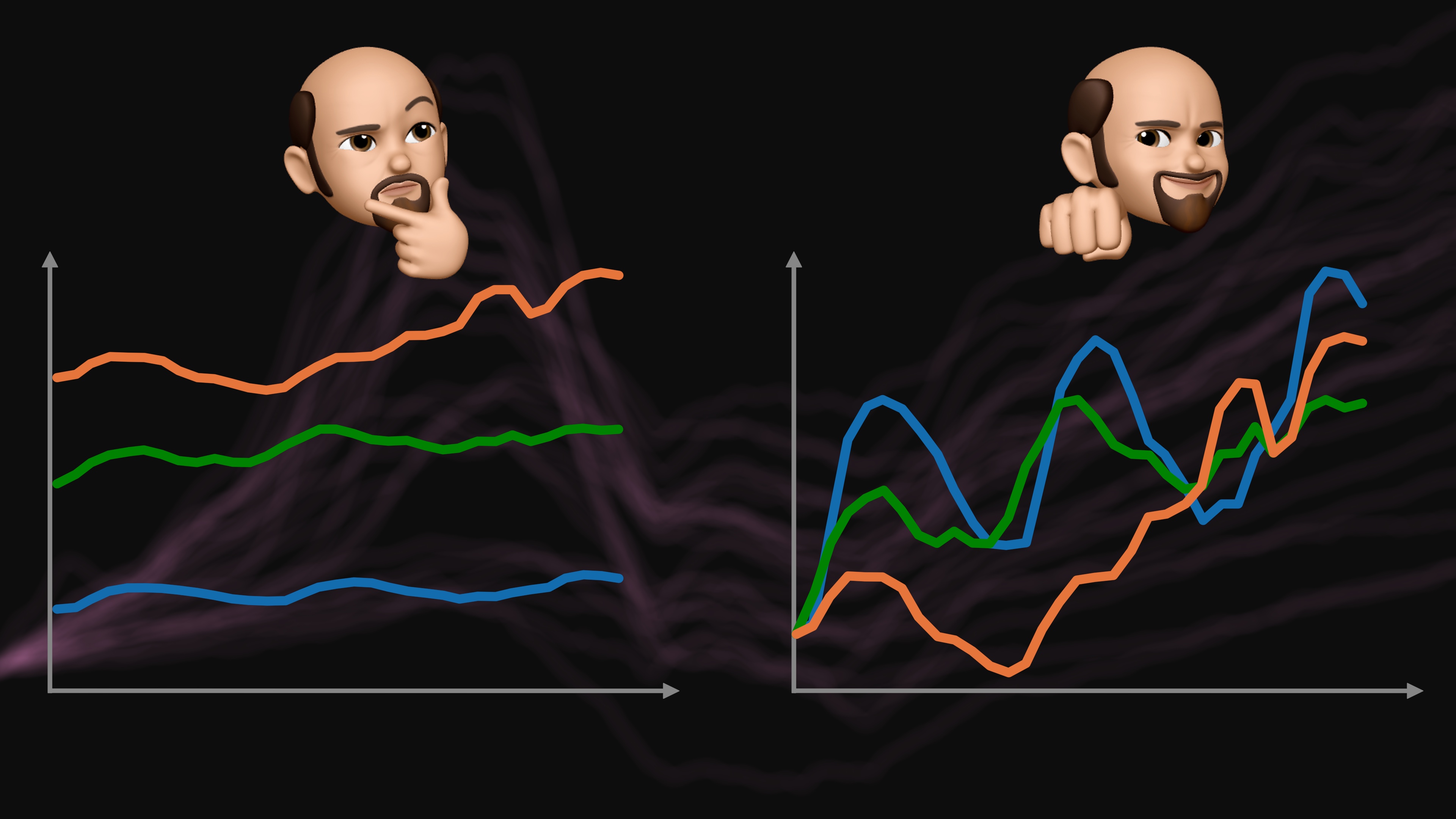
I covered the more commonly known value index charts in my my last video on index charts, this one is about indexing on the horizontal, or time, axis. It's kind of fascinating how you can fold the time axis to get a better view of your data. I show how it works and walk through a number of examples, using housing prices, camera sales, global warming, and even data about my running!
To show change over time, you typically use a line chart. But when you’re comparing time series whose values are very different, the differences between the lines can obscure the changes within them. Index charts can help with that. They align values to a reference, or fold the time axis on itself, or even do both.
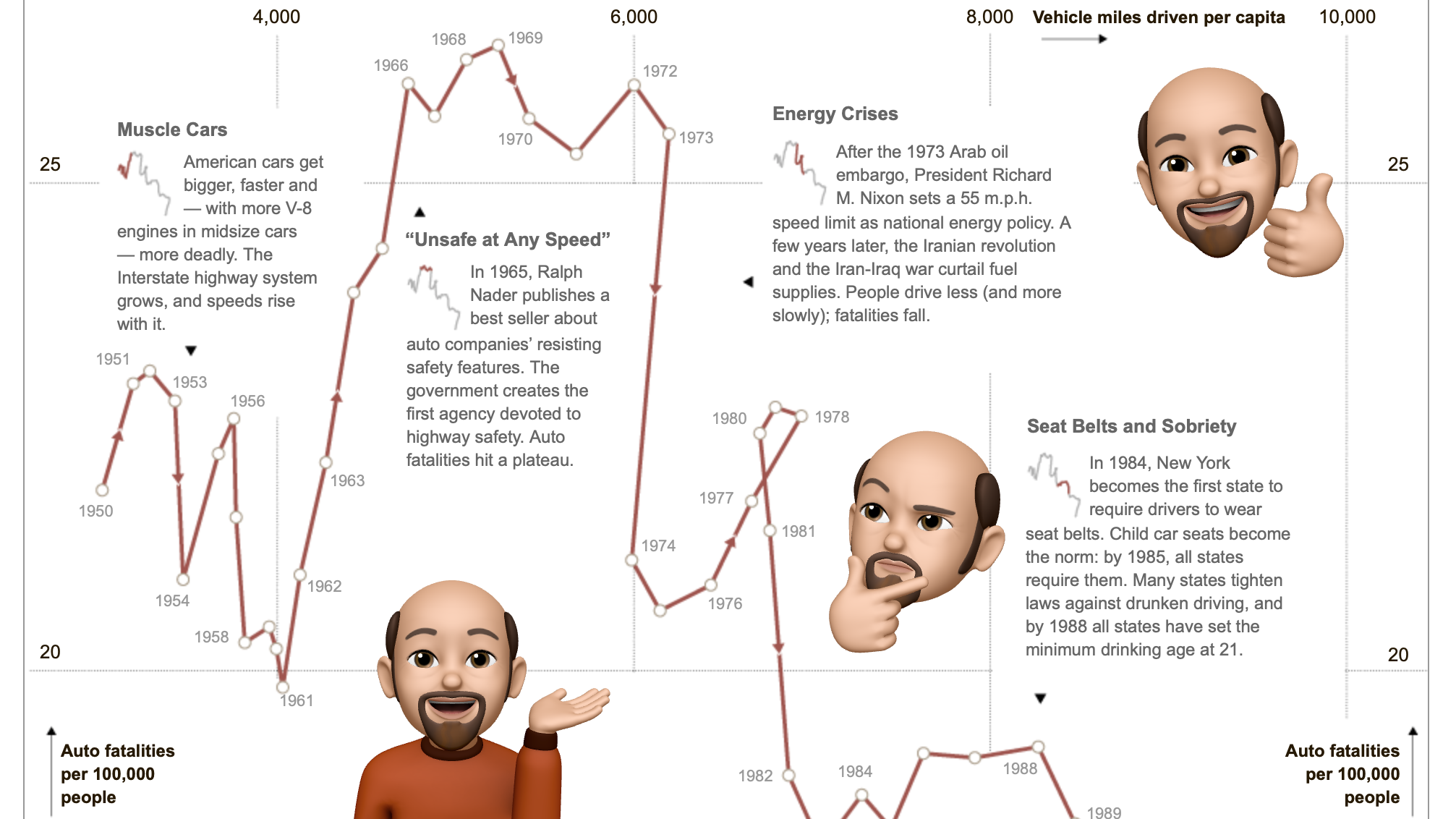
Time to breathe new life into my little YouTube channel, which I'm calling eagereyesTV. I'm doing so with the start of a new series I'm calling Chart Appreciation. Each episode will be on one particular visualization, news piece, or interactive. As the first one, I picked Hannah Fairfield's Driving Safety, in Fits and Starts from 2012.
Visualization turns data into images, but are images themselves data? There are often claims that they are, but then you mostly see the images themselves without much additional data. In this video, I look at image browsers, a project classifying selfies along a number of criteria, and the additional information stored in HEIC that makes things like portrait mode and relighting possible.
We all use data all the time, but what exactly is data? How do different programs know what to do with our data? How is visualizing data different from other uses of data? And isn’t everything inside a computer data in the end?
How do we read pie charts? This seems like a straightforward question to answer, but it turns out that most of what you’ve probably heard is wrong. We don’t actually know whether we use angle, area, or arc length. In a short paper at the VIS conference this week I’m presenting a study I ran to answer this question – a study using 3D pie charts!
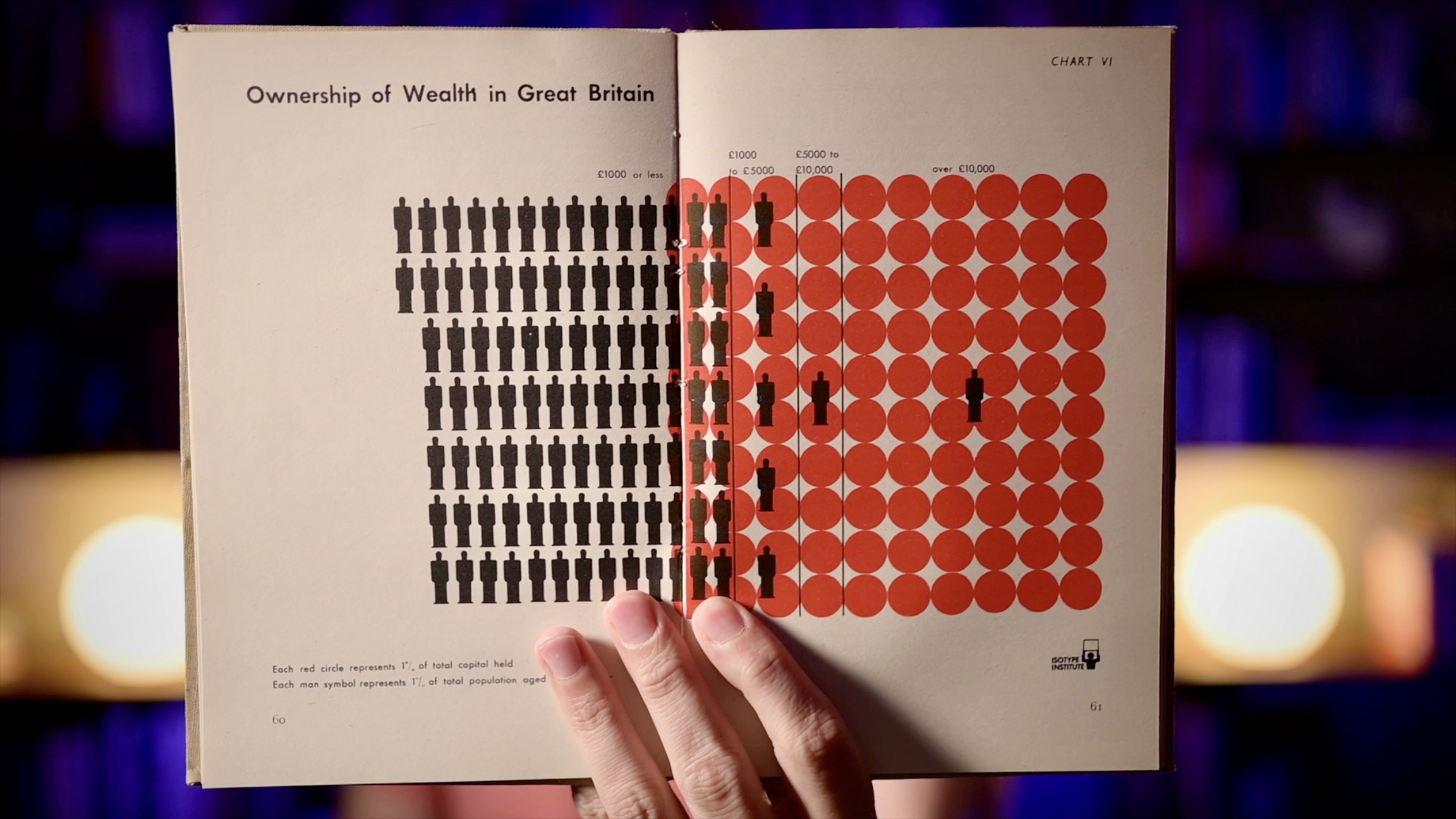
Charts usually show values as visual properties, like the length in a bar chart, the location in a scatterplot, the area in a bubble chart, etc. Unit charts show values as multiples instead. One famous example of these charts is called ISOTYPE, and you may have seen them in information graphics as well. They’re an interesting family of charts and they seem to have some unusual properties that most other charts don’t have.
After writing about visualization for over a decade, it’s time to mix things up a bit and try a new medium: video. I just uploaded the first video to my new YouTube channel, which I’m calling eagereyesTV. Take a look and tell me what you think!
When dealing with large amounts of data, we often use summary statistics like average, median, standard deviation, sum, etc. They’re useful because they actually hide data, they reduce the amount of information we need to look at to give us a sense of the data. But the same averages and can describe datasets that look vastly different.