I usually stick to the InfoVis track at VIS, and that was also the case this time. The papers in this part of my report from VIS 2017 cover text, small visualizations like sparklines and glyphs, tools for showing story structure, and multi-device interaction with data.
Word Clouds
Tag or word clouds are second only to pie charts in the kind of scorn you get for using them. And yet, they were a topic at InfoVis this year, with three papers dealing with their creation and readability.
EdWordle: Consistency-preserving Word Cloud Editingby Yunhai Wang, Xiaowei Chu, Chen Bao, Lifeng Zhu, Oliver Deussen, Baoquan Chen, and Michael Sedlmair presents a fairly straightforward, but also quite neat system to edit word clouds. The EdWordle tool allows you to add and remove words, move words around, or trigger a relayout that neatly animates. This lets you make more semantic word clouds by moving related words closer to each other (like when they’re part of a phrase).
Taking Word Clouds Apart: An Empirical Investigation of the Design Space for Keyword Summaries by Cristian Felix, Enrico Bertini, and Steven Franconeri goes the opposite direction, asking how well people can read them. They compared the classic text size with bar length, color, and bubble size. They measured time and error and found that the more precise codings (like bars) took longer to read than the ones that performed more poorly (like font size). Their materials are available.
Perceptual Biases in Font Size as a Data Encoding by Eric Carlson Alexander, Chih-Ching Chang, Mariana Shimabukuro, Steve Franconeri, Christopher Collins, and Michael Gleicher reports on 14 studies(!) on how the reading of word clouds depends on various factors such as word length, the kinds of characters involved, ascenders and descenders, etc. They found evidence for many of the assumed (but largely unproven) effects, but also that people really aren’t that bad at reading word clouds to begin with. Clearly, a word cloud will not be used for high-precision tasks, but they’re fine for comparing when there is a reasonable difference.
Sparklines and Glyphs
An Exploratory Study of Word-Scale Graphics in Data-Rich Text Documents, Pascal Goffin, Jeremy Boy, Wesley Willett, Petra Isenberg also mentions words, but in a very different context. It’s about small graphics better known as sparklines. They let designers play with Wikipedia articles to see what kinds of small graphics they’d want to include. The result is quite interesting, with a large number of different types and designs, and not limited to just numerical data. A list of designs from the study is available.
A Systematic Review of Experimental Studies on Data Glyphs by Johannes Fuchs, Petra Isenberg, Anastasia Bezerianos, and Daniel A. Keim looks at the many different types of glyphs (and their varying definitions). They compared a large number of papers going back to 1957, and put together a nice overview of what we know, where there are gaps, and where there are contradictions in the literature.
Brushing, Multiple Views, and Interaction
While there is a lot of talk of multiple views and interaction, there is not enough research to figure out how to actually use those. These three papers pushed the boundaries on what we know about this aspect of visualization.
MyBrush: Brushing and Linking with Personal Agency by Philipp Koytek, Charles Perin, Jo Vermeulen, Elisabeth André, and Sheelagh Carpendale takes apart the concept of brushing and linking to let users create their own brushing system by picking the type of source, link, and target they prefer. They show that people found that quite useful and were able to create a wide variety of tools depending on what they were after. Their source code is available and you can play with their implementation in your browser.
Keeping Multiple Views Consistent: Constraints, Validations, and Exceptions in Visualization Authoring by Zening Qu and Jessica Hullman looks at how some of the usual rules for scaling charts (like including zero, scaling to the max) can be adapted for multiple-view dashboards. They studied a wide range of different scenarios, with common measures using the same or different encodings, etc. They came up with a number of interesting results that appear to be quite useful and directly applicable.
VisTiles: Coordinating and Combining Co-located Mobile Devices for Visual Data Exploration by Ricardo Langner, Tom Horak, and Raimund Dachselt shows a number of ideas for using multiple mobile devices (in particular tables) to expand the way interaction with data works. They have a large set of interesting demos, and their source code is also available for you to try it out yourself.
Stories and Interaction
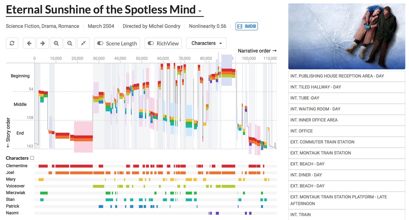
Visualizing Nonlinear Narratives with Story Curves by Nam Wook Kim, Benjamin Bach, Hyejin Im, Sasha Schriber, Markus Gross, and Hanspeter Pfister presents a very interesting tool to explore the narrative structure of books and movies, in particular flash-backs and flash-forwards. You can run it in your browser and play with a good selection of movies with interesting structure (Memento, Eternal Sunshine of the Spotless Mind, etc.). There’s also lots of interaction to find particular kinds of features, which they tested with literary and film scholars. Source code and more materials are available from their project page.
I should also mention a talk I unfortunately missed, Timelines Revisited: A Design Space and Considerations for Expressive Storytelling by Matthew Brehmer, Bongshin Lee, Benjamin Bach, Nathalie Henry Riche, and Tamara Munzner. They look at a variety of ways to show timelines and sequences, and how to use them to tell stories. Their materials are available online as well.
See also:
- Best Papers and Other Awards
- Keynote and Capstone
- Perception, Evaluation, Vision Science
- Machine Learning, Diversity, Parties