Raw numbers are easy to report and analyze, but without the proper context, they can be misleading. Is the effect you're seeing real, or a simple result of the underlying, obvious distribution? Too many analyses and news stories end up reporting things we already know.
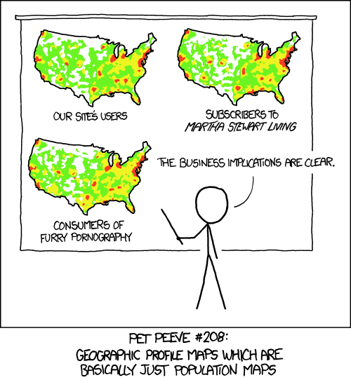
This is a particular issue with data that has a spatial component. When the data is shown on the inevitable map, you often just see a distribution of people. Where there are more people, there are more tweets, there's more crime, there are more customers, there are more coffee shops, etc. Many maps in fact show nothing but the underlying distribution of people. As usual, xkcd has captured the issue beautifully.
Crime on New York City Subways
An example for this is a map recently published by New York Daily News showing the amount of crime in subway stations in New York City. Each bubble on the map shows one station, with the size of the bubble representing the number of crimes. Mousing over the bubbles soon reveals that many of the higher-crime stations are the ones with more than one line passing through (and thus likely more people).

While it is possible to switch the map to a view that shows the number of incidents per 100,000 people passing through the station, the story leads with the raw numbers. The data was actually collected over a period of five years (July 2008 to June 2013), which increases their magnitude. Reporting crimes per year seems like a more honest way of looking at these numbers.
The station with the most crime (Times Square/Port Authority) had 1791 incidents during that time, that's less than one per day over five years. Incidentally, that is also New York's busiest station, with more than 166,000 people passing through every single day. So that seemingly scary number of crimes comes out to one for every 170,000 people, which puts it in the safer half of stations (rank 219 out of 420 in the dataset).
The number of people passing through each station is actually included in a little visualization in that article, though it's not shown directly. Since they use Tableau Public for that, I was able to tease it out and create a pair of maps comparing the total number and the per–100,000 numbers side by side. Click on a bubble in one of the maps below to highlight it in both. There is also a tooltip listing the numbers.

The difference between the total and the per–100,000 number is important not just because it changes the picture. It's the much more interesting number. The total number of crimes means nothing for the individual. What is much more relevant is how many crimes happen per person, because that provides a much closer estimate of each individual's risk of becoming a victim. Large total numbers make for great headlines (Over 191,000 crimes total!), but they're largely meaningless otherwise.
The per–100,000 number varies widely even within the top few stations based on total number of incidents. Number 2, 125th St, has over six times the rate per 100,000, and number 5, Broadway Junction, has almost ten times the rate (but less than half the total number) compared to Times Square. The distribution of crime per 100,000 on the map is also clearly different, with the Bronx, Brooklyn, and the Rockaways more dangerous than Manhattan.
There is also an interesting outlier, Broad Channel, which is discussed in the article. It is less of an outlier than it appears here, though, because the number of daily riders per station in the dataset is people going through turnstiles, which does not count people transferring between lines. Those make up a large portion of the people in some of the stations, like Broad Channel, though.
So even this first step of putting the data into context is not complete, but would benefit from better data about the actual number of people passing through each station per day. And there is clearly a lot more data that could be collected here: time of day, how busy each station is during those times, what kinds of crimes occur during what times of day, etc.
Comparing Cities
Another example is this New York Times story from over a year ago, which still gets my blood boiling when I read it. It compares New York City to Seattle in terms of their “geek appeal,” and talks about data science, among other things. The irony is completely lost on the author, though, who uses absolute numbers to compare two cities whose populations are vastly different.
Did you know that Seattle had only 139 Starbucks in 2013, but New York had 271? Or that there were a puny 85,000 IT workers in Seattle, compared to 168,400 in NYC? What a provincial little town that Seattle place is!
But when you account for the fact that New York is almost nine times as large, things look a bit different. Seattle has the highest density of Starbucks per capita in the world (second largest? Las Vegas!). All those numbers where Seattle has half of what New York has really mean that on a per-capita basis, Seattle has roughly 4.5 times as much!
Even in terms of venture capital, things look pretty good when you consider the difference in population: Seattle's $671 million end up being more than 3.5 times the amount per capita than New York's $1.6 billion.
What to Compare
Comparing numbers requires understanding, and controlling for, context. Just throwing around raw numbers often leads to wrong conclusions, or shows patterns that are already known (New York is bigger than Seattle, more crime occurs where there are more people). Not accounting for those is not just a small lapse, it's wrong.
The more complicated question is, what to compare to? Daily riders are a good first step when looking at the subway crime data, but there are caveats. The analysis would be much better with more, and more fine-grained, data. How should two cities be compared? Is population the right metric? What about GDP? How do we meaningfully compare bike lanes between New York and Seattle, for examples? What can we use to make them comparable? Street miles? Number of bicycles? Number of bicycle miles ridden? Where do we get that data from?
But even when the comparison data is not perfect, some normalization is better than none at all. And it is important to understand the limitations and uncertainties of the analysis, even when perfect comparison data is not available.
Teaser image: Heatmap, by Randall Munroe/xkcd
Comments (6)
Posting new comments was disabled in 2020.