EuroVis 2018 in Brno, Czechia, is in full swing. The first two days included workshops, the opening with a very fun and interesting keynote, and some good papers.
EuroRVVV Workshop
I helped chair the workshop with the worst name in EuroVis history this year. We had a number of good paper presentations, two invited talks, and two keynotes. I especially enjoyed the talk by Michael Gleicher, who presented a sort of framework for visual thinking with uncertainty in visualization, possibly without the need to build explicit models of the underlying distributions.
The big news for next year is that we’re changing the name to something a bit less of a mouthful: TrustVis (aka The EuroVis Workshop on Trustworthy Visualization – or something along those lines). I was advocating TrustyVis, but the other chairs found that a bit too cutesy. But either way, I’m quite excited since this will keep much of the current direction of EuroRVVV, but at the same time shift the focus somewhat and expand it to what I think is a very interesting and so far under-appreciated topic in visualization. You'll hear more about this as we make this more formal and get ready to announce the workshop (late this year or early next).
The workshops reception on Monday night was also notable for going well beyond its supposed 7-9pm slot (I think the music ended around 1) and the amount of food and alcohol available throughout.
EuroVis Opening
EuroVis this year got 162 full paper submissions (slightly down from 170 last year, but in line with previous years), of which they accepted 47 for a 29% acceptance rate. Jeff Heer did a nice job walking us through the data using some nice, animated visuals.
Short papers received 41 submissions and accepted 21, for a 51% acceptance rate (which is also slightly higher than in previous years, form what I remember).
EuroVis also has state-of-the-art reports, or STARs. Min (“SuperMin” according to Bob Laramee) Chen has put together a great collection of all STARs, reviews, and surveys published in Computer Graphics Forum (the journal EuroVis and Eurographics proceedings get published in) since 1985.
I will write more about the next years after the closing, but EuroVis 2019 will be in Porto, Portugal and in 2020 the plan is to have Eurographics and EuroVis co-located in Norrköping, Sweden.
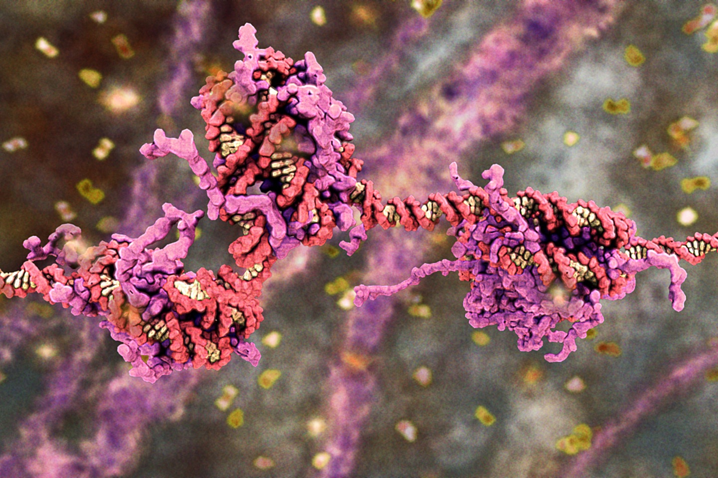
Keynote: Drew Berry
Drew Berry is a medical animator who has done some amazing work making very small-scale and hard-to-image and understand processes visible and understandable. You can find his work at his website and his university website, and he’s also active on Twitter. The teaser image at the top is one of his, too.
It was fascinating to see Berry describe his work and how he is now moving to being able to render all his complicated, high-resolution (8K) animations in real-time (which took weeks to render in the past) on modern hardware and using new techniques.
I was also intrigued by his use of sound in the videos, which he described like using color when I asked him about it: on the molecular level, there is no color, but color, like sound, can be used to get people’s attention, make things memorable, and frame the animation (like making a cancer cell sound threatening, etc.).
Papers: Comparison, Collaboration, High-Dimensional Data
James Scott-Brown has put together a great “Open Access EuroVis” page with links to EuroVis papers he was able to find (it's not really open access, but the papers are easily accessible this way). There are fewer links here than at VIS, and as usual a lot more InfoVis-type papers have at least the PDF available than those from the SciVis side.

ChangeCatcher: Increasing Inter-author Awareness for Visualization Development by Mona Hosseinkhani Loorak, Melanie Tory, and Sheelagh Carpendale is a system that reveals changes in a Tableau workbook by sheet and by type (like formatting vs. other changes, which can be important depending on what phase of the work you’re in or who’s working on something). They show very nicely how this can not just make it much faster to find changes, but also discover the ones that are easy to miss, like fields added to tooltips, etc.

Towards Easy Comparison of Local Businesses Using Online Reviews by Yong Wang, Hammad Haleem, Conglei Shi, Yanhong Wu, Xun Zhao, Siwei Fu, and Huamin Qu is an interesting take on using online reviews to make decisions like where to eat, what hotel to book, etc. They combine a number of different views to show information like prices, etc., together with numerical scores and word clouds created from the reviews. Their word clouds are particularly interesting because they combine adjectives and nouns to be more meaningful and readable.

Chart Constellations: Effective Chart Summarization for Collaborative and Multi-User Analyses by Shenyu Xu, Chris Bryan, Kelvin Li, Jian Zhao, and Kwan-Liu Ma looks at ways to compare charts generated by different people. They create a clustering of charts and show which ones are similar or different, related, etc. They then tested this against notebooks on Kaggle to see if people would be able to compare the visualizations used in Kaggle notebooks – unsurprisingly, they were, and they largely were able to do things that they weren't using the Kaggle system. So the combination of both would be interesting to see.
Towards User-Centered Active Learning Algorithms by Jürgen Bernard, Matthias Zeppelzauer, Markus Lehmann, Martin Müller, and Michael Sedlmair tested different strategies for what is called active learning: humans act as oracles that label data points in a scatterplot to belong to certain classes (like hand-written letters, etc.). They identified 19 different strategies and tested those for how fast they lead to good coverage. There is some dependency on the particular dataset, but the data-based strategies that start from the data points themselves work better early on, but are passed by the ones that are based on models (defining boundaries).
Comments (2)
Posting new comments was disabled in 2020.