My colleagues at Tableau Research have three papers at InfoVis next week. They cover guided data exploration, color theory, and data partitioning. Here's a little preview.
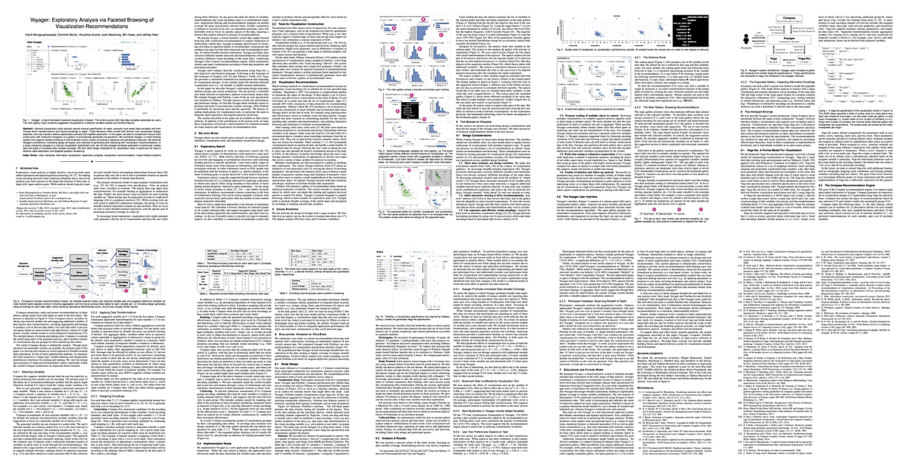
Voyager: Exploratory Analysis via Faceted Browsing of Visualization Recommendations
This is a collaboration between Anushka Anand and Jock Mackinlay at Tableau and some of Jeff Heer's group at the University of Washington: Kanit Wongsuphasawat, Dominik Moritz, Bill Howe, and Jeffrey Heer. The paper describes the Voyager system, which constructs views of a user's data automatically. The user can then select the ones that seem interesting, so the system can build more views based on the data in them. This is called a mixed-initiative system because it doesn't depend entirely on the user to make things happen.
The goal of Voyager is to make it easier for people to explore more of their data. It can be overwhelming when looking at a database to know what to look at. And when people already know the data, they tend to stick to a relatively small set of data dimensions they already know. Seeing the data makes it easier to spot what else to look at, in particular when two data fields are shown. This is borne out by the study they ran to test the system.

A Linguistic Approach to Categorical Color Assignment for Data Visualization
When you're showing data about fruit, which color would you pick for a banana? Which for a cherry? Which for a watermelon? It seems obvious, but visualization tools just assign colors without any knowledge of what the data is about. A Linguistic Approach to Categorical Color Assignment for Data Visualization by Vidya Setlur and Maureen Stone is an attempt to change that. Using Natural Language Processing (NLP) techniques, they figure out what likely good colors are for the items in a set of categories, and assign those to the visualization.
The results are, unsurprisingly, much better than just picking colors at random. There is a lot of clever statistics and NLP magic involved, but the overall idea is pretty simple yet very cool.

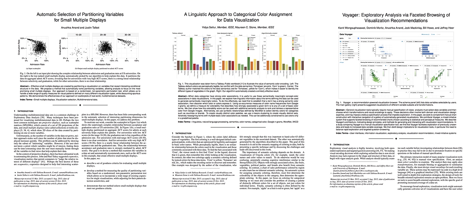
Automatic Selection of Partitioning Variables for Small Multiple Displays
A somewhat different way of giving people an idea of their data than Voyager is Automatic Selection of Partitioning Variables for Small Multiple Displays by Anushka Anand and Justin Talbot. Their approach creates views automatically by selecting two variables to use in a scatterplot, picking a categorical variable to slice the data by, and then evaluating which of those combinations produces the most interesting view. To gauge which view is the most interesting, they use scagnostics, which are a way of measuring certain qualities of a scatterplot like clumpiness, stringiness, etc. (Aritra Dasgupta and my work on Pargnostics is based on the same idea).
This requires some advanced statistics that I won't go into (even though I totally understand it all), but the end result is that their tool can automatically find the ways to subdivide the data that are the most likely to be interesting for the user to look at and investigate further.
These three papers make for a nice set that embodies what Tableau Research aims to do: deep, innovative work that is also practical and that you can imagine being built into visualization systems.
More of our papers can be found on the Tableau Research website.