There are many differences between data analysis and presentation. One that is often overlooked is the need to focus a story to just the essential points, and not overload it with unnecessary detail. Minard’s famous map is a great example of reduction to the bare minimum.
Minard’s famous map of Napoleon’s invasion of Russia summarizes the fate of some 420,000 men over more than six months. They were not alone, either: roughly the same number of Russian soldiers died, and untold numbers of civilians were killed and many atrocities committed.
Did Minard leave things out? Well, let’s see. Perhaps we can compare his elegant and simple chart to two that Vladimir Volkov created for Wikipedia (click the images for larger versions). The first one captures the march to Moscow, and roughly the first leg of Minard’s chart.

The second one describes Napoleon’s retreat, with the time period again mirroring Minard’s chart (the black, second leg this time).
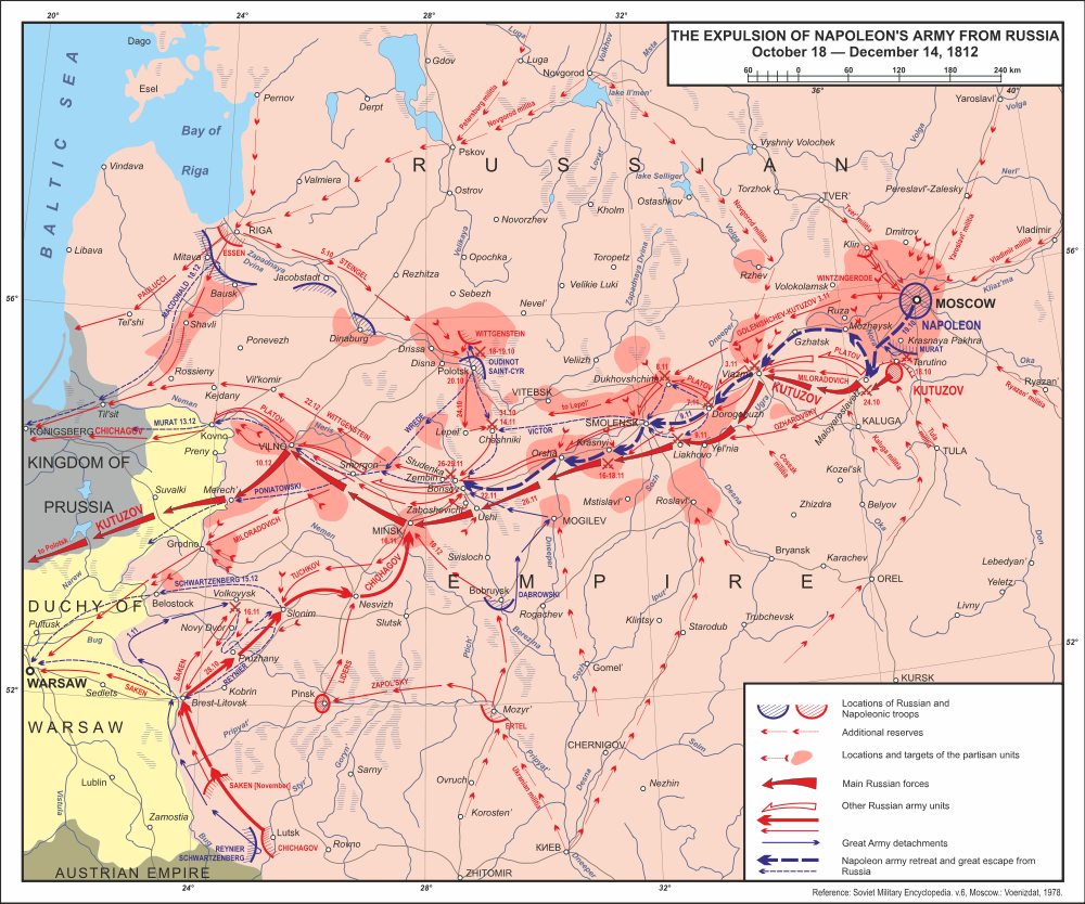
And now compare to Minard:
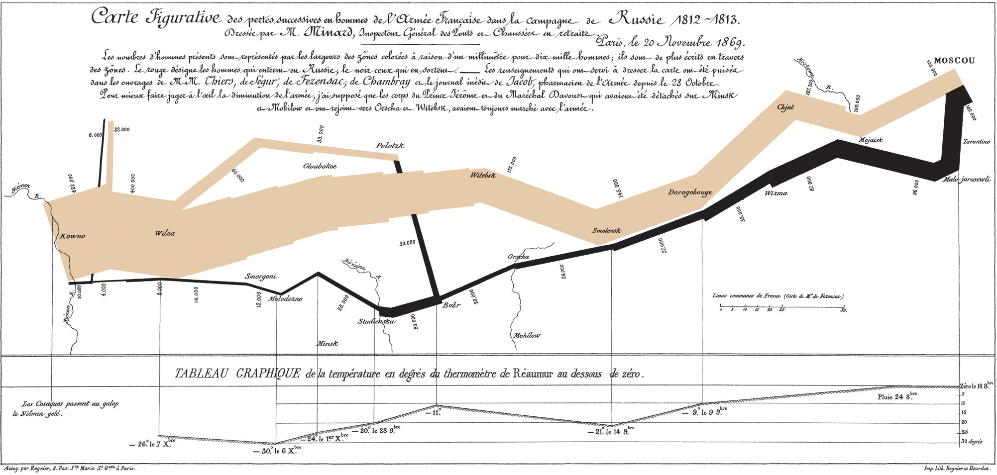
Minard, having lived during the Russian campaign (though he created the map much later), certainly knew quite a bit about it and the wars that followed. However, he chose to focus on one particular issue and on essentially one measure that he apparently felt told the core of the story. That is also helped by the graphical style: compare Volkov’s much more detailed maps that not only show a lot more troop movements and other data, but also much more geographical detail.
When analyzing data, focus is not typically the first thing. Quite the opposite, when exploring data, you want to go broad, ask many different questions, and try out many different approaches. While it can sometimes be useful to present a lot of data (a historian would have little use for Minard’s simplified view), it is usually much more compelling to figure out the key message and focus on that.
Comments (5)
Posting new comments was disabled in 2020.