Part 2 of my IEEE VIS 2017 report covers the keynote and capstone talks at the conference. They were not just at opposite ends of the conference, but also about as different as they can be in terms of content and delivery.
Keynote: Jacqueline H. Chen, Analytics Inspired Visualization: A Holistic In-situ Scientific Workflow at Extreme Scale
Jackie Chen is a highly regarded scientist and she gave an interesting, if overly detailed, talk about combustion research. She talked about the challenges they face with the enormous amounts of data their simulations produce. The traditional workflow of running simulations (which can take weeks), storing all the data, and then doing analysis is clearly slow and not very flexible.
Chen described a newer approach where they integrate the analysis and visualization much earlier and thus create a tighter loop. They also use good ideas from visualization, like multiple linked views that show different aspects of the data (temperature, mixing rate, etc) and similar. In addition to fairly directly rendering the data, they also create topological abstractions to see how certain patterns move over time, cause local extinctions of a flame, etc.
Science keynotes can be hit or miss, and this one was more of the latter, unfortunately. Chen is a good speaker and she had a lot to talk about – a bit too much, even. I really didn't need to know quite that much about combustion research, and would have liked to see more about how they use visualization – but people doing volume rendering or other scientific applications might have gotten more out of it.
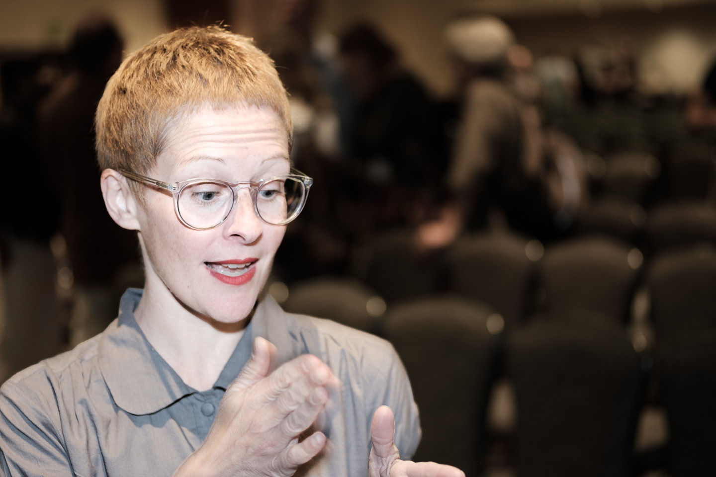
Capstone: Giorgia Lupi, Data Humanism – The Revolution will be Visualized
The capstone talk on Friday was the opposite of the keynote in many respects. Giorgia Lupi’s talk was fun and engaging, and got her a lot of applause not just at the end, but also a few times during the talk. She covered many of her projects, including Friends in Space, World POTUS, and of course Dear Data (also previously covered in this fine publication).
Among her latest projects are a show about fashion at MoMA, for which she created a data sketch – except there was no data. She collected her own from the curator’s research notes and talking to her, and then turned that into a wall-sized drawing.
Perhaps the most stunning is her collaboration with musician Kaki King, however. Giorgia and Kaki collected data similar to Dear Data, which Kaki turned into a song, then Georgia collected data about the score and how Kaki plays it and visualized that. The result is this stunning video:
What struck me during the talk, even though I should have figured this out a long time ago, is how much of Giorgia’s process is about the collection of the data, not just its representation. Each of her pieces is also very specific to the data and its context, which is almost the exact opposite of visualization techniques that tend to be general and independent of context. She talked about the value of designing visualizations that are specific to their topic, and I think there’s a lot of truth in that.
Giorgia has written up many of the ideas she talked about in her piece on what she calls Data Humanism. It was a great talk and I think it gave everybody in the audience a lot to think about.
See also:
- Best Papers and Other Awards
- Word Clouds, Stories, Interaction
- Perception, Evaluation, Vision Science
- Machine Learning, Diversity, Parties