• Skip to main content
  • Skip to primary sidebar
  • Skip to footer

eagereyes

Visualization and Visual Communication

  • Explore
    • Starter Pack
    • Blog Calendar
    • Blogroll
    • eagereyesTV YouTube Videos
  • Practical
    • Basics
    • Pie Charts
    • Techniques
    • Book Reviews
    • Journalism
  • Academic
    • Speaking Mistakes
    • Acceptance Rates
    • Papers
    • Conference Reports
    • Lists of Influences
    • Criticism
    • Peer Review
  • Admin
    • About
    • Contact
    • License
What Happened to ISOTYPE?

Robert Kosara / September 28, 2020

What Happened to ISOTYPE?

Jan Willem Tulp asked me an interesting question on Twitter last week: if ISOTYPE was so great, why isn’t anybody using it anymore? Here are some of my thoughts, but more than that I want to see if anybody has more idea, and maybe even a bit of evidence, on why ISOTYPE fell out of fashion in the 1950s and hasn’t really come back since.

The Heyday of ISOTYPE

To set some context, ISOTYPE wasn’t just a neat idea. I’m aware of at least 70 books that use ISOTYPE charts from the 1930s through the 1950s, and I actually own copies of close to 50 of them. Yes, you read that right. I’ve posted a handful in this series, and I intend to scan and post a lot more of them in the near future.

The ISOTYPE institute was around for several decades and produced a graphics for dozens of books and other media using their technique. A few others picked it up and produced more, most notably Rudolf Modley who designed around 1,000 Telefacts that ran from 1938 to the mid 1940s in American newspapers.

What Happened?

I really want to pose this as a question, but here are my thoughts. I hope others can chime in with more ideas, and hopefully some evidence, because all I have here is speculation. But speculation held with conviction.

First, Modernism happened. This one’s a bit complicated because it’s clear that Gerd Arntz’s designs of the iconic shapes used in ISOTYPE have become, well, icons of modernism. At the same time though, the idea of using such shapes in data displays may have been a victim of modernist ideals that eschew all decoration. These ideas go back much further than the 1940s of course, but became much more widespread mid-century.

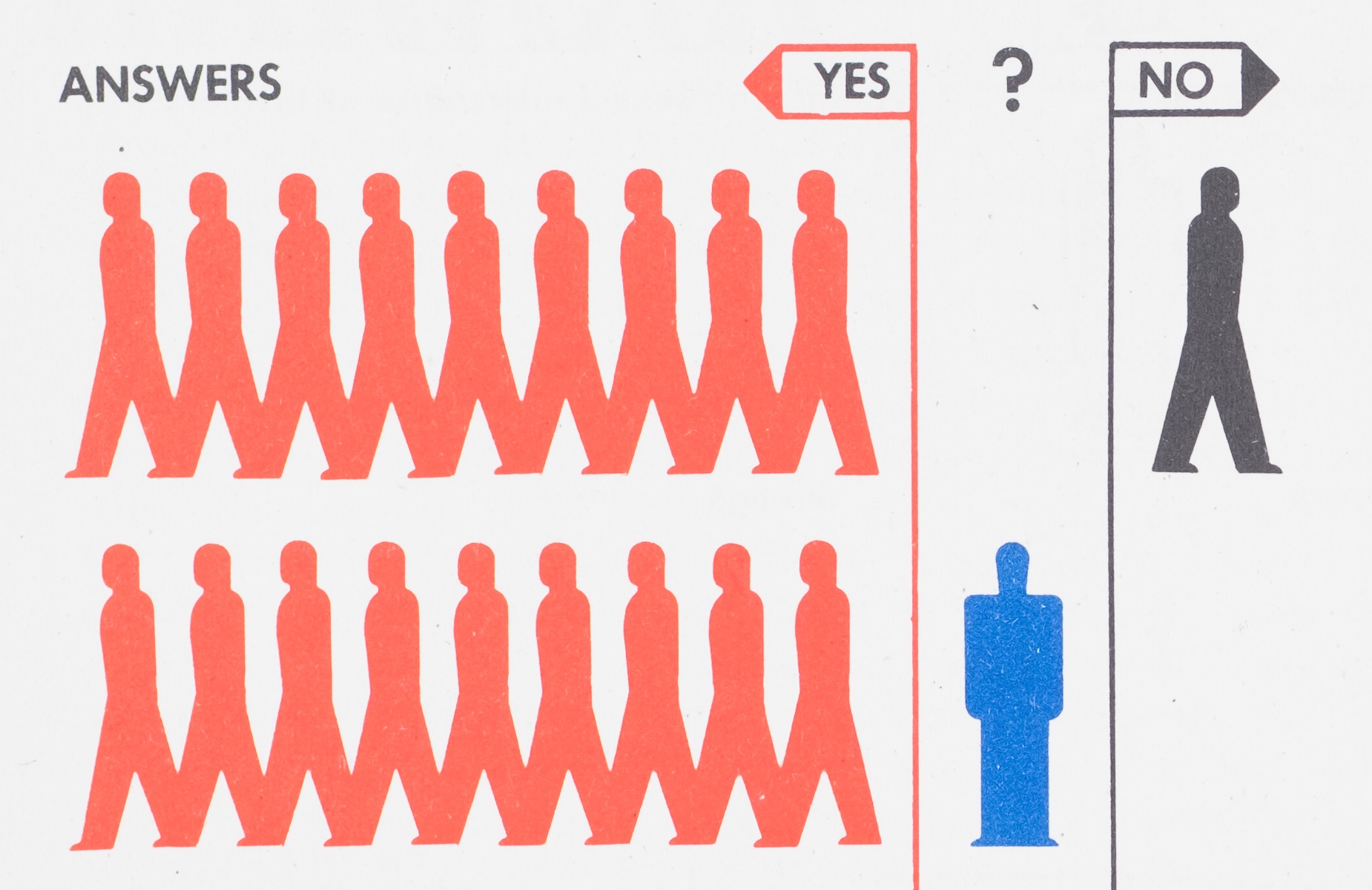
Another reason might be the tighter coupling of statistics and charts, specifically John Tukey’s Exploratory Data Analysis. The charts used in the process of data exploration and analysis had to be made relatively quickly, so there was no time to consider the right kinds of shapes to use. ISOTYPE also isn’t exactly the most information-dense format, and it’s largely confined to the equivalent of bar charts, no continuous variables or two-axis plots like scatterplots are possible.

Also, Tufte happened. Tufte has had a huge influence on what is considered good and proper data visualization, and he has no patience for decoration or the ‘pop journalism’ of ISOTYPE (he also considers the charts ghastly). Anything added to the pure data is considered chart junk in the Tuftean world, and so we end up with a style of data representation that has had all of the fun and explanatory power of images and text beaten out of it.

I don't want to rain on anyone's parade. Neurath's ISOTYPE method had an important historical niche in its time, which was to popularize simple graphics for the masses.
In the pantheon of graphic information presentation, some might say, "cute, but no cigar". https://t.co/hiQQOzzGAa

— Michael Friendly (@datavisFriendly) September 22, 2020

And then, computers happened. This is somewhat connected to the point about statistics above. The way we deal with data is not to spend a lot of time on individual data sets or questions, we want general and efficient ways to turn any amount of data into visualizations in an instant. Computers are good at that, but much less so at thinking up clever icons to go with the data. Early computers and software (especially in 60s, but well into the 80s) also couldn’t to much beyond drawing points, lines, and rectangles, so the charts that consisted of them were the ones that got made: scatterplots, line charts, bar charts.

While it’s easy today to draw any shape we want, visualization tools and libraries are still very limited in one important way: they almost universally assume that each item in a table or result set (when talking to a database) corresponds to exactly one mark. ISOTYPE needs multiple marks per value though, which requires workarounds and hacks in virtually any tool and toolset/library you will find today.

Surely, academic research is not limited by the tools though, right? My colleague Michael Correll nicely summarizes the possible reasons for the lack of academic research interest in his usual bleak and succinct way:

perhaps because isotypes are easy to understand and can be both constructed and interpreted reliably even by children, and both tufte-ism and academic vis require that vis be either a "technology" or "science" depending on the rhetorical project at the time

— The Birdbassador (@Birdbassador) September 25, 2020

What Do You Think?

As I said, I’m really looking to learn more about the why here. What do you think? If you have further ideas, and in particular evidence, please let me know!

Filed Under: Blog 2020 Tagged With: isotype

Robert Kosara is Senior Research Scientist at Tableau Software, and formerly Associate Professor of Computer Science. His research focus is the communication of data using visualization. In addition to blogging, Robert also runs and tweets. Read More…

Reader Interactions

Comments

  1. Klaas van der Veen says

    September 28, 2020 at 11:43 pm

    Really interesting post. I agree with The Birdbassador, and dislike Tufte’s looking down on things people can understand. Very common in the datavis world, always wanting to impress people instead of allowing them to understand. (I wanna be more activist about this, and will start following the Birdbassador immediately ;-))

    Reply
  2. Robert Grant says

    September 30, 2020 at 3:52 am

    I especially agree with the advent-of-personal-computers point. I suspect (no occupational psych evidence behind this) that, when a technology is new, people want to do the latest thing, and when it is established, they want to do the right thing (i.e. what everyone else does). So in the 1980s everyone wanted to do bar charts and line charts and pie charts and occasionally scatterplots (cf: http://www.macmothership.com/gallery/MiscAds2/1977IntroAppleII1.jpg), and after that everyone wanted to do what was done in the 80s. If you hand made an isotype now out of potato prints, you could probably sell it on etsy but the boss would hate it. I love isotype btw.

    Reply
  3. Wibo Bakker says

    October 1, 2020 at 5:30 am

    Modernism: That is an interesting topic. Isotype has a somewhat complex relationship with the many varieties of modernism. The icons have a mixed expressionistic/constructivist origin (1910s-1920s), but ended up with surrealistic /anthromorphic detailing and curves (1930-1940s), which for me gives it a 1950s feeling. The more illustrative approach of Isotype (subjective) does not fall in line with the hardcore Swiss style that started to get internationally popular in the 1960s, with its emphasis on typography/information theory (textual/data), and preferred photography (objective).

    The book ‘Isotype: Design and Contexts 1925–-1971’ provides some very well researched starting points. Also still interesting is: Bool, Flip and Broos, Kees (eds),Gerd Arntz, Kritische grafiek en beeldstatistiek, Kritische Grafik und Bildstatistik, Nijmegen: SUN and Den Haag: Haags Gemeentemuseum, Sunschrift 113, 1976

    Reply
    • Klaas van der Veen says

      October 1, 2020 at 6:08 am

      Thank you for this in-depth reply! There’s ideology in ISOTYPE. But there’s also ideology in current datavis: ‘minimalism’, ‘rational’ are by no means neutral. I like the attempt of making a system that is so easy to understand. In Dutch, it supports the ‘verheffingsideaal’ (‘the lifting up of the working class’), an ideal last seen in the seventies, or is there a comeback?
      Love to hear more on this, since I’m using pictograms and icons, albeit sparsely. I tend to see Google Material icons as a present day standard. A set of rules to make or adapt them is in place, very large sets are everywhere.

      Reply
      • Wibo Bakker says

        October 1, 2020 at 6:32 am

        Hi Klaas, thanks for your comment. You raise a lot of issues. And yes, rationalism and minimalism are by no means neutral. As a side note, these terms can be applied to respectively architecture and art and have very different connotations. But I know what you mean ; ). The connection with ‘lifting up the working class’ is interesting. But it does seem to assume that are some specific issues that icons and symbols will solve. Do I see that correctly? Communicate on the same level (in that case communication will be very very basic due to the limitations of icons), communicate more effectively (in some cases for simple messages yes). The problem is that most icons have to be learnt, they work by convention, and that its impossible to built a symbol language that is more effective than a written systems (hint: look at what C.K. Bliss and Yukio Ota tried to do in the 1960s). Back to today. As for today, yes, I also would like to hear more about current icon issues : ). I believe there is an interesting research intersection that has not been addressed that much: a general insight in standardisation, best practices and effectiveness about the use and development of icons in commonly used systems. See Apple, Facebook, Tencent, Google, Huawei (developing their own system now).

        Reply
        • Klaas van der Veen says

          October 2, 2020 at 1:01 am

          What does the use of icons solve? The fact that they have to be learnt is a huge barrier. I hardly use icons, certainly not without text labels.

          I’d say ISOtype aren’t icons. They are pictograms. The worker, the priest, the oil-rig, are very easy to recognise. So, the ‘audience’ is served. But here’s the big big drawback of pictograms: the scientist or academic balks at the simplification and compression of data. (I often hear when using ‘puppets’ that they shouldn’t be male). The datavis fashion is (as mentioned before) one data point = one pixel/icon. To me, only academic visualisers would be so silly as to not want to compress and simplify. But hey, I’m only looking at it from the (broader) public’s end.

          (Thanks to eager eyes I have now pinpointed what the difference is between me and 99% of the visualisers: I don’t care about the data, I care about the reader understanding a phenomenon)

          Reply
  4. Wibo Bakker says

    October 1, 2020 at 5:56 am

    I believe Isotype is mainly considered a good example because of its aesthetics and ideological underpinnings. It does not also works good in practical work. What you also mention about the coupling of statistics & charts : )

    Rather than asking why it is no used more, the question should be, why did it reappear? >>> Their rediscovery in the 1970s, has to do a) the retirement of its main proponents: Marie Neurath and Gerd Arntz with their archives being safeguarded in Reading and The Hague, both leading to research and enthusiastic clusters. And b) the nostalgia for a seemingly aestethic (softer) and ideological (socialist 1970s) acceptable universal symbols system in a time when existing international standardisation efforts seemed too slow, too fail, or bureaucratic (Yes ISO and ICOGRADA looking at you ; )) to many designers. This while designers kept churning out more pictogram systems. At the time the emphasis was more on signage and language, rather than statistics. The interest in Isotype over the last two decades is different though, as part of a wider interest in icons, emojis and emoticons ; )), reconnecting the 1970s history with current visual phenomena.

    The interest in Isotype has a lot to do with its attractive combination of aesthetics and underlying ideology, in which it differs from many other and usually lesser developed systems. This makes it attractive to incorporate as a stepping stone into design history, to build a narrative of good design ‘the invention of history’ (Hobsbawm). Isotype is a good reflection of the broad history of visual statistics at large, although we would like it to be. There still is a lot of research work to do in this area. Sadly Isotype research is very focussed on its direct proponents (Gerd Otto, Rudolf & Marie (GORM ; )). Its actual influence on other media genres (atlases, magazines, signage systems) is hardly researched. Still it is assumed.

    Reply
  5. Wibo Bakker says

    October 1, 2020 at 5:58 am

    OOPs mistake >>> Isotype is NOT a good reflection of the broad history of visual statistics at large, although we would like it to be.

    Reply
  6. Wibo Bakker says

    October 1, 2020 at 6:04 am

    Computers: I dont think their rise is an argument for Isotype disuse. But by the time computers were starting to get used for making graphs (1980s), Isotype had long gone from visual statistics, not from atlasses though. On a technical level. I do wonder whether there were also lead Isotype printing sets, in which case the transition to photo setting might be an additional reason for letting go. . ?

    With current technology designing, using and setting icons for graphs of similar complexity to Isotype should be relatively easy: ‘Isotype generator’. Or do I simplify things to much here? Anyone knows about successful experiments in this area so far? A hindering consideration might be the fear of disrespecting Neuraths idea–still hanging around as an aura–that it would be difficult to lay down rules, or that it is difficult to teach this method.

    Reply
  7. richardbrath says

    October 5, 2020 at 10:10 am

    Here’s my answer:
    – limited range of chart types
    – limited range of icons
    – hard to figure out values
    – and see new unit visualizations
    Details here:
    https://richardbrath.wordpress.com/2020/10/03/the-transformation-of-isotype/

    Reply

Leave a Reply Cancel reply

This site uses Akismet to reduce spam. Learn how your comment data is processed.

Primary Sidebar

More Blog 2020 Articles

  • Video Series: Counting In 2021 with Mechanical Calculators
  • eagereyesTV: Chart Appreciation, What’s Really Warming the World
  • All (Line) Charts are Wrong, But Some Are Useful
  • eagereyesTV: Index Charts, Part 2: Chopping Up and Folding the Time Axis
  • eagereyesTV: Index Charts, Part 1: Making Time Series Data Comparable

Recently Popular

  • Data: Continuous vs. Categorical
  • The Simple Way to Scrape an HTML Table: Google Docs
  • Stacked Bars Are the Worst
  • Understanding Pie Charts
  • The Dearth of Videos about Visualization
  • How The Rainbow Color Map Misleads
  • What is Visualization? A Definition
  • Facebook
  • GitHub
  • LinkedIn
  • RSS
  • Twitter
  • YouTube

Subscribe via Email

Footer

  • About
  • Contact
  • License

Copyright © 2006–2021 Robert Kosara · All original materials are available under CC-BY-SA