
Visualization techniques encode data into visual shapes and colors. We assume that what the user of a visualization does is decode those values, but things aren’t that simple.
Encoding
When a program draws a bar chart, it calculates the length of the bars from the numbers it’s supposed to represent. When it draws a pie chart, it calculates angles. When it draws a scatterplot, it looks at two numbers for each data point and turns those into coordinates to draw a shape.
We understand the encoding part very well. There’s nothing mysterious about how a chart comes about, it’s a mechanical process.
This is also where we have much of the theory of visualization, such as it is. Bertin’s retinal variables, despite their name, are all about encoding. Likewise, Wilkinson’s Grammar of Graphics has a formalism for many different ways of encoding numbers.
Data properties, like whether a data field or column is numerical vs. categorical, whether there’s a meaningful zero, etc., are all about encoding. This is the stuff that lives inside the machine, and that we can formalize very easily.
Decoding
When it comes to decoding, things get a lot messier. What do we decode? We like to assume that decoding just reverses the encoding: we read the values from the visualization. But not only don’t we do that, we do many other things that are surprisingly poorly understood.
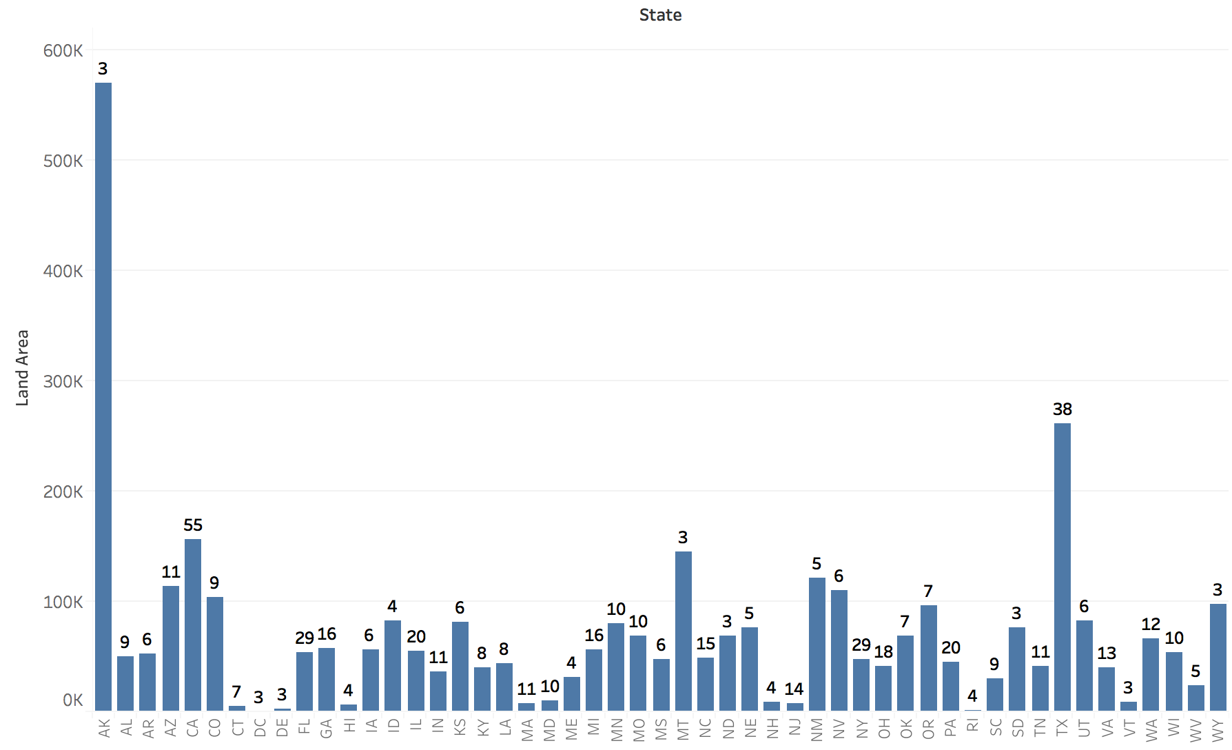
In a bar chart, we rarely look at individual bars. Instead, we compare them to each other. We also look at the shape of the plot. Which is why being able to sort a chart is incredibly important (charts are from this posting on problems with election maps).

In a pie chart, we presumably compare a slice to the whole. Except we also compare slices to each other, of course. And that thing about the angle? Well, we’re apparently not actually reading it that way.
It gets even more interesting when we look at complex charts like scatterplots, parallel coordinates, etc. In a scatterplot, nobody compares two data points along two axes. Instead, we look at the overall shape. That gives us an idea of correlation (which we’re surprisingly good at estimating), clusters and density, and outliers. Those are much more interesting than merely looking at data values.
The Value of Visualization
If visualization were about decoding values from charts, things like aspect ratio would not matter; the number of bars between the two you’re comparing would not matter; the orientation of slices in a pie chart would not matter.
If it were about decoding values, we would not be getting anywhere as much out of visualization as we do. We would not be getting correlation or clusters or outliers from a scatterplot. There would be little point in drawing pictures from data at all.
What makes visualization powerful is our ability to go beyond the mere decoding of values from a chart. That makes it interesting, but it also makes it complicated. So far, we have focused our understanding largely on the encoding side of visualization. We need to learn much more about the complex and powerful decoding side.
Comments (7)
Posting new comments was disabled in 2020.