There is a lot of confusion about storytelling and what tells a story. I have argued previously that stories do not tell themselves. Rather, we tell the stories given raw materials. Some of these materials lend themselves better to ad-hoc storytelling, so we tend to say that they actually tell the story, when it's really us who do it.
Exhibit A: Minard
A particular example of the easy storytelling genre are maps, and a particularly famous example is Charles Minard's visualization of Napoleon's Russian campaign in 1812/13. While not immediately obvious if you haven't seen it before, this is really a map, with the Polish border in the west and Moscow in the east. The width of the ribbon shows the number of men in Napoleon's army: he starts out with 422,000, loses a lot of them before he even reaches Moscow, where he arrives with 100,000; turns around and makes it back with all of 10,000 men.

What makes this such a compelling visualization? There is more to it than just the width of the ribbon. The line graph at the bottom shows temperatures, with the highest one being freezing, and most of the way being considerably colder. There is not just space, but time. Of course, time and space are tied together, they are not independent here. But the temporal dimension is what draws us in and makes this into a sort of road movie: we can follow along a journey.
Exhibit B: Nightingale
Another famous chart is Nightingale's depiction of deaths of British soldiers in the Crimean War in 1854-56 (often wrongly referred to as a coxcomb plot). The depiction here is more abstract because there is no map, but the amount of information is comparable. There are 24 months of data, with three values each (one for each cause of death). Reading the visualization is a bit more challenging: you start in the nine-o'clock position on the right chart, go around clockwise and then follow the line to the left chart where you again start at nine o'clock and follow the circle segments in a clockwise direction.
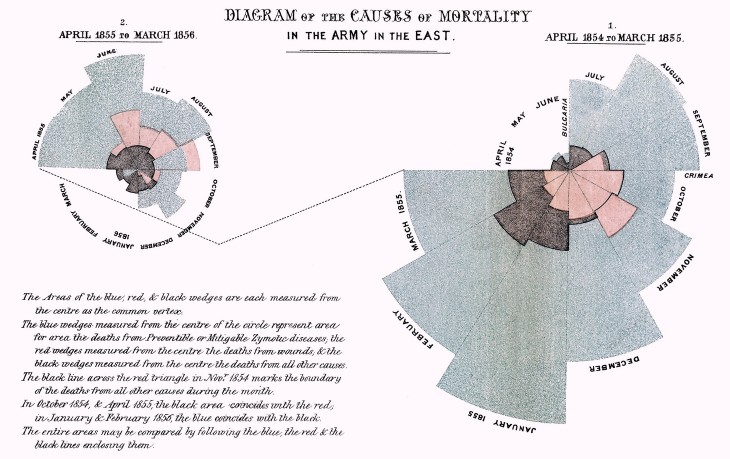
So we have time here, and we have suffering: this is about soldiers being wounded or killed in combat, and dying from horrible infections and disease (the red part shows deaths from wounds, blue shows infectious disease, and black shows all other causes). But the depiction is clearly less compelling than Minard's, and much harder to turn into a story.
Storytelling Affordances
The key difference, I believe, is the map. It makes it easy for us to turn the temporal sequence into a story. It's the analog of drawing out a path on a map with your finger, a kind of virtual journey. It also helps that the first leg of Napoleon's march is going left to right on the map, the natural reading direction in the West. Movement is progress, and it pushes the story along. We are used to these kinds of stories, many of the oldest stories in existence (The Odyssey, for example) are based on journeys (even if not on roads).
It's also a kind of lazy storytelling. Of course you can make people see a story when you give them a map. But what if there is no map? What if location doesn't mean anything? I don't know if Minard was interested in telling a story, or if he considered not using a map. I do know that Nightingale's goal was not to tell a story, but to convince an audience that had barely heard of statistics, much less understood what numbers could tell them. But whether those decisions were based on the intent to tell stories or not, the outcomes are vastly different.
We are so hard-wired for causality and stories that it's difficult to look at something like a map and not tell a story. We are incredibly creative at filling in the blanks. That can be useful when we are given hints and we revel in the creative act of making up a story (good photography evokes that kind of storytelling), but it can also lead to misinterpretation and wrong conclusions. The key to storytelling with data is not only to be able to convey a story, but to make sure that it's the intended one.
Comments (2)
Posting new comments was disabled in 2020.