• Skip to main content
  • Skip to primary sidebar
  • Skip to footer

eagereyes

Visualization and Visual Communication

  • Explore
    • Starter Pack
    • Blog Calendar
    • Blogroll
    • eagereyesTV YouTube Videos
  • Practical
    • Basics
    • Pie Charts
    • Techniques
    • Book Reviews
    • Journalism
  • Academic
    • Speaking Mistakes
    • Acceptance Rates
    • Papers
    • Conference Reports
    • Lists of Influences
    • Criticism
    • Peer Review
  • Admin
    • About
    • Contact
    • License
Data Visualization and Journalism Event in San Francisco on September 26

Robert Kosara / September 15, 2013

Data Visualization and Journalism Event in San Francisco on September 26

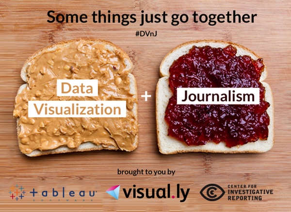
Visual.ly is hosting an event on data visualization and journalism on September 26 in San Francisco, under the rather clever heading of DV’n’J (think PB&J). I’m one of the speakers.

DVnJ

I will be talking about my research on storytelling and where I see visualization going in journalism. Given the audience, The new Story Points feature we just announced for Tableau 8.2 will also be part of my talk.

The other speakers are Augustin Armendariz and Michael Corey from the Center for Investigative Reporting, as well as Aleksandra Todorova and Jess Bachmann from Visual.ly.

If you’re in San Francisco or can get there on the 26th, don’t miss this event! For more information and where to sign up, see the posting on the Visual.ly blog.

Filed Under: Blog 2013

Robert Kosara is Data Visualization Developer at Observable. Before that, he was Research Scientist at Tableau Software (2012–2022) and Associate Professor of Computer Science (2005–2012). His research focus is the communication of data using visualization. In addition to blogging, Robert also runs and tweets. Read More…

Reader Interactions

Leave a Reply Cancel reply

This site uses Akismet to reduce spam. Learn how your comment data is processed.

Primary Sidebar

More Blog 2013 Articles

  • Ben Shneiderman’s Treemap Art
  • Scaling An Axis to Make A Point
  • A Lack of Communication and Visibility
  • A Guide to the Quality of Different Visualization Venues
  • Tapestry 2014 Announced

Recently Popular

  • Midjourney is a Trip
  • Data: Continuous vs. Categorical
  • The Simple Way to Scrape an HTML Table: Google Docs
  • Stacked Bars Are the Worst
  • How The Rainbow Color Map Misleads
  • Spreadsheet Thinking vs. Database Thinking
  • An Illustrated Tour of the Pie Chart Study Results
  • Facebook
  • GitHub
  • LinkedIn
  • RSS
  • Twitter
  • YouTube

Subscribe via Email

Footer

  • About
  • Contact
  • License

Copyright © 2006–2022 Robert Kosara · All original materials are available under CC-BY-SA


Loading Comments...