While reading Jarke van Wijk's Views on Visualization, I could not help but notice the negative references he makes to the subjectivity of visualization. A visualization science on par with statistics would certainly require the elimination of any and all subjectivity. I do not think that visualization is such a science, or that it being that is even all that desirable.
The subjectivity argument stands out especially in a paper titled Views on Visualization, which is more of a position statement than a traditional technical paper. While van Wijk presents ideas that are common in visualization (or at least acceptable once presented), he stresses the personal nature of his views in the introduction, and uses the first person deliberately when talking about his experiences and anecdotal evidence.
Subjectivity as a Problem
Clearly, subjectivity is something negative:
In the ideal case, one would hope that extraction of knowledge from data is an objective process, in the sense that the outcome does not depend on who performs it, and that the analysis can be repeated afterward by others, with the same outcome. Statistics aims at this, a typical pattern is the use of statistical tests to validate hypotheses on the data. Such tests make assumptions on the data (such as a normal distribution) and have free parameters (like the confidence level), but, furthermore, they do meet the criteria for objectiveness.
Unfortunately, visualization often does not meet this aim.
He then goes on to argue that it's not all bad, but gets very defensive: This does not mean that visualization is useless. And why would it?
It appears to me that we have the wrong ideas about visualization, and this is limiting our abilitiy to make visualization more than a manual alternative to data mining. Subjectivity is only bad if we suspect the user to twist the visualization to an extent where the visual result is not actually reflected in the data (which is undoubtably possible in many cases). But there are also other ways of looking at subjectivity, one of them is commonly known as the task. Statistics and data mining in all their objective glory cannot capture the intent of the user: what is the goal? What do I want to get out of the data? What does the data mean to me? There is of course an infinite number of objective truths about the any particular data set, and all but a very few are entirely meaningless to the user. Any actual analysis involves picking a particular subset of those truths to come to a conclusion, or to make a point.
Statistics is an obvious standard for comparison, especially for InfoVis (the paper is general enough to actually cover both Information and Scientific Visualization, though). Many techniques in InfoVis are based on statistical measures if not statistical graphics, and Martin Theus even claims that visualization is applied statistics – van Wijk seems to have a similar point of view. But why compete with statistics? And how? It's obvious that visualization will never have the accuracy a purely mathematical method has, or offer the thorough data digestion of data mining. Why go back to slide rules when we have pocket calculators?
Visualization: Careless Conduit or Complex Communication Conveyor?
It is easy to see that there is not just one right visualization for any given data set and task. And any visualization fulfills many more purposes than its designer foresees. We visualization designers are not simply applying our vast knowledge of visual representation, perception, and cognition to pipe data into the brain as efficiently as possible, but rather engage a complex and unpredictable mind. Our choices of parameters and interactions influence what the user sees and can do with a visualization. Our choice of data set to demonstrate a visualization technique prejudices the user's impression of how powerful the visualization can be. And the user's experiences, tasks, and goals.
A visualization is not simply a conduit for pumping information from the computer's hard disk into the user's brain. Such a view of visualization would only work if we were machines without the proper interfaces to directly plug into the data cloud. The power and beauty of visualization goes much further, and provides many interesting challenges along the way.
Objective Visualization: How?
Let's try a little gedankenexperiment to see how viable an objective visualization would be. In addition to the perfect visualization method we would need the proper conditions: a calibrated display to get proper color reproduction, controlled ambient light that is not distracting and not influencing the user's perception, an environment that is free from shapes that could prejudice the user's mind by being recognized in the visualization, etc. Further, the user would need to be standardized: properly trained in visualization as well as the particular data set, with no pre-existing ideas about the data, no interest in a specific outcome of the analysis, and clearly no color-blindness, color deficiencies, less-than-perfect vision, or other perceptual or cognitive deviations from the norm.
Even if all that was possible, would that be desirable? What would be the point? Just as visualization can be and is used in subjective ways, objectivity of statistics is only skin-deep: choosing the right measures and parameters is subjective and task-dependent! The entire point of letting humans deal with data sets is that there is value in subjectivity, experience, and opinion – plus the fact that the the consumers of an analysis are human, too!
Visualization is Communication
This is what is commonly known as expression and communication. Assuming there has been no downright lying, we have to accept any interpretation of the data as valid, just as we have to accept any statistical measure. But by emphasizing different aspects of the data, by picking subsets, or by fiddling with settings, we can present different points of view. That may make things more complex, but also more interesting.
Does that mean that anything goes? Any visualization is good and useful? Of course not, but we need to broaden our ideas and criteria for good visualizations. There is never only one truth about a data set, regardless of how it is analyzed or presented. This was a major point of discussion at the Social Data Visualization Panel, and perhaps the crucial one. Academics can't control visualization, nobody will ask us to sanction every visualization that is produced. We need to learn to let go.
Conclusions
I don't disagree with van Wijk's points about subjectivity, but I think we are doing ourselves a disservice by trying to eliminate, control, or even just downplay it. Subjectivity is a great strength that may be daunting to the technically minded person, but that makes things like photography, email, language, etc. so powerful. Just like there is no central authority for which truths can be expressed in English, there is no central authority for visualization. Why would we want things to be different?
2007 was the year of social visualization. With any luck, 2008 will be when people will start embracing the subjective nature of visualization and realize that visualization is communication.
Update: Jorge Camoes has posted an interesting discussion of Minard's Napoleon's March that provides food for thought along similar lines.
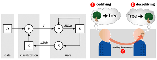
Image credits: Left half taken from the cited paper; right part from illustration for the Wikipedia entry on communication by Luis Javier Rodriguez Lopez.
Comments (1)
Posting new comments was disabled in 2020.