While the first part of this report covered mostly workshops and other events, it's all papers from now on. Plus a session on the future of the VIS conference.
Time
Temporal aspects of data are extremely important, in particular when the data is more complex than just a simple time series. A number of papers addressed time this year.
Comparing Similarity Perception in Time Series Visualizations by Anna Gogolou, Theophanis Tsandilas, Themis Palpanas, and Anastasia Bezerianos looked at how well different chart types (like horizon graphs, paired line graphs, heatmap-style charts) work to find similar patterns in time series. In short: it depends. Different charts work better for different tasks.
A Multiresolution Streamgraph Approach to Explore Hierarchical Time Series by Erick Cuenca, Arnaud Sallaberry, Florence Ying Wang, and Pascal Poncelet is a new take on stream graphs (which show categorical data over time). Stream graphs work well with few categories and smooth data, but with many categories or spiky data, they quickly become useless. Their Multistream technique combines three different views to allow the user to focus on groups of categories, zoom into the graph, etc.
Line Graph or Scatter Plot? Automatic Selection of Methods for Visualizing Trends in Time Series by Yunhai Wang, Fubo Han, Lifeng Zhu, Oliver Deussen, and Baoquan Chen asks a pretty basic question: given a noisy time series, is a line chart or scatterplot (really more of a dot plot) the better choice? Noise can make it harder to read line charts because the connecting lines amplify the problem. Their technique is pretty simple, but they find that it matches what people would have chosen in a study.
A Vector Field Design Approach to Animated Transitions by Yong Wang, Daniel Archambault, Carlos E. Scheidegger, and Huamin Qu looks at how to animate points between time steps in a scatterplot so that they are the easiest to follow. While techniques for this have been proposed in the past, they have not taken the issue of crowding into account, which has recently been shown to be a major factor in being able to follow what is going on. Their new algorithm does, which makes for better transitions between time points.
Temporal Treemaps: Static Visualization of Evolving Trees by Wiebke Köpp and Tino Weinkauf looks at hierarchical data whose structure changes over time. They create a fairly simple treemap-like visualization that shows nodes merging, splitting, and being added and deleted. It’s also an interesting algorithmic approach because they use constraint programming to specify criteria and create the best solution.
Evaluation
Figuring out which visualizations and charts work for what data and purpose is another important question.
Evaluating ‘Graphical Perception’ with CNNs by Daniel Haehn, James Tompkin, and Hanspeter Pfister reports on the results of training a number of neural networks to solve the classic Cleveland&McGill perception tasks. The results are mixed, with some tasks being done better by the neural networks than actual humans, others worse. I’m a bit confused by this paper, since it uses neural networks that aren’t specifically built to mimic human perception.
Augmenting Visualizations with Interactive Data Facts to Facilitate Interpretation and Communication by Arjun Srinivasan, Steven Drucker, Alex Endert, and John Stasko adds a number of facts about the chart a user is looking at in a list. These can be used to explore the data further and use text search to find interesting charts to look at.
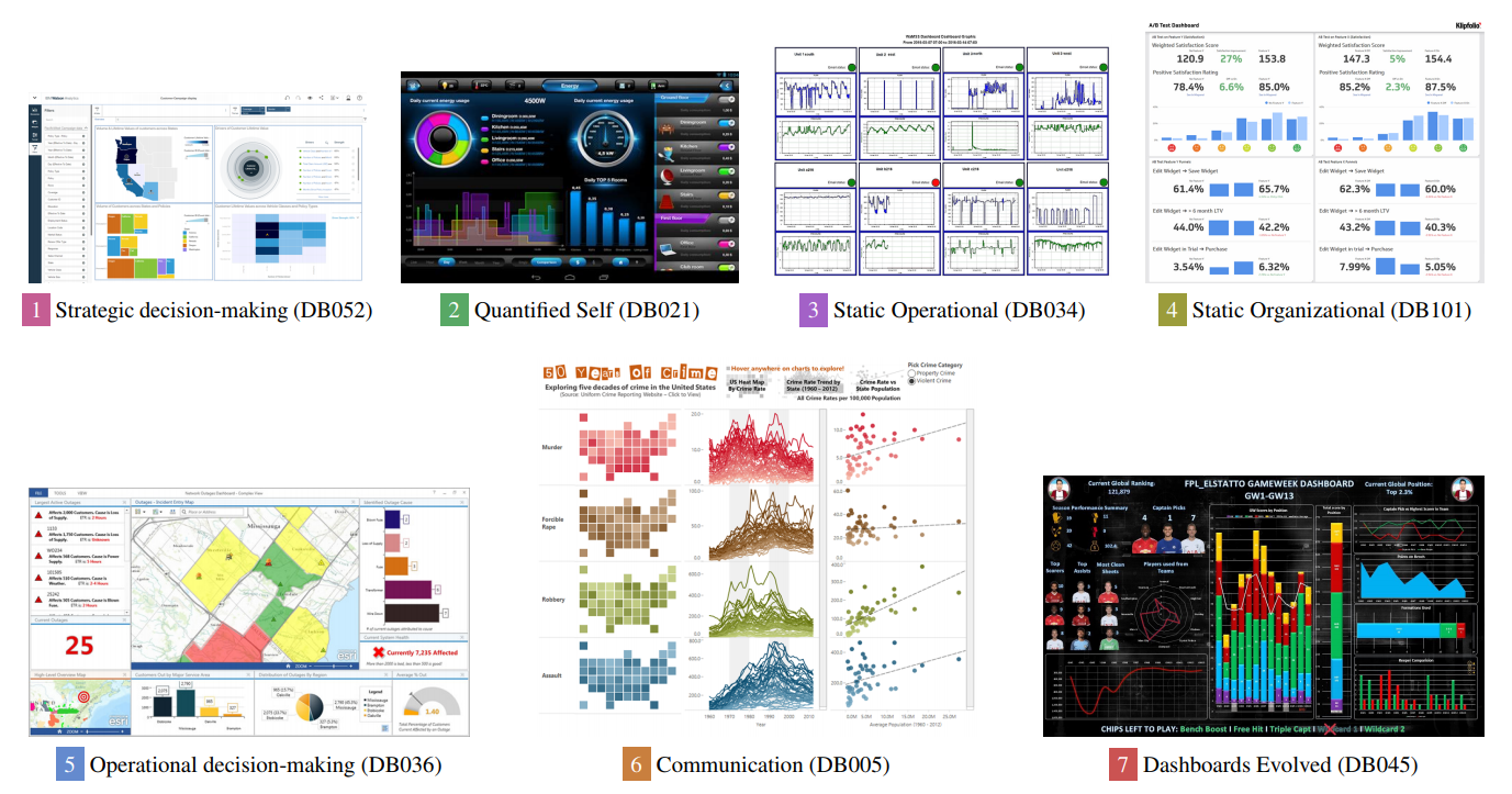
What Do We Talk About When We Talk About Dashboards? by Alper Sarikaya, Michael Correll, Lyn Bartram, Melanie Tory, and Danyel A Fisher argues for the importance of dashboards as a separate and distinct way of using visualization from single views, not just collections of charts. Despite their ubiquity in the real world, dashboards are still largely ignored by visualization researchers. The authors of what they call the dashboard conspiracy argue that dashboards are more than the sums of their parts and serve distinct purposes, such as decision-making, awareness building, motivation and learning, and persuasion.
Restructuring VIS for the future
The current structure of the VIS conference has developed over time, and many of the distinctions and ways of doing things are based on we’ve always done it like this rather than real reasons. Over the last year, a number of people have worked on identifying issues and looking at ways to structure the conference in ways that make more sense for the way things work today.
This is an ongoing process, but the first changes are being made, and the members of the committee in charge of this held a well-attended and -structured meeting to solicit feedback at the conference. A few documents summarizing their work and thinking are available on the VIS website for those interested.