I see a lot of discussions of misleading charts lately, and there are certainly many of them out there. One distinction that isn’t always made, but that I feel is important, is whether the chart itself is poorly designed, or whether an otherwise correct chart is taken to mean something it does not. It’s an important difference that often gets glossed over.
A Bad Chart vs. the Wrong Chart
A recent NYTimes Story about a chart showing cell phone radiation risk is a good example. The chart in question is this one showing microwave absorption in brain tissue depending on frequency. It has been used in lawsuits claiming that cell phones cause harm to children’s development. What’s wrong with the chart?

Nothing. There’s nothing wrong with this chart or the data. It’s a good enough chart showing how the rate of absorption increases sharply with higher frequencies. The data is also correct, for all we know.
The problem is not that anything is wrong with the chart or the data, but that it’s the wrong data to look at. If our brains were exposed to the outside world, this would be the right chart. But there are layers of skin, fat, bone, etc., between our brain tissue and the emitters of microwave radiation that shield our brains, so it’s not.
The problem with this chart is not that it’s wrong, but that it’s irrelevant. There is no way to figure that out by just looking at the chart, you need to understand the context and the science (and some common sense). The distinction is also important because no tool can save you from this kind of mistake. Your visualization program or chart chooser doesn’t know that you’re using the wrong data.
And yet, the NY Times story’s subhead reads, How one scientist and his inaccurate chart led to unwarranted fears of wireless technology (emphasis mine). The chart is not inaccurate! It’s the wrong chart, but it’s not inaccurate.
The Message vs. the Content
Another chart that was making the rounds to much derision a little while ago is this one showing global temperatures over time. In contrast to the famous “hockey stick” chart, however, it’s in Fahrenheit and scaled to start from zero.
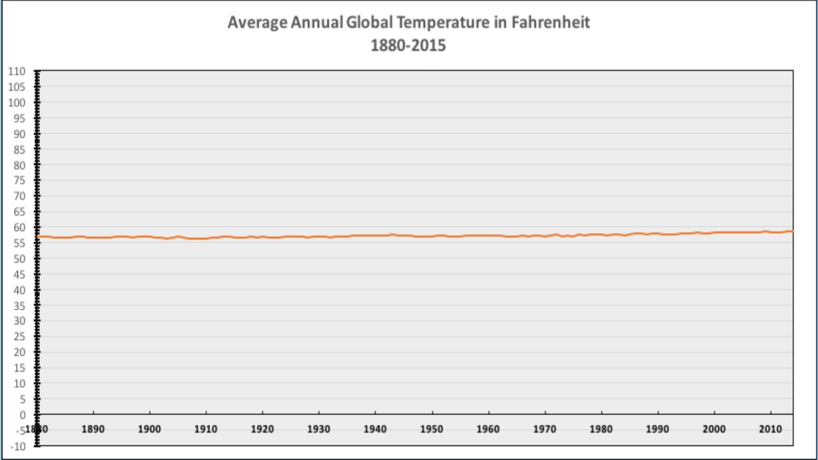
There have been endless arguments about whether charts should start at zero in general, and this one in particular. Is a chart correct if it doesn’t start from zero? Isn’t that wrong? Then what about this one? The whole discussion is as tedious as it is pointless.
I don’t think there’s anything wrong with this chart at all. It’s a perfectly fine chart that serves its purpose. It shows the data and is easy to read. You can create this chart yourself, the data is available.
The problem is not the chart but the intent. The goal of this chart is to downplay the danger of global warming, and it does that quite well. It shows the data correctly without distorting it. It’s not the chart’s problem that it’s used for propaganda any more than a particular font is responsible for being used to tell a lie.
The Medium is Not the Message
When we discuss “bad” charts, we need to look beyond properties of the chart itself. If a pie chart doesn’t add up to 100%, that’s a bad chart. But the number of strict rules like this is actually quite small. Many charts we consider to be bad charts are perfectly correct charts that were made for a purpose or with a message we don’t agree with. We need to separate that from questions about the chart itself, however.
Comments (2)
Posting new comments was disabled in 2020.