Information Visualization shares part of its history and some techniques with statistical graphics. The two fields differ in their approaches though, and in the expectations people have of what they will gain from a visual representation. In two articles, Andrew Gelman and I have written about what we think visualization is, and our points of view could hardly be more different.
The Article
Martin Theus invited Andrew Gelman and me to write articles for the Statistical Computing and Graphics Newsletter he is co-editing. The idea was to write about visualization from two perspectives: Gelman from the statistical graphics side, and I from the information visualization (infovis) side.
The resulting articles can be found in the current issue of the newsletter (PDF), and I'm sure you'll find them interesting. My article is largely based on a critique of one of Gelman's postings titled That Puzzle Solving Feeling and its accompanying slides, though it's not actually mentioned in the text. But if you find the veiled references and the last sentence confusing, that is what they are referring to.
The Reaction
What has been interesting is not just the debate itself, but also the reaction and comparing the different points of view of two different communities. In response to the articles, Andrew Gelman and Kaiser Fung (author of Junk Charts) have written further postings, and I'm having an interesting email exchange with Stephen Few about the merits of spirals for finding periodicity. The latter will be the topic for another posting, but the Gelman and Fung pieces are a good illustration why we need this kind of debate.
Gelman's posting essentially rehashes the argument that he made before about how the goal in infovis is drawing the reader in with nice-looking visuals, but not delivering much new information. He calls that the Chris Rock Effect:
I call this the Chris Rock effect. Chris Rock says things we all know are true. But he says it so well that we get a shock of recognition, the joy of relearning what we already know, but hearing it in a new way that makes us think more deeply about all sorts of related topics. Sure, you might have already known that Denver is not near any other large city–but seeing it on this map of phone calls brings this fact to life in a way that maybe never happened in your previous experiences looking at U.S. maps.
That is clearly not what information visualization is about. The problem is not that Gelman misrepresents infovis on purpose, he simply has a skewed picture of what it is. Within a few days, he wrote another posting making the same point with different examples.
Kaiser Fung's posting makes a different point, but is clearly based on the same (or a very similar) way of looking at visualization. He talks about what he calls the return on effort, and how that differs between infovis and statistical graphics. While Minard's Napoleon's March and Gapminder are supposedly in the high-reward range, the examples I use in the article are in the middle- to low-reward zones; and that is despite both requiring high effort. Fung does differentiate between the reader and the producer of a visual representation, though, and his point is about how the effort is distributed differently between statistical graphics and visualization: in infovis, the reader has to do more work than in statistical graphics.
Points of View
I think it's clear that both Gelman and Fung see things from a statistics-centric point of view. That view is based on the things and the tools they are used to: static images, lots of number crunching and statistical testing, and R. When you're used to a tool like Tableau, interaction and being able to change things easily and quickly are perceived as advantages. But with a tool like R that produces static images and requires considerable effort to change things, this is different.
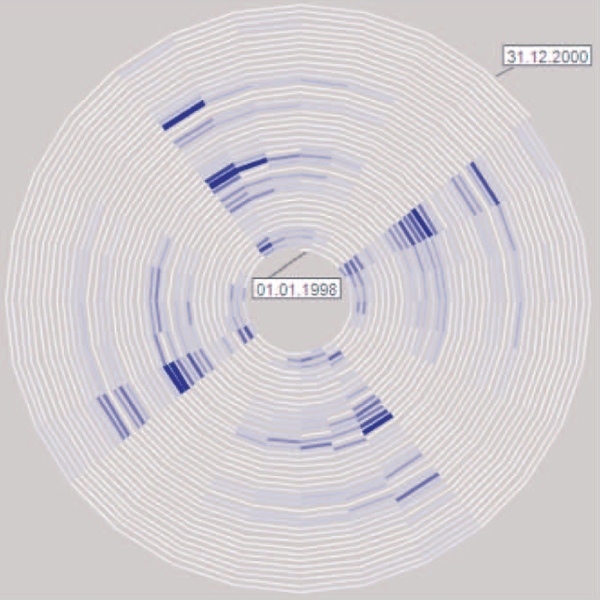
Also, the image is not the end goal in visualization. Gelman talks about the circular sick leave data visualization that I'm using as an example in the article, saying that it doesn't give him any new insights because he would have expected a weekly pattern anyway. The image here shows the view where there are 28 days (or four weeks) on each period of the spiral, showing that pattern.

Yes, there is that weekly pattern that we all expected. But there is also a lot more: there are seasonal patterns, there is an almost complete drop-off for the last quarter of the data, there are some atypical weeks where people suddenly get sick on Thursday, etc. Statistics may care mostly about that one effect that can be written down as a hypothesis and then tested, but infovis is about discovery. What else does this tell me? What more can I find out about the data? Is there other data that may explain some of these effects?
If the goals and means in statistical graphics and infovis were the same, there would be no point in having both. But to get value out of them, we need to understand and respect the differences. There are some statisticians who get it, but most seem to be stuck in the Tukey-Tufte school of thinking; unfortunately, most of them would even take that as a compliment. They need to stop looking at colorful pictures and start using an actual visualization tool: something that responds to mouse input and reacts in real-time; something that actually supports discovery in a visual way, rather than just plotting graphs.


Comments (7)
Posting new comments was disabled in 2020.