
Is visualization art? Are video games art? Is programming art? Is art art? You can discuss these questions at length, but without concrete criteria, they end up being academic exercises rather than leading to some kind of conclusion. One criterion, which I believe to be suited especially well for visualization, is the sublime. Art is sublime, visualization is not. Hence, visualization is not art.
Some Context
The question of whether and why or why not visualization is art is one that is of great interest to me. I started this website because I was thinking about the question and was looking for an outlet for my thoughts on the matter. My first tagline was "EagerEyes – Visualization is Art!"
But things are a bit more complicated. While there are some interesting connections when you dig deeper, I have come to the conclusion that no only is visualization not art, it is actually its opposite. How did I get here?
The Sublime
The key to understanding how art works is a concept from aesthetics, called the sublime. Sublime is a quality that is hard to describe but that can be demonstrated in a few examples. It provides the best description of art that I am aware of.
Sublime things inspire awe and invite you to ponder them. They are also often much larger than we are, more beautiful, around for longer, etc. Many things in nature are sublime: mountains, waterfalls, etc. We like to experience these things because they inspire this feeling in us. It's easy to be cynical about them today and call them kitsch, but they're the real thing. They are the things that, deep down inside, we admire and daydream about.
A similar experience is that of a piece of art. Something you can look at and ponder, without it handing you an answer or a conclusion. Something that has a certain beauty about it, even if it is not primarily beautiful. Something that gives you the idea that there is something deeper hidden within it, something you can't quite get to.
There are other, related criteria that are typically seen as separate, but that can add to the sublime quality of a piece of art. One is the uncanny: something seems vaguely familiar and unfamiliar at the same time. Another quality is ambiguity: the piece of art does not reveal itself as one particular thing, it can be many different things. Ambiguity provides a space in which we can search and use our own interpretations.
The Anti-Sublime
Given this criterion of the sublime for art, the natural thing to do is to look for things that are not sublime, and see which of these two areas visualization falls into. As it turns out, visualization in the technical sense is entirely anti-sublime: there is no ambiguity, no uncanniness, and typically no sublime quality at all. A visualization reveals its data right away, that's the whole point. We don't want it to be difficult to get the data out of it, we design it to speak as clear a language as we can.
That is essentially the argument Warren Sack made in a paper on the aesthetics of information visualization. I took it further to use that criterion to define two types of visualization, pragmatic and artistic.
The key argument in Sack's paper for our purposes is what he calls user-friendly: a visualization has to talk to the user in clear terms. That is the opposite of sublime, or anti-sublime (as Lev Manovich calls it); Sack also uses the interesting term utilitarian.
It is important to realize that these terms can have different connotations depending on where and by whom they are used. In the technical world, utilitarian is a good thing: a utility is useful, we want that. In art, it's not what you want. The point of art is not to make useful, user-friendly things.
Types of Visualization
Tying these thoughts together, I see two different kinds of visualization:
- Pragmatic visualization. The type of visualization that is done by people in computer science and whose goal it is to create images from data in order to provide insight. This is useful, or utilitarian.
- Artistic visualization, or data art. This is work done by artists, who do not care about insight but rather want to raise an issue or want to make you think. If this work is useful, that's an unintended side effect. The point is to make something interesting and/or beautiful.
In a paper a while ago I used these criteria to not only define these two kinds of visualization, but propose the sublime as a dimension along which different kinds of work can be arranged.
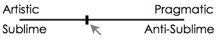
Not every visualization is necessarily on one of the ends, there's a middle ground there as well. But as it gets more artistic, it loses its utility. And by trying to be more useful, it loses its artistic appeal.
Right there in the middle is the place where there is a kind of uncanny valley: the kind of cargo cult visualizations that make no sense as either useful pragmatic visualizations or sublime artistic ones. They're trying to do both but succeed at neither. They use the tools of visualization without understanding what they are for, like somebody wielding a brush and oil paint thinking that alone will make a piece of art.
The Heisenberg Principle of Visualization
One problem with accepting this dichotomy of art or visualization is that a lot of visualization techniques end up creating interesting or beautiful pictures. We like looking at beautiful things, so why aren't these art? The problem is that we seek beauty in everything, whether it's art or not. I find printed circuit boards endlessly fascinating and beautiful, but that doesn't make them pieces of art. They're made for a certain purpose, and usually out of sight. They're utilitarian and useful. They're not art.
But there is a place where these things can be art because the sublime is not an objective property of a thing. If I don't know what a visualization shows, and perhaps even that it is a visualization, I can experience its beauty as something that is sublime. At the moment where I realize (or am told) what is shown and how to read it, the sublime quality disappears and it becomes utilitarian and anti-sublime.
This is the problem with the informative art piece I discussed a while ago. If you don't know what it means, it is sublime.

But once you're told what the different parts mean (and that it is, in fact, a visualization), it loses that quality and becomes a useful visualization like any other.

Whether it is art or not is clearly in the eye (and mind) of the beholder.
Teaser image: Mark Tansey, Modern/Postmodern (1981)
Comments (7)
Posting new comments was disabled in 2020.