Scrollytelling is a common way of interacting with stories these days. Scroll down and the story unfolds! Except it’s often awkward, brittle, and gets in the way.
The Age of Scrollytelling
Scrolling is a funny thing. It was long considered something people rarely did, and many news organizations will still talk about stories being “above the fold” when they’re visible on most people’s screens without scrolling. But the advent of scroll wheels on mice, scroll gestures on trackpads, and of course touch screens on phones and tablets, has turned scrolling into something everybody does without even thinking about it.
Scrollytelling takes this a bit further by assuming that people would rather scroll (or swipe) through a story – hence the term – than hit buttons to advance through a story. Rather than having to click a button on a stepper, you smoothly sail through the story with your scrolly finger.
Except it doesn’t work. Let me count the ways it goes wrong.
- Continuous scrolling through a story with discrete steps. Let’s take the very cleverly done What’s Really Warming the World?: It presents a series of questions and answers them. Each question has a little animation, which is continuous. But the steps between the questions are discrete. Scrolling is continuous. It doesn’t match the way the story is told. A simple stepper would be way easier. The same is true of this Visual Introduction to Machine Learning – great piece, but it’s individual steps, continuous scrolling makes no sense.
- Knowing how long the thing is. Before watching a video on the web, I always check how long it is. If it’s longer than I feel like watching, I won’t. Scrollytelling pieces often don’t give you a good indicator how long the piece is. Yes, you may be able to se the scrollbar, but what does that mean? How far apart are the steps? I have no confidence in that as an indicator.
- Direct access. Just like I like to know the length of a thing, I also like being able to jump between points. Many scrollytelling pieces now have indicators for the individual steps, which sometimes can be clicked to access them directly, sometimes not.
- Scroll-jacking. When I scroll, I scroll. I’m the user. I’m in control. I do not want your stupid website to interfere with the scrolling because your little JavaScript thinks that I’m scrolling too fast or that I really should pause here or there before moving on. That tab is closed faster than you can say onScroll.
- Scrolling that doesn’t scroll. Scrolling needs to actually scroll, not just advance an animation. How the U.S. and OPEC Drive Oil Prices makes my brain hurt. I scroll, but nothing (okay, almost nothing) actually scrolls. It’s just a bunch of confusing transitions in the same space. Granted, this piece has some other issues as well, but the weird interaction makes things even worse. This Diary of a Food Tracker is another example that would have been so much better with a stepper.
- Precision scrolling. Why infectious bacteria are winning is really interesting, but the scrolling action is infuriating. Text scrolls over the animated graphics, and you have to watch the action while scrolling or you’ll miss it. Try to read the text, and you miss the graphics, pay attention to the graphics and the text has just scrolled off the top. This nice piece is completely ruined by the scrollytelling.
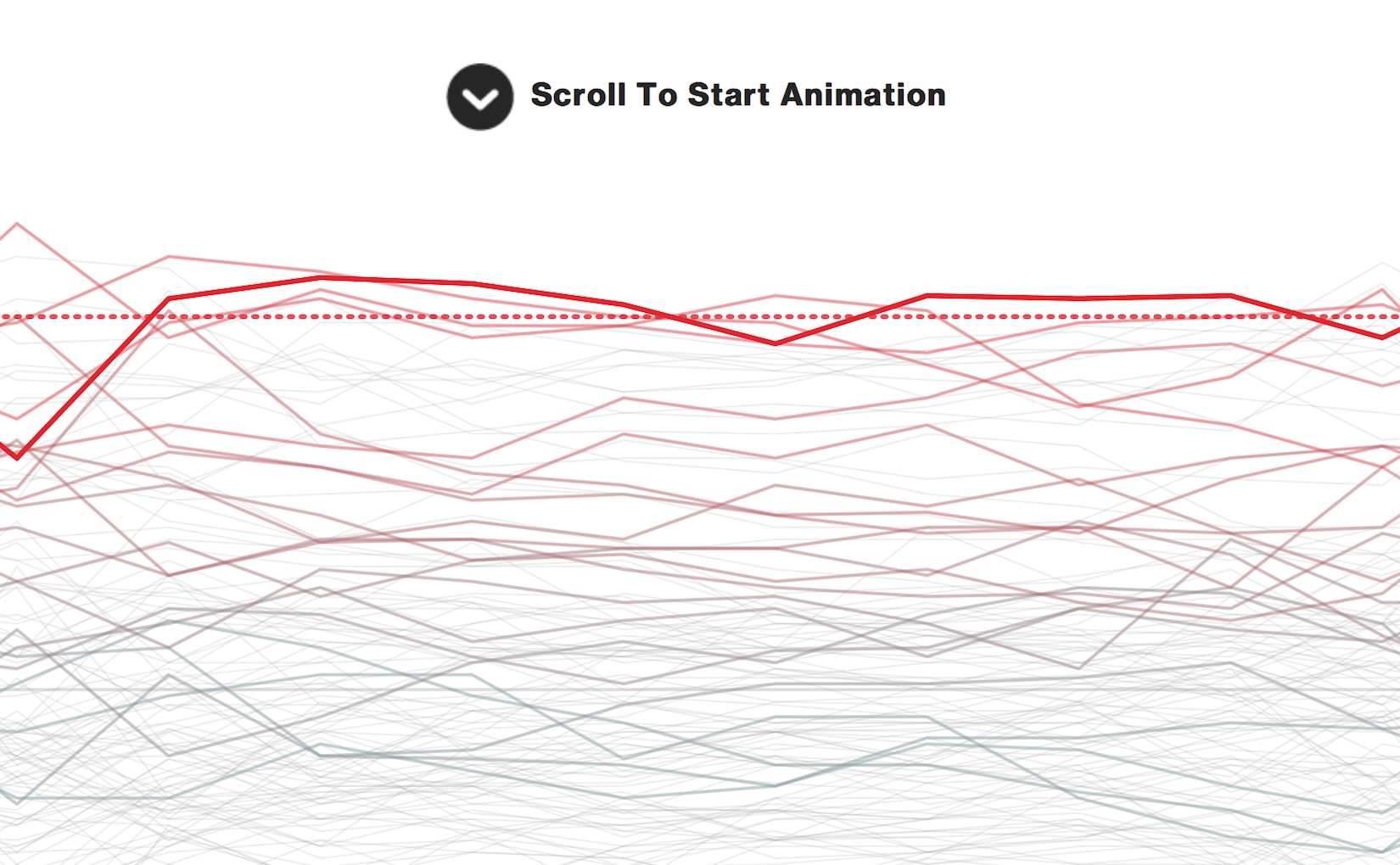
- Weird mixed metaphors. The fantastic Hottest Year on Record piece used scrolling as a trigger to start the animation. What if you want to see it again? Now you have to hit a button. It makes no sense. And the initial scrolling distracts, so you’ve almost certainly missed the first few years.
Stepping Back
What’s the alternative? Why, a stepper of course!
This one’s from For the Elderly, Diseases That Overlap. It’s nice and straight-forward: you know many steps there are and where you are in the sequence. Just click the Next button to go to the next one, or any of the numbers to jump around. Animation happens just the same, no scrollyanything needed. But the navigation doesn’t get in the way and doesn’t distract.
If you absolutely have to use scrolling, read – and heed – Mike Bostock’s How to Scroll. But even better: don’t.
12 responses to “The Scrollytelling Scourge”
Sorry dude, you’re just a bitch. I think they’re awesome.
Well, now I really changed my opinion. Thanks for that counter argument. :)
In fact, Mr. BB has enunciated the main reason people like them: the “awesome” factor. Things that look kewl are popular, even if that kewlness comes at the expense of usability. Steppers may be easier to use and more intuitive, but they lack the kewlness factor.
Scrolling is “kewl”?
Stepping is easier and more intuitive?
While the preceding comment may be silly and pointless, I think you’ll have a hard time backing up this argument.
Generally speaking I would much rather scroll through content than have to continue clicking step by step, and I think you’ll find a lot of people react the same way.
As mentioned in other comments here, there is good design and bad design in any paradigm, and a badly designed scrolling interface is not an argument against scrolling interfaces.
Hi Robert.
Well – I have to say I don’t agree.
There is good scrollytelling and there is bad scrollytelling. It doesn’t make it all bad.
Stepping fell out of favour because people don’t realise there were steps. The NYT tried using steps and gave up because nobody used them. I don’t have data, but I suspect scrolling is more natural and more discoverable.
Knowing how long the thing is: I agree not knowing puts me off scrollies. But that’s bad design, not a fundamental problem.
The OPEC example is an amazing example of scrollytelling (IMHO). I had to devote time to understanding it. In the same way I devote time to understanding a scatterplot. Once I’d cracked the code, it was an amazingly animated piece of work.
Scrollytelling fits the modern use of tablets/smartphones/browsers and needs care in implementation, not blanket advice against it.
No-one interacts with steppers. No-one. Now that we’ve got that out of the way… as a scroller enthusiast who occasionally shares some of your concerns, let me address each point:
1) Yes, it would be better if the scrolling gave immediate and direct feedback, but there’s nothing fundamentally wrong with mixing discrete and continuous. Paragraphs are discrete, but no-one suggests we should step through paragraphs. Scrolling is the more natural interaction. (No-one interacts with steppers.)
2) A stepper doesn’t give you any better indication of how long it will take you to get through it. It just tells you how many steps there are, which isn’t the same thing.
3) Why? Being able to go to point 3 is meaningless except for the fact that it’s between 2 and 4. The progression through the narrative is the entire point.
4) Agreed. A scrolling action should present immediate and direct feedback, without jank.
5) Basically the same as 4. Agreed. It’s an execution problem, not a fundamental problem with scroll-driven storytelling.
6) One of the nice things about scrolling is that you can achieve that level of precision.
7) Easily solved by enabling the user to pause and restart without watching all the way through. Definitely not a fundamental problem with scroll-based interaction.
Also, no-one interacts with steppers! (Especially on mobile.)
Not saying that scrollers are inherently good, or that all the kinks have been ironed out. But I think we should be trying to iron out those kinks, not reverting to a form of storytelling that user testing tells us is a big turn-off for most people.
I’m fascinated by your hatred of scrollytelling — always interested in hearing your next critique and curious if you’ll acknowledge its advantages.
Here’s one scrollytelling example I like https://www.theguardian.com/technology/2016/apr/12/the-dark-side-of-guardian-comments The charts flawlessly enter and exit the article, showing up when they’re needed but not dominating it like they would if all 6 were shown in sequence, and also not burying charts as a stepper would. Now, there is some information in this article that is buried — there’s an interactive quiz and it only provides the first question until you answer it. I think that agrees with my philosophy well — you should only have to click when you need to provide input to the page. “I want to continue consuming this article / sequence of information” should not require a click. (“scrolling is a continuation; clicking is a decision” http://bokardo.com/archives/scrolling-easier-clicking/ )
Then there’s the excellent http://www.nytimes.com/interactive/2015/01/09/sports/the-dawn-wall-el-capitan.html which seamlessly responds to the natural “give me more” scrolling gesture. Imagine how much would be lost if this was done with a series of still images and a stepper. Or even if you kept WebGL and animated between different rock face positions for the story points, you’d lose the natural in-between transition that scrolling gives. Stepper control would be more difficult and the experience less rewarding.
A well-known stepper that uses transitions instead of discrete charts is http://www.nytimes.com/interactive/2015/03/19/upshot/3d-yield-curve-economic-growth.html but that has flaws too. Look at the caption for slide 6: “the same chart as from above”. Well, with this free-form navigation, who knows where you’re entering that chart from? If it’s not a step to the left of it, that caption is entirely wrong. And the first 6 slides are different views of the same chart with transitions between them, but slide 7 switches to Germany, and the only way that change in context is shown is by *lack* of transition. If it was scroll-controlled maybe the US would naturally scroll off the stage and Germany would slide in, or maybe they could do it in-place with a scroll-controlled transition — e.g. if opacity is used to reveal the incoming Germany chart over the US, the user could have full control over that fade
Sure, the yield curve stepper could be modified to address the flaws I mention, but it’s worth considering if the best stepper version of this visualization is better than the best scroll-navigated version. Steppers do one thing well: exact control of steps. You click, it goes. Scrollers offer other advantages: easier navigation (scroll effort < stepper discovery & click effort), better delivery of your complete message (not buried behind multiple clicks), and full user control over transitions. The biggest question with scrollers is if you can get the scroll input and page response to feel natural. Not all scrollytelling is good, but I'll argue that in terms of joy and user experience the best scrollytelling interactive delivers more than the best stepper interactive.
It certainly would be interesting if there was A/B testing of scrolling v steppers, to show how well they perform with the readers.
Personally, I don’t like scrolling in the examples shown either, but there are nice examples where the visualisations update as scroll with the text narrative. eg http://s.telegraph.co.uk/graphics/projects/safaas-journey/index.html.
I would thought a nice design feature would be to offer stepper buttons alongside the ability to use scroll gestures. the stepper buttons would follow you down the page, and clicking takes you to anchors on the page
For example
http://swanh.net/
I would recommend you to read the following study of parrallax scrolling and the effects it has. It has a lot of similar touch points with your argumentation. The study came to the following result:
“Participants believed that the parallax scrolling website was more fun than the non-parallax scrolling website. The results of the study also showed parallax scrolling to be more effective when used in a hedonic and fun context. In spite of these benefits two of the participants suffered motion sickness and experienced significant usability issues while interacting with the parallax scrolling website. ”
Some of the arguments that you discuss deals with content type. If you really want the reader to learn something about a topic a scrolljacking parrallax superlong page might not be the best choice.
http://uxpajournal.org/the-effects-of-parallax-scrolling-on-user-experience-in-web-design/
The problem with a stepper is that if your last few steps contain the big reveal in the story, how many people make it through to the end? Take this recent one as an example, its not story points but uses tabs to navigate through. https://public.tableau.com/s/gallery/what-will-brexit-mean-uk. The first page has 41k views, 2nd – 3.5k, 3rd 1.8k, 4th 1.3k last 1k. Its not scientific and no doubt there are subtleties, but does the click to the next page approach mean that your readers never make it that far through the story? If your conclusions or big reveal is not up front there is a danger of people not seeing it. In this case its not a story so much as was to delve into the details behind the headlines and is a good example of front loading
Would be interesting if Tableau Public has any data on click through rates for storypoints, find out what % of people click through to the end and what the drop off rate is.